Adventures in Linux Ep. 6: The death of the scrollbar
Only an idiot would need proofs of the utmost idiocy that infested every single UI concept of the last ~10 years, but “the case of the missing scrollbars” needs a succinct explanation. I can live with the way things are, but this doesn’t make them less stupid.
It started with something else
Something like 15 years ago, everything was still making sense in the world of the desktop computers. Technological advances brought with them increases in the display resolutions, and small changes in a screen’s aspect ratio. For decades CRTs and later TFTs had an aspect ratio of 1.33:1 or 4:3 (640×480, 800×600, 1024×768), inspired by the traditional TV sets, which matched the silent film aspect ratio (1.33:1), very close to the Academy Standard aspect ratio (1.375:1). Computer screens weren’t designed for home cinema used, so screens even came in a more squarish aspect ratio of 5:4 (1280×1024). This would eventually change.
Cinema used several wide screen aspect ratio, up to 2.76:1 at some point, but eventually two formats became standard: a “normal” 1.85:1 format, and an “anamorphic” CinemaScope 2.39:1 (originally 2.35:1) format. Based on that, some genius (who should have been used as cat food instead of being let alive) came with the idea of 16:9 screens which, at 1.78 were close enough with the narrow version of the cinema films, meaning the 2.39:1 movies still had to be cut laterally or, to display everything that was filmed, top and bottom black padding had to be added, just like in the times of the 1.33:1 TV sets and computer displays.
To make the pill easier to swallow, a 16:10 format existed for a while (usually 1280×800), but eventually everything reached 16:9, from the infamously ridiculous 1366×768 screens to the standard 1920×1080 and the UHD (4K) 3840×2160 ones. (There seems to be a Résistance that tries to go back to 16:10, e.g. LG Gram with its WUXGA 1920×1200, but this is not the norm… yet?)
Why am I mentioning the screens that get wider and wider?
- Because it doesn’t make sense!
- Because this change triggered further changes that are against any logic!
Why it doesn’t make sense
I don’t know anyone who uses their computer primarily as a Home Cinema or a Smart TV; if such people exist, they must be a tiny minority. For everyone but a few fools, the current aspect ratio is less optimal than ever! An extremely wide display would only be optimal in two cases:
- When using a DTP software to design a magazine, and two facing pages must be shown in parallel.
- When reading a PDF version of a magazine and, you guessed, two facing pages must be shown simultaneously.
With uselessly wide screens, most web sites display the actual text to be read centrally, on 33% to 45% of a screen’s width:
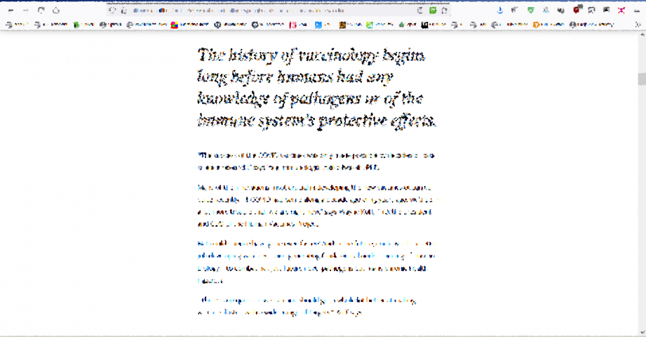


So much screen estate, simply wasted! No to mention the impracticality of reading a long text (or an e-book) on a screen that’s landscape and can only display a couple of paragraphs at once. If anything, the display should have a vertical (portrait) orientation, like the smartphones! (As a compromise, why not a square one, like the Blackberry Classic?)
As a side note, as screens become wider in aspect, the classic GNOME2/MATE layout that included 2 panels, top and bottom, started to feel out of place. Even single panels are now placed by some vertically, like the left-side panel in MX Linux XFCE.
One thing is clear: not the horizontal space is what lacks nowadays. Unless, of course, someone wants to watch a film in the original 2.39:1 or 2.35:1 format, but good luck in finding a data source for that: the even the BluRays carry such movies in 16:9, with black padding.
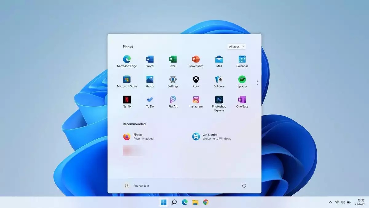
Windows 11 makes it clear that the screen is too wide, so it wants you to focus on 30% of it:
We have plenty of lateral space, yet it’s the vertical scroll bars we disable
Horizontal scroll bars are less frequently used, right? Most people only expect to scroll vertically for additional content, so unless you’re writing code and you don’t use word wrapping, the need for horizontal scrolling is bad design.
But hey, it’s the vertical scrollbars that are under attack, since about 2011!
- Step one: Ubuntu 11.04 came with “overlay scrollbars” in Unity! (Video, article.) That was… “to provide more immersive experiences”! Apparently, Mac OS X 10.7 Lion also tried something of the kind.
- Step two: The “non-scrollbar scrollbars” are gone, meaning they aren’t hidden anymore, but they’re extremely thin.
- Step three: The scrollbars are totally fucked-up: they hide when not in use, and they’re too thin when visible.
A typical behavior:


Then the scrollbar hides again. As a reminder, the perfect scrollbar concept was the one introduced by Windows 95:
It improved the scrollbars from Windows 3.1 by making the “scroller” proportional with the part of the contents visible on the screen, and the position in the document suggested by the position of the “scroller” in the scrollbar. The end arrows could be clicked for fine scrolling, finer than with a mouse’s wheel. Just perfect.
Nowadays, in Linux, not only one has to “hunt” for a tiny and normally hidden scrollbar, but it became 100% impossible to scroll line-by-line, because there are no end arrows anymore!
I sincerely wish terminally untreatable colon cancer to everyone who contributed to this design.
But it can be tweaked, right?
It can and it can’t. I don’t feel like fiddling with every single Linux I see, and I’m definitely not Dedoimedo, but I care when restoring the classical behavior needs excessive tweaking for good-looking results. So I won’t do it.
In practice, scrollbars should be restored separately for GTK3 (e.g. in ~/.config/gtk-3.0/gtk.css) and GTK2 (e.g. in ~/.config/gtk-2.0/gtkrc). The end arrows need to be restored to. Random pointers: one, two, three. I’m not sure about Qt, but GTK3 is screwed by design, and GTK4 is even worse. Key points:
- The tweaked legacy scrolling is not obeyed by all GTK applications.
- Prior to GTK 3.6, clicking on either side of the slider in the scrollbar would move the scrollbar in the direction of the click by one page. Since GTK 3.6, the slider will move directly to the position of the click.
- Since GTK 3.15, overlay scrollbars are enabled by default, meaning that scrollbars will be shown only on mouseover in GTK3 applications. This behavior can be reverted by setting the following environment variable: GTK_OVERLAY_SCROLLING=0.
- GTK4 no longer supports GTK_OVERLAY_SCROLLING. In GTK4, the overlay nature of the scrollbars is part of the toolkit and cannot be changed.
I reiterate my good wishes involving colon cancer.
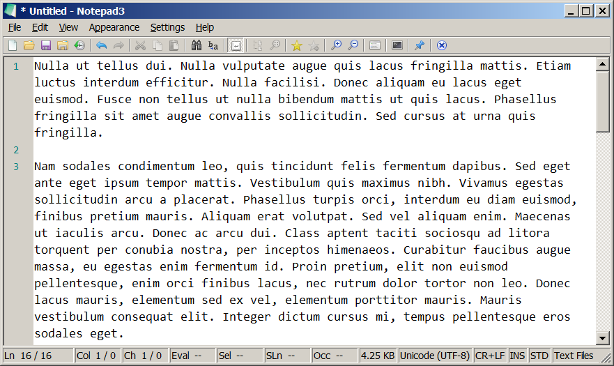
My first and last attempt to restore the scrollbars gave pathetic results:


Fucking ugly. It’s not worth fighting the windmills. I’ll have to live with the stupid crapola designed by those fucking morons. Usability-wise, I’d go back to Win95/98/NT4/2k any time! Well, except for the bugs and crashes, were it to build such an OS for today’s hardware, it would be faster than the light. And it would still have proper scrollbars.
Bonus links: proofs of moronic UI/UX design
- Terence Eden: Whatever Happened to UI Affordances?
- Grumpy Website: Invisible scrollbars was one of the biggest blows on the usability of computer interfaces. You can never know if something is scrollable and how much stuff are you missing.
- Grumpy Website: Firefox and its new tab design (which can be fixed)
- Grumpy Website: Literally no one at Google knows how Google’s own accounts work
- Grumpy Website: text input looks like combo box; filters look like buttons; “Advanced search” looks like a link (it’s a button!); actual buttons look disabled and resemble decoration rather that a toolbar
- Grumpy Website: Skype, Meet, Zoom, Face Time and Whatsapp: You can’t indicate mute/camera state with a single icon. Whatever your reasoning might be, it’ll always be confusing.
- Grumpy Website: A lot of empty space in both columns, yet text is abbreviated. (Oh, I’ve seen worse! There are gazillions of situations where “…” is shown when the full text would have fit!)
- Grumpy Website: Why yes, we put a LCD screen on our blender so we can draw real life-like buttons on it.
- Grumpy Website: Unusable macOS Finder in iCloud. (Remember: macOS is for retards.)
- Grumpy Website: Compare cursor travel time from Start button to apps shortctuts in Windows 10 vs Windows 11. (Windows 11 is for morons too.)
You can see how bad 16:9 is. Setup a new system / install new apps. Open the new app. You will see a severe lack of vertical space unless you maximise or manually adjust window to 16:10, 4:3 etc.
Never in my life has an article more resounded with me. Vertical scrollbars in Linux that are thin, hidden, and have no end up/down arrows are the bane of my existence and a giant step backwards that I can’t fix. Unbelievable.