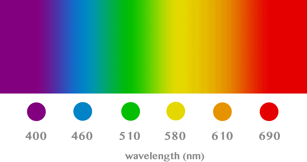
The Blue That Is Green (And More)
Posted originally on Facebook, this is one of those “I’m at war with the world” things, simply because my eyes are trained to perceive and judge colors in terms of RGB values. Let me explain.
I’m at war with the “is this green or blue?” question…
…since forever. As a kid, I’d constantly contradict my mother regarding a plastic handle of a kitchen knife: it was officially turquoise, but was it more green, or more blue? I saw it as more green, but she saw it as more blue.
I see it as a problem of definition. Purely scientifically speaking, nobody was taught like this: “light with a wavelength below 500 nm is blue, and light with a wavelength above 500 nm is green” (for obvious reasons), and I’m not even sure these conventional limits are universally accepted. Britannica says that green has 550 nm and blue has 450 nm, which I suppose justifies the 500 nm boundary, but in practice, how does one compare a real color with a non-existing “golden standard”?
In real life, we all learned as children by the means of accumulating lots and lots of samples: this object is green, this one is blue, this one is green, etc. After thousands and thousands of such labels, each of us has decided for themselves which is the border color that separates “shades of green” from “shades of blue” (let’s disregard the personal color bias given by the “sensors” in one’s eyes, or maybe also depending on the “calibration” at the other end of the optical nerve, the brain). But this depends on two factors:
- how many objects of each color (and in which shades) was one exposed to as a kid;
- how was each object’s color defined to the kid by whoever defined the color for them: a parent, a grandparent, etc.
But now, I just discovered “the blue shade that’s actually green”: the Tiffany Blue®!
To the question “Is Tiffany more green or blue?”, here’s what Canva answers: “Around 1845, the world-famous jeweler, Charles Lewis Tiffany, chose a mixture of bright green with a hint of blue as the official color for his jewelry line and packaging. With time and Tiffany & Co.’s ever-growing popularity, these little blue boxes became an icon, getting the name Tiffany blue.”
So they stress on the hint of blue, but is it more green still, or more blue?
Tiffany Blue is defined by Wikipedia as follows:
- ISCC–NBS descriptor: “Very light bluish green”
- #81D8D0 or (r, g, b) = (129, 216, 208)
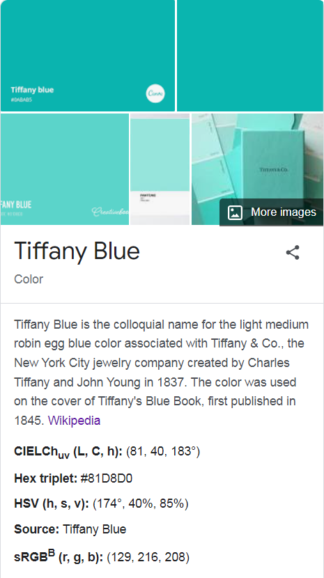
The way I judge the color is by their RGB triplet, here noted as (r, g, b). If the green component is higher than the blue one, then the color is to be considered a shade of green; and vice versa. Here, as one can see, g = 216, which is higher than b = 208, so this Tiffany Blue® is actually a shade of green! This is in line with the ISCC–NBS descriptor, which makes it a “very light bluish green” — hence green!
The same Wikipedia page also describes it as a “light medium robin egg blue color”; and robin egg blue is “a shade of Teal (bluish-green color)” and not a greenish-blue color, although the Teal color as we know it from MS-DOS and Windows is (r, g, b) = (64, 128, 128), which makes it perfectly neutral between green and blue.
In some cultures, there is no specific word for “teal”; however, lighter shades tend to be called turquoise. But here too, turquoise is called by some “blue-green” (sounds neutral), and by others “turquoise green” (which keeps it to green).
Actually, teal and turquoise don’t only differ in brightness or saturation: “while teal and turquoise are often used interchangeably, they are not the same color. Teal is a darker, cooler shade of blue-green that is more blue than green, while turquoise is a brighter, more vibrant shade that is closer to green.”
Canva again: “Positioned between blue and green in the color wheel, turquoise is a mixture of pale blue and green or blue with a small amount of yellow. Its hex code is #30D5C8.” Well, should this be the “most standard” turquoise, that makes it (r, g, b) = 18.8, 83.5, 78.4, and since green > blue, this makes it a shade of green!
This shouldn’t be a problem. Most people think of turquoise as being greenish (I guess).
The cherry on the cake: there’s also a color called Mint Blue! Apparently, “Mint blue is a soft blue-green color. The mint blue color code is #429E9D.” The RGB equivalent is (r, g, b) = (66, 158, 157), which makes it ever so slightly greenish, but really only symbolically so. Basically, it’s on the verge, or what I call “neutral”!
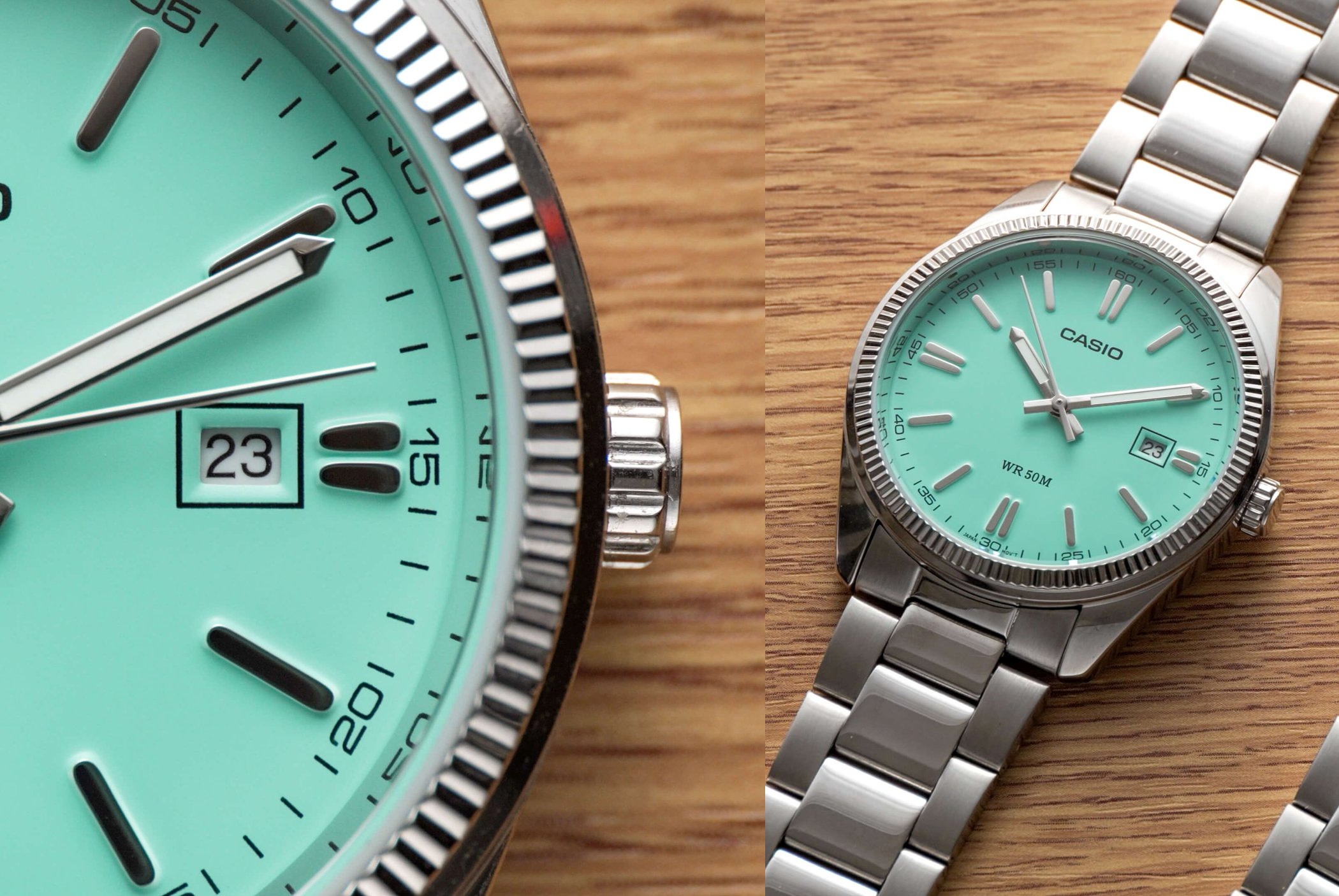
Back to Tiffany Blue®, I learned of this color by chance, after having watched a few YouTube videos about Tissot’s PRX watch collection: Facebook showed me an ad, then I googled for more. Funnily enough, the seasoned watch reviewers called this color differently:
- Tiffany Blue® (the official name)
- “mint green” (I hope nobody sees mint leaves as being blue!)
- “light green”
So, unless you want to stick to the official name, it looks like Tiffany Blue® is actually green! (to some)
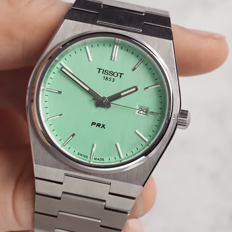
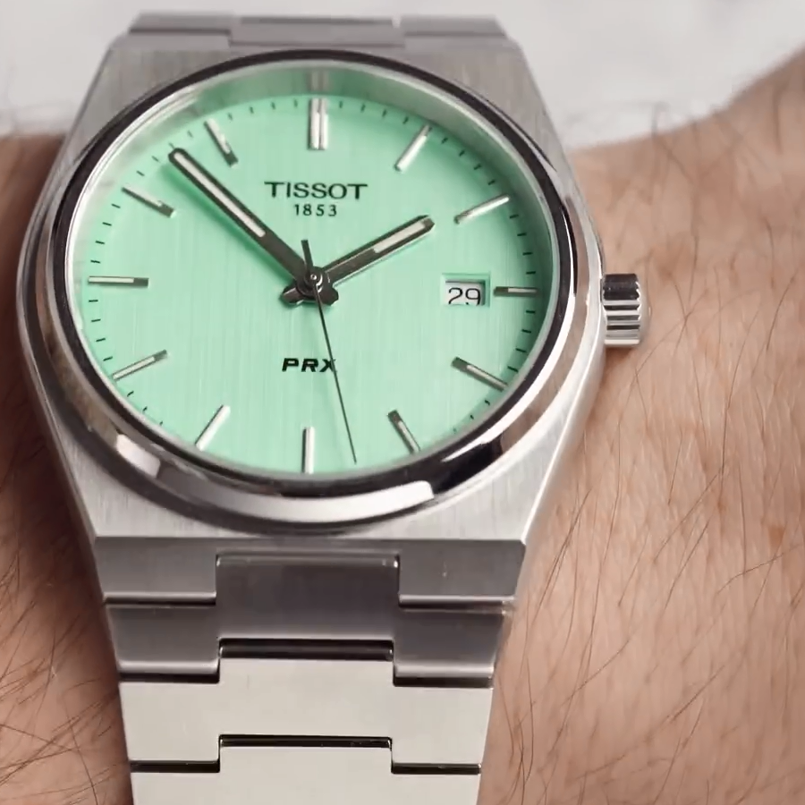
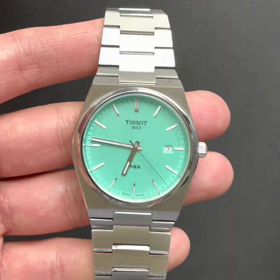
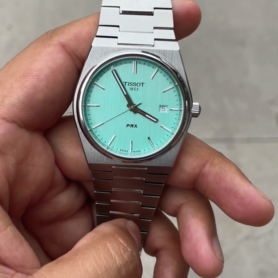
When it comes to Tissot, there’s a catch, however: the dial isn’t a matte color, but rather a brushed metal one, and it’s been designed so that, in neutral natural light (think of “neutral” as in autumn/winter light, which isn’t as yellow as the summer one) and under certain angles, it looks blue!
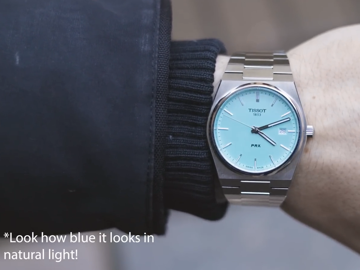
The last picture shows this blue metamorphosis.
The watch pictures are stills from video reviews, not from the official marketing pictures, so they’re real colors. (URLs: one, two, three.)
So what is it: is Tiffany Blue really deserving the name of blue, or is it more like Tiffany Green, or Tiffany Mint?
Oh, I just remembered it: Albini Prassa, who sells this watch in Romania, described the Tiffany Blue® variant on Facebook using the terms “mojito” and “green mint”… but no blue whatsoever, not even Tiffany Blue®!
BONUS
Why The Ancient Greeks Couldn’t See Blue (on YouTube). I would add to what the video says that blue and green still have special statuses in some cultures. In Romanian, “bleu” means “light blue” (unlike in French, where “bleu” means just “blue”) and “vernil” means “light green”; in Russian, “dark blue” (синий) and “light blue” (голубой) have distinct terms; in Italian, “azzurro” is “blue” (with a tendency to be used for lighter shades, as it literally means “sky blue”; but to definitely mean “sky blue” one has to use “azzurro chiaro”), whereas the generic blue is “blu” (duh).
LATE EDIT
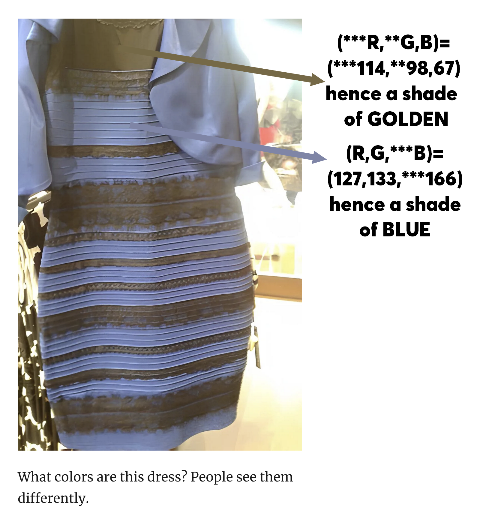
Remember the famous dress hysteria? Is it white-and-gold, or black-and-blue? Wikipedia claims it to have been “confirmed” by the retailer as being “black and blue“!
However, my Paintbrush-trained (it’s actually PhotoFiltre-trained) eyes always judge colors in terms of RGB values (as I cannot measure the dominant wavelength), and they told me the dress to be EXACTLY AS THE COMPUTER CONFIRMS IT TO BE, namely gold-and-blue. Any image editor can confirm it. Why can’t you see it right?
An Even Later Edit: Purple vs Violet
Selection of pointers to some other insightful information regarding colors:
- Blue–green distinction in language
- There’s Evidence Humans Didn’t Actually See Blue Until Modern Times
- The words that change what colours we see
- Why it took us thousands of years to see the colour violet
- Difference between ‘violet’ and ‘purple’
Now, regarding the difference between violet and purple, which can be even more confusing in other languages (as purple is sometimes translated into whatever word is used for violet in the target language), there is another thing, answered on Quora:
Q: Since red and violet are on opposite ends of the color spectrum, why do you get violet when you mix red and blue pigment?
A: You don’t. You get purple.
Violet is a spectral color, meaning that it is a color that can be viewed on the natural spectrum. It’s basically a wavelength (or a narrow band of wavelengths) of light.
Purple is a composite color, meaning that it does not exist on the natural spectrum of colors. Purple light must be comprised of multiple wavelengths of color in a mixture.
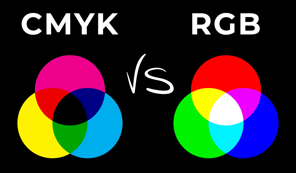
As an interlude, note that there are two color systems:
- The additive color system, i.e. RGB, also called “light color system” — like in cinema, television and computers (projection screen, CRT, LCD, TFT, IPS, LED, etc.).
In this system, adding red and green gives yellow (more light leads to a lighter color). If you further add blue, you get white. - The subtractive color system, i.e. CMYK, also called “pigment color system” — as in printing.
In this system, mixing magenta and yellow gives red (that’s less light, because the pigment is absorbing the corresponding part of the spectrum, which is not reflected back). Should you then add cyan, the result is black (ideally), as the entire spectrum is absorbed. In practice, color printers using CMYK also add black, because CMY alone might result in dark gray, which is not a color, but not black either.
That’s both to explain the system in which red and blue give purple, not violet. Wikipedia: “Violet is the color of light at the short wavelength end of the visible spectrum, between blue and invisible ultraviolet … between approximately 380 and 435 nanometers.” On the other hand, purple a non-spectral color in that there isn’t a single wavelength that “carries” it; Wikipedia: “In the CMYK color model used in modern printing, purple is made by combining magenta pigment with either cyan pigment, black pigment, or both. In the RGB color model used in computer and television screens, purple is created by mixing red and blue light in order to create colors that appear similar to violet light.”
Back to the last article in the bulleted list, it reveals one more stunning fact: Only humans can mistake purple for violet! Why?
We have three types of color-sensitive cells in our eyes, the so-called cones. The problem with them is that they don’t perceive the intensities of a single “assigned” color, namely red, green, blue. Instead, the cones “responsible” for red also “believe” they see red when the light is blue!
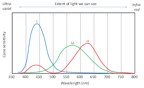
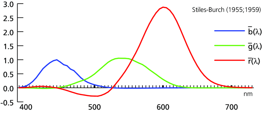
These are not accurately depicting the output signals from the cones, but the signals after they have been processed by the brain to self-represent the visible CIE 1931 color space. As explained in Basic Color Science For Graphics Engineer, the color cones have the highest sensitivities for different shades of red, green, and blue than the standard ones: 600 nm (reddish), 550nm (greenish), and 450nm (blueish). The unadjusted, “electrically-correct” chart is the following one:
Either way, the important thing to learn is that the brain has been educated to know that blue is blue, not purple! That is, when the cones for red are excited by a shade of blue, but the cones for blue aren’t, the brain decides that the blue must be missing, UNLESS the red “signal” is strong enough to suggest that there isn’t a single dominant wavelength, but at least two that together, might leave the impression of purple. This explains why, 2,800 years ago, the Greeks said that the sea is wine-like or purple! Their brains didn’t learn to distinguish between the cones for red being excited by the blue light or by the red light.
But the human eye is even stranger than that. The so-called rodes that complement the cones, cells that are much more sensitive to light, and essential at night or in low light (but also useful in normal light in detecting movement and edges), while supposed to be color-insensitive, they have the peak sensitivity around 510 nm, which is a shade of cyan! (I’ve seen charts depicting the rods as peaking at 498 nm, and others making them peak at 530 nm. I can’t tell which such value is factually correct and which one is RGB-adjusted to match the CIE 1931 color space.)
The Traditional Primary Colors Are Bullshit
I was taught in school at the drawing class that the “primary” colors are: red, yellow, and blue. Even today, I expect to find painters or artists claiming that this RYB system is a real thing.
IT IS NOT.
Later, I learned at electronics (the CRT) that RGB are primary colors when added. Learning about printing taught me that the CMY are primary colors when subtracted. THESE ARE FOR REAL. The RYB system ain’t!
Wikipedia calls this nonsense Traditional red, yellow, and blue primary colors as a subtractive system. This is a retarded system that poisoned our minds for centuries! Blame the Bauhaus, though:
The widespread adoption of teaching of RYB as primary colors in post-secondary art schools in the twentieth century has been attributed to the influence of the Bauhaus, where Johannes Itten developed his ideas on color during his time there in the 1920s, and of his book on color published in 1961.
…
In discussing color design for the web, Jason Beaird writes: “The reason many digital artists still keep a red, yellow, and blue color wheel handy is because the color schemes and concepts of traditional color theory are based on that model. … Even though I design mostly for the Web—a medium that’s displayed in RGB—I still use red, yellow, and blue as the basis for my color selection. I believe that color combinations created using the red, yellow, and blue color wheel are more aesthetically pleasing, and that good design is about aesthetics.”
…Numerous authors have taught that red, yellow, and blue (RYB) are the primary colors in art education materials since at least the 19th century, following the ideas tabulated above from earlier centuries.
A wide variety of contemporary educational sources also describe the RYB primaries. These sources range from children’s books and art material manufacturers to painting and color guides. Art education materials often suggest that RYB primaries can be mixed to create all other colors.
Itten’s ideas about RYB primaries have been criticized as ignoring modern color science with demonstrations that some of Itten’s claims about mixing RYB primaries are impossible.
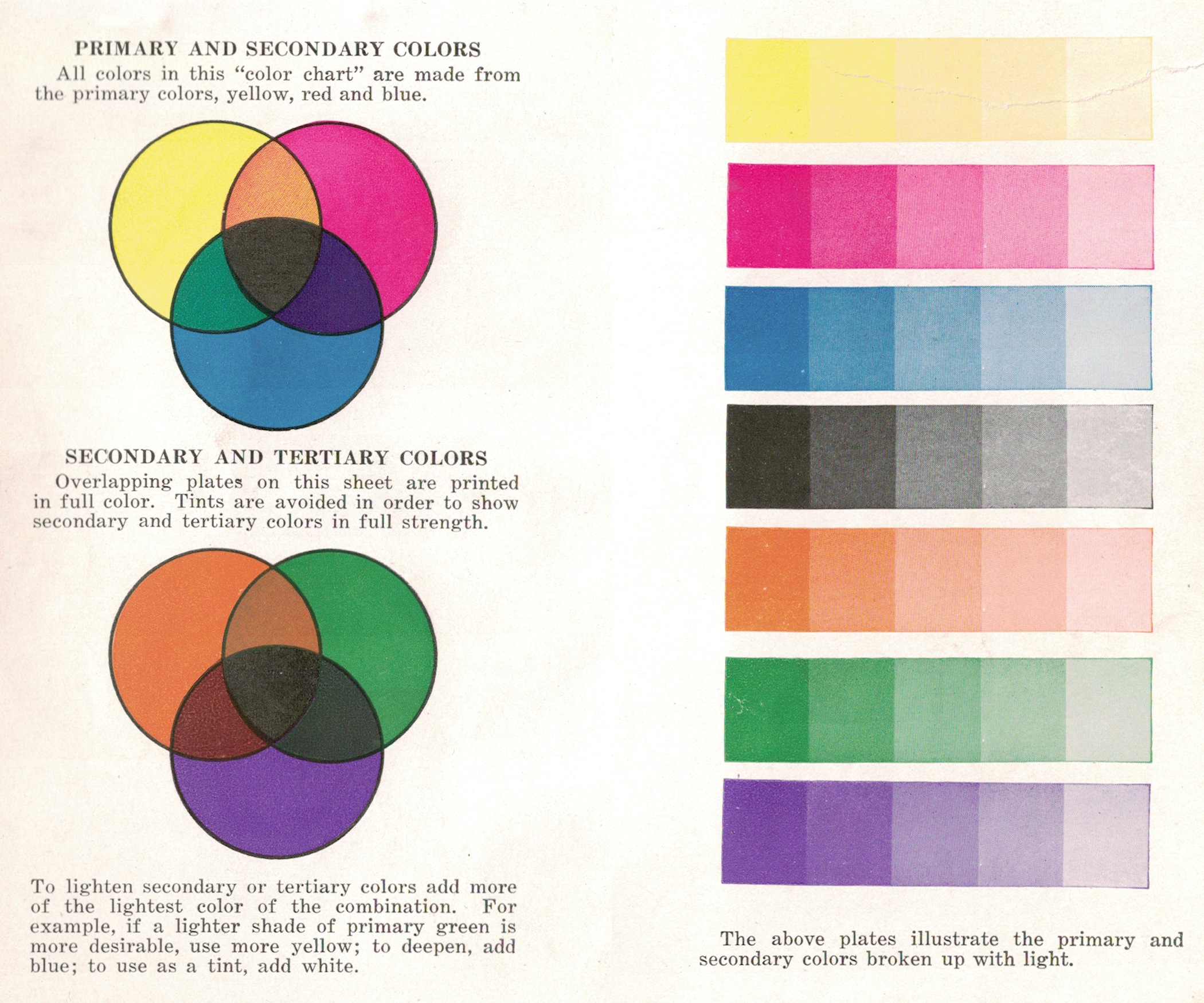
Now, in all truth, and without discussing the concept of color gamut, we should acknowledge that no color system from the standard ones, say CMY/CMYK for printing, can achieve any possible color using those three inks! In this regard, the previous Wikipedia page is right in saying this:
Of course, the notion that all colors can be mixed from RYB primaries is not true, just as it is not true in any system of real primaries. For example, if the blue pigment is a deep Prussian blue, then a muddy desaturated green may be the best that can be had by mixing with yellow. To achieve a larger gamut of colors via mixing, the blue and red pigments used in illustrative materials such as the Color Mixing Guide in the image are often closer to peacock blue (a blue-green or cyan) and carmine (or crimson or magenta) respectively. Printers traditionally used inks of such colors, known as “process blue” and “process red“, before modern color science and the printing industry converged on the process colors (and names) cyan and magenta (this is not to say that RYB is the same as CMY, or that it is exactly subtractive, but that there is a range of ways to conceptualize traditional RYB as a subtractive system in the framework of modern color science).
Basically, the typographers noticed that the red-yellow-blue system is a scam, and, on their way to standardization of cyan and magenta, they used intermediate “process blue” and “process red” shades. Physics can’t be denied by some “artistic” ideology.
Never trust someone who says that RYB are the primary colors. Ask an engineer or a scientist.
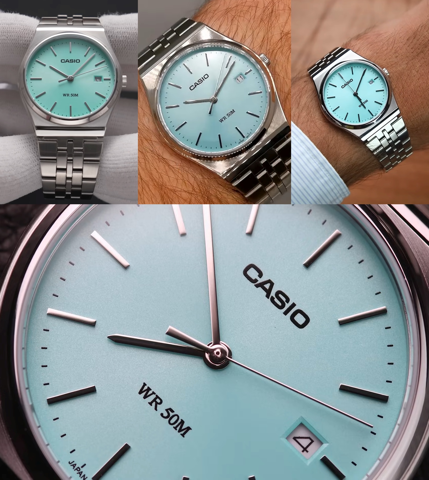
ADDENDUM: Casio enters the Tiffany hysteria
YouTube insisted that I learn about The $50 Casio That’s Harder To Buy Than A Rolex! Then I read Ben’s The REAL Truth About the Casio Datejust Tiffany Watch.
So people who can’t afford more expensive watches rushed into buying a Casio quartz “Tiffany Blue” model, the MTP-1302PD-2A2VEF, aka Casio Tiffany Datejust.
Sure thing, many people refer to this color as a blue thing. Nope, it’s anything but blue! It might depend on the incident color and on the lack of calibration of the video sensors, but this turquoise is definitely greenish. There are lots of videos about this watch, e.g. one, two, three, four, five, six; just watch them!
38.5 mm (38.5×44.2), 9.20 mm thick, 105 grams. About €55 street price (£44.90 on Casio UK).
ADDENDUM 2024: Casio’s improves on Tiffany
If the previously mentioned MTP-1302PD-2A2VEF has a brass case, but at least it has some lume on its hands, the new Casio Collection MTP-B145D-2A1VEF aka MTP-B145D-2A1V is cased in stainless steel, but it’s more minimalistic. And for smaller hands.
35 mm (35×40), 7.40 mm thickness, 82 grams. About €80 street price (£64.90 on Casio UK).
In sunlight, it will look much bluer than in artificial light. But the color won’t be “pure” or uniform, given that it features a sunburst dial (i.e. with a radial brushing pattern, which does funky things with light). There are four other variants in the MTP-B145D series. Some videos to watch: one, two, three, four, five, six.
Regarding the first video link: don’t be as retarded as Benjamin Arthur, the “expert” from Ben’s Watches, is. He questions the watch’s steenless steel composition, because it doesn’t react as expected to magnets. Several comments try to educate him, and here’s the main idea: some stainless steel are magnetic and some are non-magnetic. There are five types of stainless steel, and 304 is an austenitic one, which is mostly non-magnetic. (Incompetents “experts” such as Ben are the best proof that watch reviewers don’t know shit about anything.)
ADDENDUM BIS: Josef Albers in a wristwatch
Josef Albers was a legendary color theorist criticized for his influential book Interaction of Color (1963) and best known for his iconic “Homage to the Square” series (1949–76) that includes “Persistent” (JAAF 1976.1.610), which has just been recreated as a wristwatch by Project Watches.
Compare the official photo of the painting, where the turquoise is quite neutral, albeit leaning towards teal…
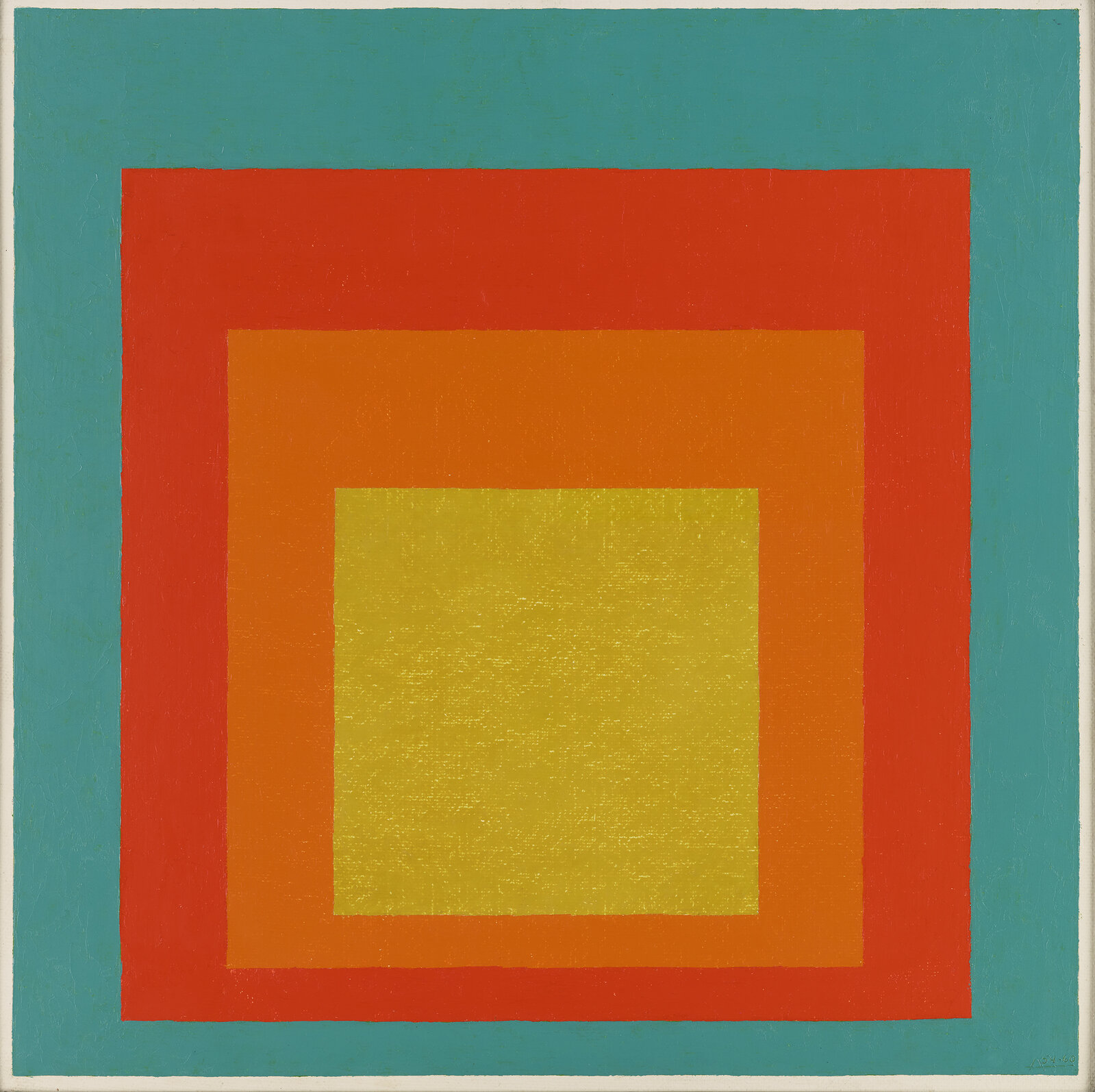
…to the way one of the official photos seems green…
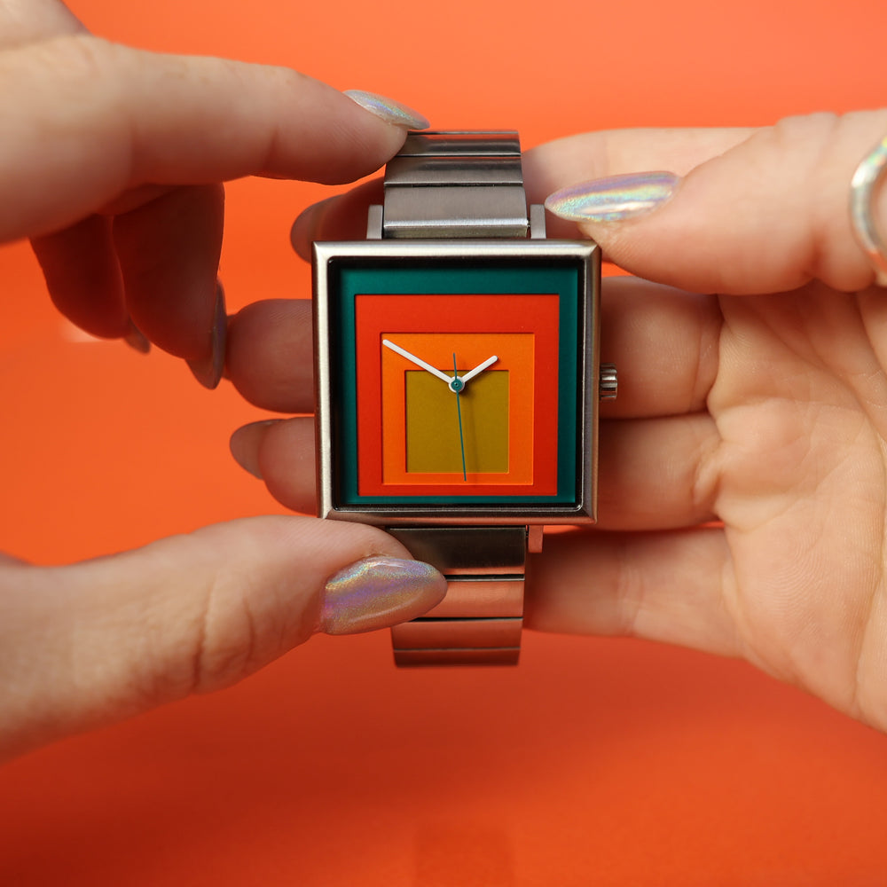
…while a user-made photo makes it look blue!
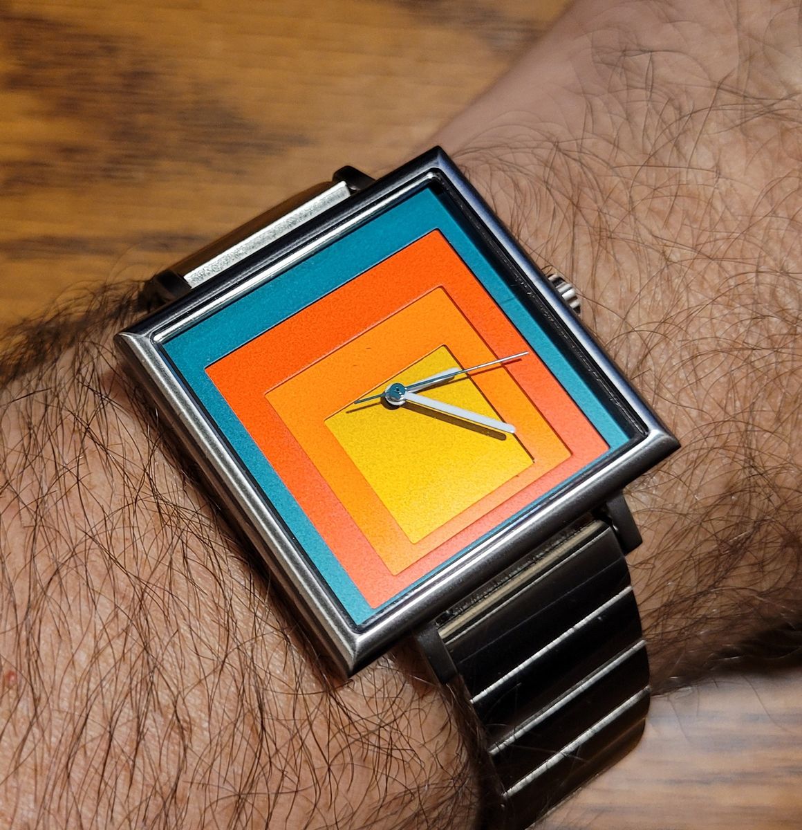
It’s clearly a matter of light and, almost certainly, the user-made photo has been taken by a smartphone whose color calibration and color correction are wrong. I could never get the true colors with any recent smartphone if the photos were taken inside, in artificial or mixed light. (Albert was so meticulous as to have written down the exact shades and brands of the colors he used, but I don’t know what is the exact case here, nor whether the time has somewhat altered the original shade.)
ONE MORE ADDENDUM: Timex x Peanuts in a light teal blue that’s more green than blue!
Yet another 2024 discovery: two Timex watches, Timex Weekender x Peanuts Holiday 38mm TW2W24500 (“With its light teal blue fabric strap and matching dial showcasing Snoopy and Woodstock spreading a bit of holiday love, this timepiece is sure to delight all season long.”) and Timex x Peanuts Holiday 34mm Fabric Strap Watch TW2W24700 (“It brings fun to the holiday season with a charming light teal blue fabric strap adorned with a winter white snowflake pattern and a matching dial showcasing Snoopy’s doghouse all decked out with lights.”)

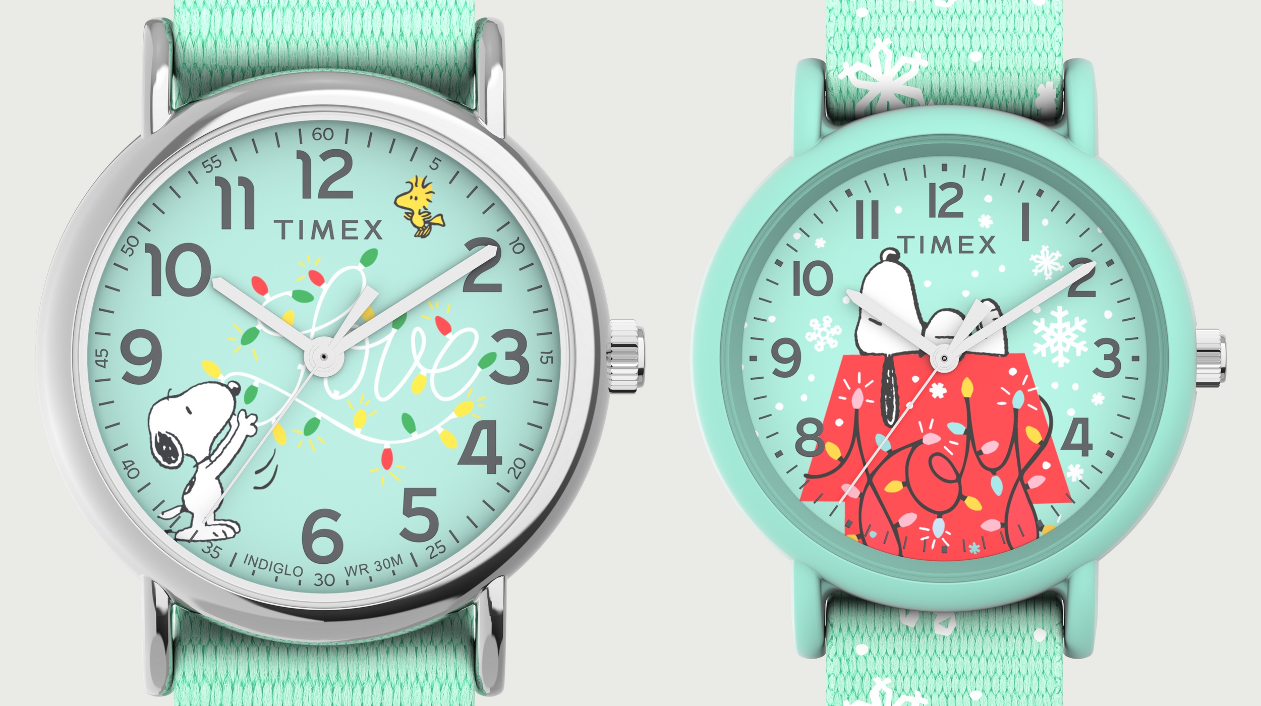
Now, these official images aren’t consistent in the color shades between the compilation in the snow and the watches alone. And the color of the dial isn’t uniform, mimicking the way the light may come on it. Regardless of these details, open any graphics program and use the color picker tool (usually a pipette or eyedropper): you’ll notice that, no matter what RGB triplet you’ll get, the value for Green is always greater than the value for Blue! Therefore, their light teal blue is actually light teal green. QED.
2025 UPDATE: Timex Legacy Day and Date
I just learned about the Timex Legacy Day and Date 36mm TW2V68400 (an elegant women’s watch), officially described to have “Dial Color: Blue.” The official image shows a completely balanced (G=B) turquoise, but real photo from users show that under certain lighting conditions, it tends to be blue!


Added an ADDENDUM 2024 to the addendum on Casio’s Tiffany watches. The newer watch is more blue than green.
ONE MORE ADDENDUM: Timex x Peanuts in a light teal blue that’s more green than blue!
Updated with another watch whose face is blue, but actually turquoise, or maybe really blue sometimes.