E-book readers on Windows and Android: my 2 cents
I have always favored, literally for decades, the ePub file format for e-books and ranted against Amazon’s various Kindle-specific e-book formats. And, oh boy, they have changed in time: from .mobi, .azw, .azw3 (KF8), to the current mess that downloads, for a single book, a folder containing .azw + .mbpV2 + .phl + .voucher, possibly also .azw.res + .azw.md + .apnx. My hostility against Kindle books was mostly due to the fact that this is a monopolistic bookstore (only Amazon sells books in the Kindle format, whereas dozens of .epub books are sold or were sold by dozens and dozens of online bookstores, not to mention the free, DRM-free books, because EPUB is an open format), and also because Amazon refused to let Kindle devices read .epub files.
Ironically, despite Amazon’s eternal refusal to support EPUB directly (not a technical decision but a strategic one), since the introduction of .azw3 (KF8) in 2011, Kindle’s books are containers of XHTML files with CSS, images, fonts, and metadata, very much like an EPUB 2 or 3 file, just differently packaged! The newer KFX (Kindle Format X), which reverted to the .azw file name but added a bunch of companion files, still uses XHTML files internally! But still, no direct ePub support. One has to send an .epub file to their Kindle account to have it converted to a Kindle-supported format, then download it on their device or app. No fair play from Bezos, ever.
❶ I’m not a fanatic (and I even use the Kindle app)
Not that the EPUB format is such a good choice (but hey, eventually even Kindle is using it to a relevant extent!). I’m not happy with the using of XHTML instead of HTML. You see, an HTML file is usually rendered very well by any browser, even if tags are not properly closed or are intertwined, e.g., <b><i>text</b></i>. Not so in the case of XHTML, which inherits from XML the mandate of perfectly matching tags and not a single stray character: any error, no matter how small, and the rest of the XHTML file won’t be displayed at all. Typically, that means the rest of the chapter, but for smaller books it could mean the rest of the book.
Then, we have the reality of EPUB2 and EPUB3 files that don’t render identically on different reading software or devices. Sometimes, it’s because Kobo has added their specific shit, or because Apple has made them for iOS or macOS. Or it can be as simple as the fact that the editor only tested them on an Apple device.
In more than 20 years, I might have spent about €1,000 on e-books (years ago, I estimated the total at €800), but I also had tens of thousands of ePub files, free or pirated, in front of my eyes. What’s worse is that I had to correct hundreds and hundreds of them!
Unless and until you see it yourself, it’s hard to believe how so many major publishing houses can release broken ePub files. Not unreadable, but with severe formatting errors, most often images that are too small. It’s one thing to be such an idiot (yes, they are!) to include tiny images that just cannot convey the information (think of maps or of family trees), but including reasonably large images only to have them displayed on half of the screen width is another level of stupidity. I won’t mention all errors that could be found in an official e-book (and which can only be fixed if the DRM is removed), because their variety is astounding. I’ll single out one more quirk that’s not an error per se: the idiots who export covers and title pages often come up with image sizes à la 1413×2487 pixels, instead of trying to get some numbers that make sense. Oh, and the legal department of those retarded publishing houses frequently decides that they cannot ship an ePub with the actual cover but with a generic one; meanwhile, the publisher’s website can feature the actual cover in a large size (say, 1500×2560 pixels), often with an accompanying high-res TIFF, both downloadable by everyone!
I won’t even mention the so many ways pirated e-books can be slaughtered by the brainless people who convert them from some other format. In a certain place with “Anna” in its name, it’s customary to find for a book a dozen files with similar sizes, and only one of them is genuinely not screwed. On a forum with “mobilism” in its name, the books are usually of much better quality.
❷ Now, we come to software
Under Windows, ADE (Adobe Digital Edition) is a huge piece of crap. But ADE 1.7.2 from 2010 displays EPUB2 files perfectly, provided that they don’t use “modern” tags such as SECTION and as long as the CSS files don’t get excessively complex. But for files that use “exotic” diacritics and that don’t include any fonts, ADE 1.7.2 “forgets” that the system fonts are Unicode and skips those diacritics. So under Windows with English language settings, which means codepage Windows-1252, it won’t display the Romanian diacritics that are part of Windows-1250. This is why I had to include a font in some e-books and declare it in CSS to be in use.
Starting with ADE 2.0 and including the latest 4.5.12 from 2023, more recent features, including most of those defined in EPUB3, started to be supported, but font rendering got pathetically poor. I can’t understand how this happened.
Alternative ePub readers for Windows include:
- Aquile Reader — a Windows Store app that has its pros and cons, but which doesn’t satisfy me.
- Sumatra PDF — a tiny universal e-book and comic book viewer that can display ePub files, but most of the CSS won’t be honored. It’s useful as a backup quick fix. (It runs under Win7.)
- Icecream EPUB Reader 6 — the best solution for Windows, except that you’ll probably want the PRO edition, which is not free. You don’t know it from me, but there’s some workaround here. (It runs under Win7.)
- Koodo Reader — a multi-platform Electron app that I don’t like much, but it’s not such a bad choice. (It runs under Win7 via VxKex.)
One important feature of Icecream EPUB Reader is that fonts can be configured, but pay attention to the details:
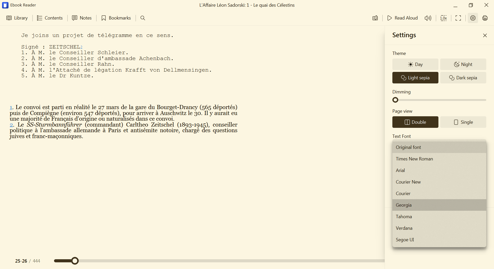
- It defaults to “Original font”; if the book doesn’t embed any fonts, Times New Roman will be used. Generic fonts declared in the book (serif, sans-serif, monospace) and fonts included in the ePub will be honored. Unfortunately, sometimes an included font won’t be used, even if ADE 1.7.2 itself would use it (for some reason, ADE 1.7.2 cannot process some fonts). Most recently, Icecream EPUB Reader 6.52 refused to display Bodoni Std and used Times New Roman instead.
- If one of the few custom available fonts is selected, it will only replace the default font. In the screenshot above, it can be seen how “Courier” from CSS was still honored (it’s also included in the book) despite the global font being set to Georgia.
- Unfortunately, custom fonts provided by the user cannot be used.
In contrast, Koodo Reader can be customized to use any font that’s installed in your system! This good news comes with a caveat: this will override all the other fonts defined in the ePub!
Here’s in the first image how mixed monospaced-cum-serif pages are displayed. When the default font is replaced (in this case, with Bitter), the monospaced font is screwed!


❸ Not covering Linux anymore
Since I don’t care much about Linux anymore, I’ll only mention that I tried some e-book readers for Linux four years ago. Nothing was able to display everything properly!
My bottom line at the time (this might still be a valid conclusion):
For “normal” fiction books, Foliate should still be fine, and practical enough at that. For “size-challenged” files, I’d strongly recommend Koodo Reader instead.
❹ Fiction is meant to be read on a portable device
Enter Android. (Apple users, I don’t care what alternatives you have to Apple Books. You could use Kobo if you purchase from them. Or KyBook 3 on an iPad. Or you could shove it.)
Also, go fuck yourself, Google! Your Google Play Books & Audiobooks app is the utmost piece of shit! I have ~200 ePub files on my smartphone, and you fucking cannot read them! I need to upload them, one by one, into your fucking cloud so that your retarded app can download them! Whose retarded mother made them instead of having an abortion?
So on Android, any decent individual needs a third-party app.
People purchasing e-books from specific stores would need the apps provided by those stores. Examples: Kobo, Tolino, Thalia, Osiander, Skoobe, or Google’s shit. Also, the Kindle app, but not for ePub files (but I tested their automatic conversion in the cloud, and it worked).
Free people need more. Because free people have DRM-free e-books (if they were this way or if the DRM has been removed). Sometimes lots of them. And the above apps are locking the user to their ecosystem (as I said, one could still send ePub files to Google or to Amazon and download them afterwards, but this is absurd).
Now, here’s a list of apps I do not recommend!
- PocketBook reader — it used to be great, now it’s mediocre.
- Moon+ Reader (Moon+ Reader Pro is €10.99) — ugly, a PITA to configure. How could people like such an anti-ergonomic app?!
- FBReader (FBReader Premium is €13.99) — antiquated, clumsy, even worse.
- eBoox — just say no. The settings at the bottom drive me crazy!
- Aldiko was once great, now it became the shit known as Cantook by Aldiko.
Now, the apps I do recommend to you! But I need to group them. Further explanations will follow.
① The must-haves (les incontournables):
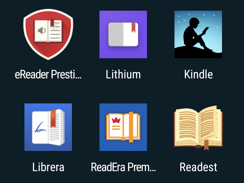
- Lithium — for a long time my preferred one because of the high contrast and bolder rendering of fonts.
- eReader Prestigio — now my default book reader.
No single ePub-reading app can display all books impeccably, so a backup is needed, regardless which of the above ones is preferred by you.
Premium features:
- Lithium: A one-time in-app “PRO” purchase offers custom themes, should you really want them. It’s $1.99 (I don’t know the VAT-included price in euros). I don’t suggest you to do anything, but there’s a patched APK here: Lithium: EPUB Reader v0.24.6.1 [Pro] [Mod Extra].
- eReader Prestigio: For the in-app removal of ads, I paid €4.79 (it might depend on the VAT level in your country). Rogue people could look here: eReader Prestigio: Book Reader v6.7.4 [Unlocked] [Mod Extra]. Note that the current version is 6.7.8, hence newer.
② The extras (four are better than two)
- Librera — but you actually want Librera PRO (€4.99) to get rid of the ads. IMPORTANT: There is also an F-Droid edition of Librera Reader. “The only difference between Librera FD (F-Droid) and Librera PRO is the absence of Google Play services and Google Drive book synchronization in Librera FD.” So ads are only in the non-PRO edition from Google Play. Official releases and source code: github.com/foobnix/LibreraReader/releases/. Beta versions: beta.librera.mobi.
- ReadEra — but to use your custom fonts and get extra features (additional highlight colors, page thumbnails for navigation, customizable library views, device synchronization via Google Drive, and a dedicated “Quotes and Notes” section) ReadEra Premium (€14.99) is required. The price is absurd! A recent hack, no root required (previous patched needed a rooted system): ReadEra Premium – ebook reader v26.02.02+2250 [Paid] [Altered].
❺ Things you didn’t know you need to know about these Android apps
Fonts and other CSS things, what else?
● In Lithium, there’s the choice between using the original fonts embedded in the books (should they exist) and using a custom font from a limited selection: Open Sans, PT Serif, Domine, Lato, and Arbutus Slab. The most legible one is the last one.


Unfortunately, as you can see in the background (shaded but perfectly distinguishable), overriding the original default font broke the section written in monospaced (“Courier” as per the CSS, and included in the ePub!) in my test book! The app is simple and straightforward, but expect such bugs or overlooked aspects.
Custom fonts cannot be added, so you have to deal with what’s available. Sometimes, a book includes nicer fonts; other times, a book forces Times New Roman, and you might prefer to override it with Arbutus Slab.
A very peculiar feature of Lithium only becomes apparent once you learn that Arbutus Slab is only available as a regular font. No italic, no bold, and no bold italic. Android, just like most font renderers in Linux, doesn’t synthesize missing font variants. Only Windows “mends” such things by creating slanted fonts when italics are missing and fake bold fonts when they’re missing. Better a forged one than a plain regular font, eh?
Well, lo and behold, Lithium behaves like Windows! It can display Arbutus Slab also as italic and bold, despite not having such original variants! A keen eye would soon realize that the italic font is actually slanted, but the bold version might look genuine, what with all those “medium” and “semi-bold” fonts that contaminate the typeface ecosystem.
● In Prestigio, you can select a default font from CourierStd, Droid, MinionPro, MyriadPro, Roboto, and Roboto Slab (the last one is very legible). But you can also bring your own fonts and put them in a folder that you can specify (here, the “fonts” folder is in the main storage’s root folder, and, surprisingly, it’s found even if written in the wrong case).


Here I added as fonts (I recommend FX File Explorer for file and app management) Amazon Ember, Bitter, Bookerly, and Literata.
It’s important to know that even when you select a default font, you can still check “Apply EPUB style settings” and then, should you want it, uncheck the specific CSS settings that you don’t want to be applied: Font family, Text size, Text alignment, Margin. For instance, I hate left-aligned paragraphs, so I like to force them to be justified.
But even when all four CSS categories are checked, not everything is overridden! In the book I’m using as an example:
- Paragraphs don’t have any typeface declared, so my font, Amazon Ember, is used instead of a default.
- Monospaced portions are using the embedded Courier, and they’re displayed as expected.
- Chapter titles are declared in CSS as “serif” without any embedded font referenced, so “serif” is still honored by using Android’s default serif font instead of my Amazon Ember (which is sans serif).


This doesn’t mean everyone should use the eReader Prestigio app for all their books! Some books have such fucked-up CSS that no app displays them as intended! (I suppose iOS is their “intended platform.”)
Or, maybe, one of the two other e-book readers from my recommendations would deal better with some CSS quirks. (PocketBook might also do, actually. Or not.)
● Librera also supports user-provided fonts, as what’s available in the app isn’t that great. Fonts placed in /Fonts (or /fonts) and fonts placed in /Librera/Fonts will be detected automatically. Should you want to specify a different path, go to Preferences, Reading Settings, Fonts.
If you don’t puke at the horrendous Preferences section in Librera (it could be worse, but not by much, and I even wonder whether Moon+ Reader is really worse) and set a custom font, you’ll notice that it doesn’t replace the fonts included in the book, such as the monospaced font in this case:


● Readera Premium (Readera free cannot use user-provided fonts) makes the font customization much more explicit and customizable. Let’s explore some screenshots:
- Readera (free) allows you to select which of the pre-installed fonts are to be shown as available (some more can be downloaded, but I’m not happy with the selection).
- Readera Premium also allows you to select which of the user-provided fonts are to be shown as available. Notice the default path (
/fonts). - When you select a custom font, the default behavior is to use “Embedded+Custom” (the behavior encountered in Prestigio and Librera).
- However, the use of the embedded fonts can be disabled so that the selected font would override everything. This might be useful if the embedded fonts are ugly (say, Times New Roman).
- In the “Embedded+Custom” scenario, the test book displays the embedded Courier correctly.
- In the “Custom”-only scenario, the embedded Courier is replaced by the custom Bookerly.


Despite having some nice features, such as the ability to use the installed dictionary apps (I’m a maniac of dictionaries), Readera cannot customize the page margins, not even in its Premium edition: they’re either on or off. When they’re on, they’re too wide.
A final note. When using the “hacked” APK for Readera Premium, the app might eventually detect that a proper license is missing and stop working. Should this happen, the only workaround is to uninstall and reinstall it. The ethical way is to pay €14.99, which I find to be an unreasonable price. But the free edition might be just fine for many users.
Now you’re more knowledgeable than you wanted to be on a very specific topic, but an important one to me.
❻ Update: Koodo on Android
I didn’t notice that Koodo is also available for Android, just not in Google’s Play Store. It needs to be sideloaded.
So here’s a quick report on what I found relevant about it:
- Trying to import all the books in a folder fails. Even if I allow it to access the folder, it doesn’t import anything.
- Adding books works either one by one or by selecting several books at once, in which case it’s preferable to group them on shelves.
- Attempting to change the fonts reveals that there are no fonts installed by default.
- “Featured fonts” can be downloaded, but I’m not happy with their selection.
- “Add font” adds a font from a folder. You read it right: a font at a time, in the meaning of one file. If a typeface has separate files for italic, bold, and bold italic, that’s four import operations, and each font will be listed as if it were a separate typeface. WTF? If I only import a regular font, what would it do when its italic variant is required?
- BTW, I inadvertently added Bookerly Bold Italic instead of Literata Bold Italic. It cannot be removed from this settings section! (“Setting,” because the Chinese have a problem with plurals.)
- Removing fonts is hidden under “Appearance”!
- The second-to-last image: the book’s monospaced font is used when needed.
- The last image: but selecting a custom font overrides every single font from the book!


To me, Koodo on Android is a complete failure. Oh, and be careful about what you touch, because it loves to ask you to create an account with them!
❼ Update 2: The strange case of Readest
I’ve been recommended to try Readest, which indeed is available for macOS, iOS, Windows (10/11), Linux (AppImage), Android (Google Play Store or a sideloaded APK).
While I wasn’t aware of it, I initially had a strong reluctance against it for a simple reason: it’s developed by the same guy who created KOReader, which is 110% shit. OK, KOReader was developed for e-Ink devices, and it shows it. But it’s still crappy because it lacks ergonomics. Better to make it simpler, with fewer features, but easier to use.
Huang Xin (X, GitHub) seems to be living in Göttingen, Germany. Formerly with ByteDance, he created KOReader and later he founded Readest. The source code for both apps is open: github.com/koreader/koreader, github.com/readest/readest.
Readest is © 2025 Bilingify LLC, and bilingify.com is identical to readest.com. Or rather, almost identical (no, it’s not just a redirect), because Bilingify’s main page includes Readest_annotation_notebook-1080p.mp4 (which doesn’t render on some computers), whereas Readest’s includes Readest_annotation_notebook-1080p-h264.mp4.
But according to Google Play Store app’s page, Bilingify LLC is registered at 30 N Gould St Ste R, Sheridan, WY 82801-6317, United States, not in Germany. Strange thing, if I’m being honest.
This being said, I really wanted to try the Android version of this e-reader, because most e-books are fiction books, meant to be read on smaller devices.
① First, let’s force a light theme:


② Now, let’s explore the options regarding the fonts. For elements that don’t have a typeface set by the book, a default font is used, and it defaults to a sans serif font, but this can be changed to serif or monospaced. The really smart thing is that for each of these 3 generic font types, the user can choose from a sensible selection of typefaces. I find it regrettable that user-provided fonts cannot be used and that Roboto Slab or some other slab serif font isn’t available.
The result is a properly displayed mixed-font pages, using both in-book and external fonts. But if “Override Book Font” is enabled, all book’s fonts are replaced with the default external font:


③ An important thing to know that each style that’s not defined in the book will be defined by Readest to values that sometimes are not what you’d expect them to be. Specifically, the line height is set to 1.6, while a sensible value would be 1.2 or 1.3, depending on the typeface (Merriweather requires 1.4). Other e-book readers default to something more like 1.2 when line-height is not set, because this is how any web browser works, be using the font designer’s own recommendations for each font.


Even worse, when the vertical space between paragraphs (margin-bottom + margin-top) is not set, Readest sets it (“Paragraph Margin”) to a too large value at 1. I prefer it to 0.3-0.6.


④ Some extreme sports now. Suppose you enable “Override Book Layout”—this will override all CSS settings in the book that are set in this section of the app: paragraph and page settings. As a side effect, because all paragraphs will share the same style, all centered and all justified paragraphs will be left-aligned. You could force “Full Justification,” but centered paragraphs won’t revert to being centered. The main utility of “Full Justification” is to force it on paragraphs that have no alignment set (so they default to being left-aligned), but without enabling “Override Book Layout”! However, if this preserves the centered paragraphs, it breaks the centered images.


⑤ Advanced features, part 1. You can use a translation service, or the Wiktionary (or both). The most surprising feature is that permanent translation can be used (notice the top-left “中 ⇄ A” icon being blue, hence activated). When permanent translation is used, each paragraph, however long, will be followed by its translation in the target language! Amazing!

⑥ Advanced features, part 2. One of the first features I configure in a book reader app is the ability to use the volume buttons for page turning. (Obviously, by “clicks” the developer meant “taps.”) The second screen shows that custom CSS can be used, which opens the path to experimentation. Finally, in the main screen, notice that “Auto Upload Books to Cloud” is enabled, but obviously won’t work without an account. I’d rather enable “Open Last Book on Start” if I were you.


⑦ BOTTOM LINE: To my surprise, I liked this app (quite a lot!), so it secured a place on my smartphone. I’ll see whether I resolve to use it as a first-choice app alongside eReader Prestigio and Lithium (maybe even as the app of choice!), or merely as a second-choice one. Time will tell.
Well, it seems that Prestigio doesn’t exist for iOS.
I took it on iOS. I confirm, mediocre. I have to find something else.
There are quite a few on the Store, but certainly a lot of mediocre ones.
In your list, for iOS I only found ReadEra.
It looks recent, version 1.0 => one year ago, so maybe not yet complete, and only Free, no Pro version, for now at least. Maybe give it a try? 🤔
From the Store description, it seems to have quite a few options, including configuration.
For Windows, I’ve got Aquile Reader, but I haven’t tried it. But something that only comes from the Store, um, that doesn’t really appeal.
Koodo Reader is also available for mobile, Android and iOS. You don’t mention it because it’s not good on mobile?
I have Sumatra PDF… for PDFs, instead of Adobe Reader (which I also have, for the occasion) Maybe I should try it with other things too.
By “intended platform” I meant FOR THE BOOKS! They seem to be tested by the publishers only on Apple shit.
I did mention it (for Windows and Linux), just not for Android. I didn’t notice it exists, because it’s not in Google’s Play Store. It needs to be sideloaded. But given that I didn’t like it that much on the desktop (Electron app, rather heavy), I doubt I’d like it on Android.
KyBook 3 Ebook Reader that you give in the article seems very complete, I didn’t know it. But it seems to have been discontinued: last update 6 years ago.
If it still works…
I added an Update: Koodo on Android.
I’ve jailbroken my Kindle Oasis “10th gen” (retarded Amazon nomenclature, technically it’s the second generation of Oasis readers) and I couldn’t be happier. Especially since Amazon stopped supporting it.
Try “Readest” it’s available for almost every platform.
Also Calibre’s ebook viewer has been improved so much over the last updates.
So you can try that as well on windows.
I never use Calibre’s ebook viewer. I never liked it.
RE-UPDATE: I added Readest to my list of e-book readers. Review included.
On Android, I uninstalled ReadEra and Readest, so I’m left with the original trio (eReader Prestigio + Lithium + Kindle), extended with Librera, but no more.
The reasons:
● ReadEra has a bug somewhat similar to this older one: reading position jumps ahead when phone is plugged / unplugged, but it manifests differently.
Say I am in the bed, reading on the phone. If I quit the upright position and I lean to the right, at some point the opened book in ReadEra would jump randomly by God knows how many pages (50? 100? 200?). The buttons I could accidentally touch with my right hand, as well as the screen, should only skip one page at a time. My theory is that the orientation sensor of the phone discombobulates ReadEra, despite the screen orientation being locked (but the sensor still works).
After a half-dozen such idiotic jumps, I decided that ReadEra is for the trash bin.
● Readest is the master of the lack of ergonomics. Who cares that it’s elegant and full-screen, as long as changing settings is a nightmare? The font size can be changed both from the top of the screen and from the bottom of the screen. But I also had issues with the line height in a very banal book: no matter what I tried, the descenders (as in p, g, q, y, j) weren’t fully displayed.
Too much is too much, and too complex is shitty. Gone. Sophisticated garbage.
Back to a simpler life: