Adventures in Linux Ep. 2: Subpixel idiocy
Dedoimedo is the only guy in the known Universe who’s pickier than I, and who constantly complains about the lack of contrast, the 1-pixel misalignment, and any other similar usability faults in most releases of all the distros he’s testing. One constant complaint of his concerns the lack of contrast à la Linux Mint, when instead of black on white, the text is written with very dark gray on very light gray. But occasionally he also addresses the antialiasing in Linux, which involves the typical sub-pixel drama that screwed my nerves since the very first ClearType patent.
Patents and no patents
Here’s what triggered this blog post: Rocky Linux 8 & how to get better font clarity. I couldn’t care less about it, for I can’t find a reason to use for a desktop or laptop antiquated and severely limited software as that in a RHEL clone, and I could also object to his only considering of Rocky Linux, when equally valid alternatives include AlmaLinux and VzLinux, but that’s not the point. This part triggered me:
For some reason, using Subpixel (for LCD screens) rather than Standard (grayscale) seems to work less well in Rocky. However, on its own, this isn’t a complete solution. We can do a bit more. Much like the trick I used in my openSUSE 15.2 essential tweaks guide, you need to tell the system to use the infinality interpreter mode for the freetype font library. Why would a user ever, EVER need to bother with this, beats me. Licensing reasons?
Here’s some news for those who have slept for too long under a rock:
Yes, there are still some IT professionals who tell me of this and that Microsoft patent, and this and that Microsoft tax, when in most cases those patents have been “freed” by Microsoft! In most cases, not through expiration, but through Microsoft having joined the Open Invention Network!
October 31, 2018: Fedora Enables ClearType Subpixel Font Rendering Thanks To Microsoft:
Fedora has finally enabled ClearType sub-pixel rendering in FreeType for providing much nicer font rendering.
ClearType is Microsoft’s sub-pixel font rendering technology to make fonts appear crisper on LCD displays. ClearType has been around for almost two decades and while upstream FreeType has supported, it hasn’t been turned on in Fedora. Microsoft has at least nine patents covering ClearType as outlined on FreeType.org, which made it a no-go for Fedora to ship.
But now that Microsoft joined the Open Invention Network with 60,000+ patents, Fedora is comfortable in turning on ClearType!
Fedora’s FreeType packages have now enabled ClearType code “thanks to Microsoft joining OIN” and then further fixed up today. Thereby fonts will begin looking much nicer on Fedora Workstation soon as the package updates are sent out.
Now, as for the RGB subpixel rendering in Rocky, we have to consider that Rocky is RHEL, rebuilt. And the tradition at Red Hat was to disable it in all their distros (i.e. RHEL and Fedora), as it had a patent presumably valid at least in the US. Even if the patent is now expired, an Enterprise Linux distro wouldn’t change anything that would make some of its users potentially unhappy (any sudden and noticeable change in an EL is to be avoided when possible). But Debian stable did the same in disabling the colored antialising, and generally any distro that has an organization behind it, and a US market, acted similarly. Beyond the DVD zoning (libdvdcss), the MP3 patents, other codecs, etc., which were all “restricted” and usually explicitly installed by the user, enabling ClearType-class antialisasing in freetype wasn’t by default in the major distros.
By the way, the original MP3 patents also expired, in their case the last one on April 23, 2017, but there might still exist further enforceable patents connected to some MP3 derivatives. It’s worth noting that Fraunhofer’s MP3 patents were a shame and a hindrance to the technological progress, because Fraunhofer also “invented” the improved MP3Plus, a format nobody used because of the patents! MP3Plus had at 96 kbps the same quality as MP3 at 128 kbps. Now, to my ears, AAC/AAC+ at 96 kbps is even better, but here too there are some patent and licensing issues.
The real problem
The real problem is that people are stupid, and Microsoft offered to those stupid people the LSD they wanted so badly. But tell me, when you take a magnifier and look at a monochrome text in a press-printed book, or in a document issued by a monochrome printer, what are you expecting to see: something like in the first picture, or more like in the second one?
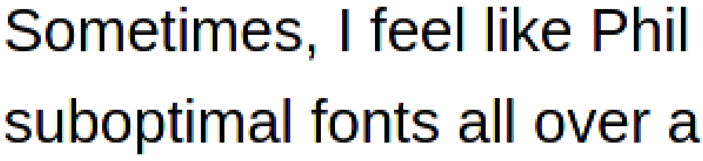
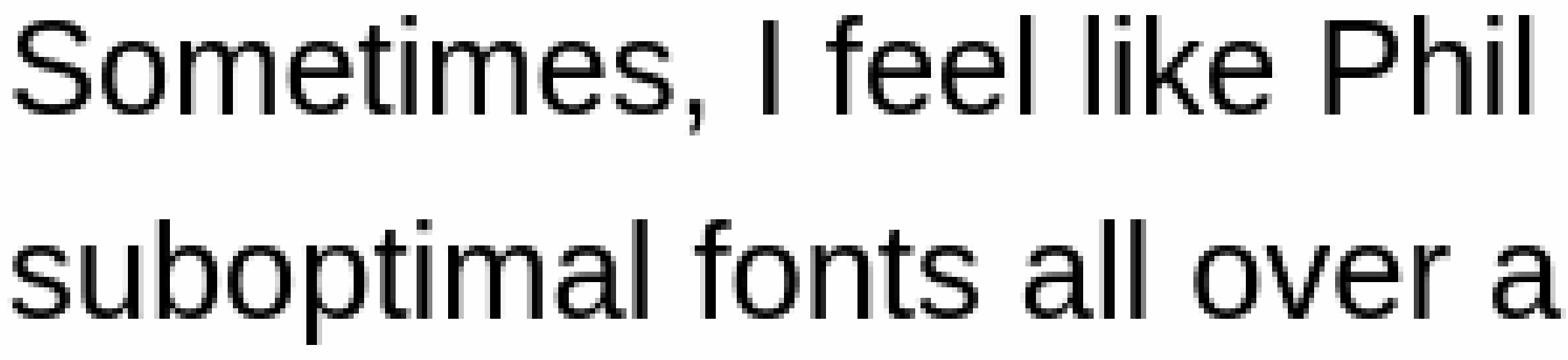
I know for sure that I’ll die before understanding why some people want to see rainbow fringes in a black text on a white background!
Originally, the idea was that subpixel antialiasing was meant for LCD/TFT/IPS/LED/OLED displays. Old-school color CRT displays typically had rather large dot-pitch values, initially 0.51 mm, then 0.39 mm, later slowly improving to 0.28 mm and 0.25 mm, and the way the image was obtained through three electron guns made the image less than perfect. The metallic mask was imperfect too, so monochrome images weren’t 100% monochromatic. On those CRTs, yes, one would have seen rainbow fringes in a grayscale image! But for LCD/TFT screens, what’s the point of using subpixel antialisasing? Just to match the poor rendering of an older technology?! What’s wrong with grayscale smoothing, which is the actual way a printer smooths a black text?
An exploration
Dedoimedo suggests a classical solution, involving e.g. a file /etc/profile.d/freetype.sh in which truetype:interpreter-version can be set and exported. Here’s the contents of this file in Arch Linux:
# Subpixel hinting mode can be chosen by setting the right TrueType interpreter
# version. The available settings are:
#
#     truetype:interpreter-version=35  # Classic mode (default in 2.6)
#     truetype:interpreter-version=38  # Infinality mode
#     truetype:interpreter-version=40  # Minimal mode (default in 2.7)
#
# There are more properties that can be set, separated by whitespace. Please
# refer to the FreeType documentation for details.

# Uncomment and configure below
#export FREETYPE_PROPERTIES="truetype:interpreter-version=40"
But they still don’t tell you the whole story, not even in the official reference page. Only three values are defined in freetype/ftdriver.h:
#define TT_INTERPRETER_VERSION_35  35
#define TT_INTERPRETER_VERSION_38  38
#define TT_INTERPRETER_VERSION_40  40
The descriptions are educative IMO:
TT_INTERPRETER_VERSION_35
Version 35 corresponds to MS rasterizer v.1.7 as used e.g. in Windows 98; only grayscale and B/W rasterizing is supported.TT_INTERPRETER_VERSION_38
Version 38 corresponds to MS rasterizer v.1.9; it is roughly equivalent to the hinting provided by DirectWrite ClearType (as can be found, for example, in the Internet Explorer 9 running on Windows 7). It is used in FreeType to select the ‘Infinality’ subpixel hinting code. The code may be removed in a future version.TT_INTERPRETER_VERSION_40
Version 40 corresponds to MS rasterizer v.2.1; it is roughly equivalent to the hinting provided by DirectWrite ClearType (as can be found, for example, in Microsoft’s Edge Browser on Windows 10). It is used in FreeType to select the ‘minimal’ subpixel hinting code, a stripped-down and higher performance version of the ‘Infinality’ code.
So, 35 is just fine for grayscale smoothing; 38 is “the best one” if you like colors and it’s dubbed “Infinality”; and 40 is “the new one,” which somewhat gives worse results for subpixel i.e. color smoothing!
Why even bother?! I was perfectly happy with the way Win98SE and Win2k were displaying text. OK, here’s some more values, not guaranteed to work in recent versions of the library:
 3 Win 3.1 (16-bit color space, not TrueColor)
33 Win NT 3.1
34 Win 95
35 Win 98/2000
36 Win CE 2 - "classic" ClearType
37 XP - v1.8 ClearType
38 Vista, Win 7 - v1.9 subpixel ClearType
39 - v2.0 subpixel ClearType
40 Win8 - v2.1 Y-direction subpixel ClearType
Well, of course Microsoft claimed in 2009 to have conducted studies revealing that ClearType in Win7 was much better than in WinXP, and that ClearType improves the efficiency of typical office tasks (I bet they didn’t try bitmap aka raster fonts, which have the best contrast, and which would have given the best efficiency!), but what to think of such comments to a previous Microsoft article?
• JoeWoodbury
February 13, 2009
Just please remember that not everyone likes ClearType. It drives me batty, even on LCD screens.• Tihiy
February 13, 2009
And ClearType-7 is really making things hard to read not only on CRTs, but on cheap LCDs too (which are, i think, office majority).
You do care about corporate users, right? Care about their eyes too, please.• Mike Williams
February 13, 2009
It’s a pity that with all these advances the text/background contrast levels in Windows 7 are even worse than in Vista.
Worst of all is Windows Media Player 12, which has grey text on blue on blue and no way to adjust the size or colour. If you don’t have the visual acuity of a peregrine falcon it can be difficult to even perceive which text is selected and which is not, because the difference between them is like adjacent fields on a Pantone chart.
However don’t bother bugging any of these issues in Windows 7, because they’re all BY DESIGN.• marcinw
February 14, 2009
my 2 cents: I agree with the opinion, that old menu fonts (used in XP) + old ClearType tweaker (available for XP) were much better than these available in Vista/7.• Anonymuos
February 15, 2009
It’s impossible to continue using the computer running an OS which hurts the eyes. Apparently, a large number of users are affected by this since Vista but MS won’t do anything as “This behavior is by design.”
Meanwhile, the sheeple learned to love colored rendering of black on white. After all, there were studies claiming that KDE4 was better than KDE3, and that GNOME3 was better than GNOME2, all of them conducted on people who never used a computer in their life!
Either way, the way I always customized ClearType in Win7 was to make it have the best contrast, practically to make the text look as much as possible as in WinXP.
However, should you read The sad state of font rendering on Linux (no, not by me), you’ll find more about OS X and MacOS too, such as:
OS X has the absolute worst font rendering from the readability aspect. It does not use hinting at all and relies only on grayscale anti-aliasing. This combination makes everything appear very bold and blurry:
…
… a number of people pointed out that prior to Mojave, which was the latest release at the time the post was written, OS X used to have sub-pixel anti-aliasing, text rendering was great, I was wrong and Apple did not deserve the hate. To verify this, I temporarily got my hands on a box running High Sierra and did some comparisons.
… indeed, OS X had sub-pixel anti-aliasing in High Sierra, which provided less boldness and blurriness with somewhat better consistency in glyph thickness. However, colour fringing on High Sierra is rather apparent. Rendering is still rather blurry, closer to the FreeType auto-hinter than to what I would consider an optimal result.
I disagree, without even caring how bad Apple’s antialiasing is. RGB antialiasing cannot bring more contrast than grayscale antialiasing. If you’re color-blind, you’ll see it grayscale anyway, and if you’re color-stupid you’ll enjoy the color fringes because it’ll look like on an old CRT.
⚠️ Either way, that blog post has blurry images anyway because if you have fractional scaling in your OS, your browser will scale up the images, which will look blurry. E.g., with 125% scaling (the default in Windows 10 for smaller laptop screens) an image with a width of 500 pixels will be displayed on 625 pixels, so you can’t use that article to make judgments on sharpness if fractional scaling is enabled!
ℹ️️ Incidentally, you shouldn’t use my blog to compare sharpness either: I never let the images be displayed by their “nominal” size, because I know they’ll get blurry. Instead, I let them have 100%, 67%, 50%, or 33% of the column width. This is why I hate scaling, and I believe any image should be displayed one pixel per one physical screen pixel, except on HDPI screens (4K, usually), when 2×2 pixels are used per an original pixel.
A message from the past
MATE, as a continuation of GNOME2, has embedded in its font settings screens The Truth.
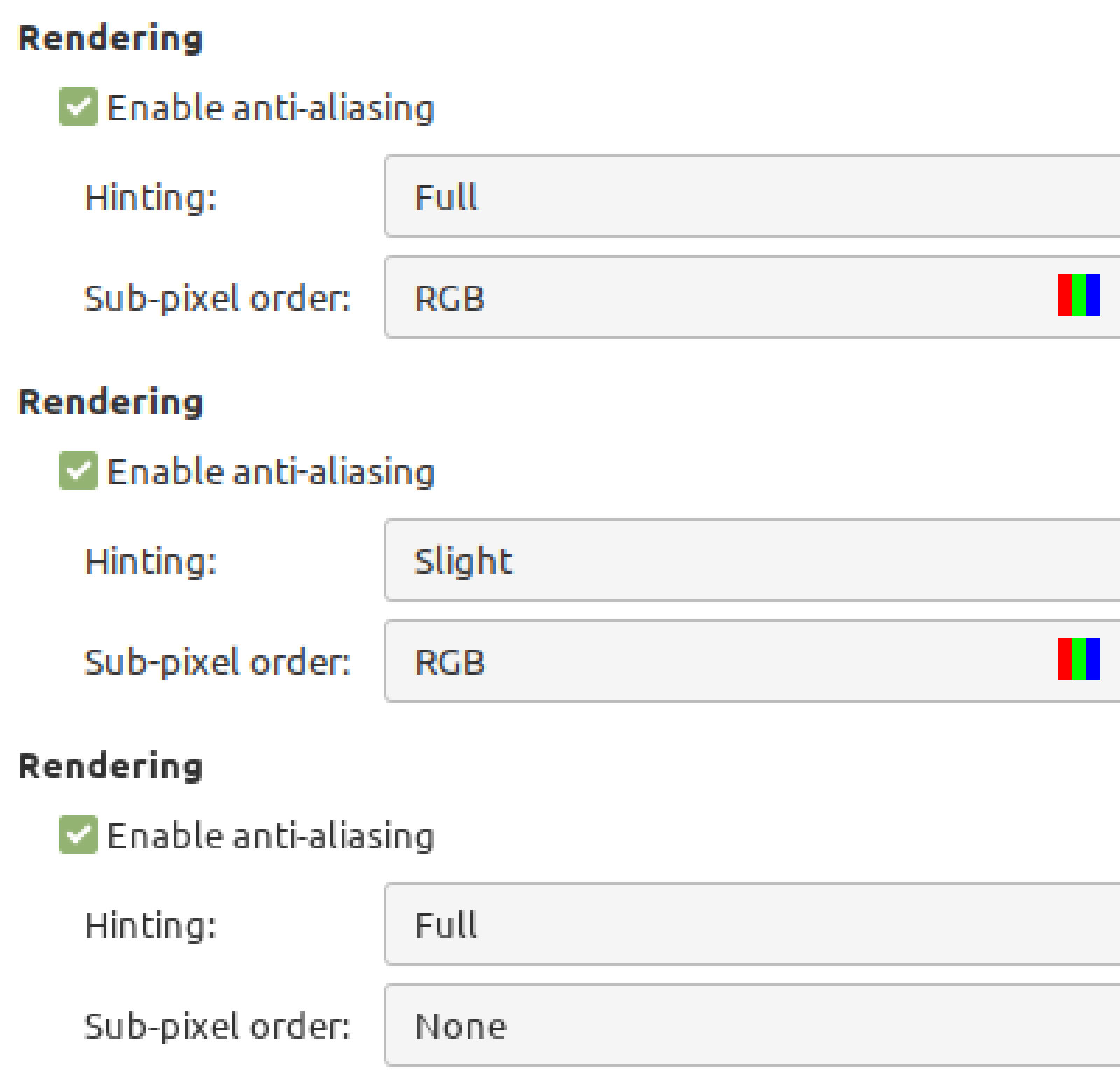
If you select in the fine-tuning screen Grayscale, Full…
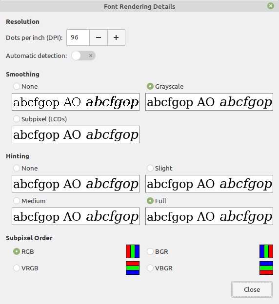
…this corresponds to Best contrast once back on the main screen, which is what everyone should prefer unless they’re stupid or drugged:
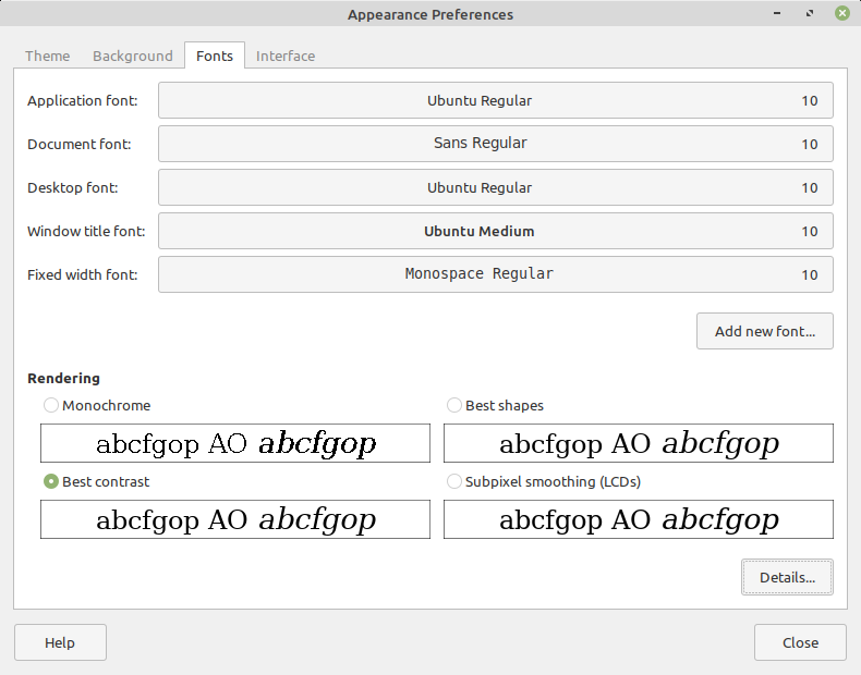
If you select in the fine-tuning screen Grayscale, Medium…
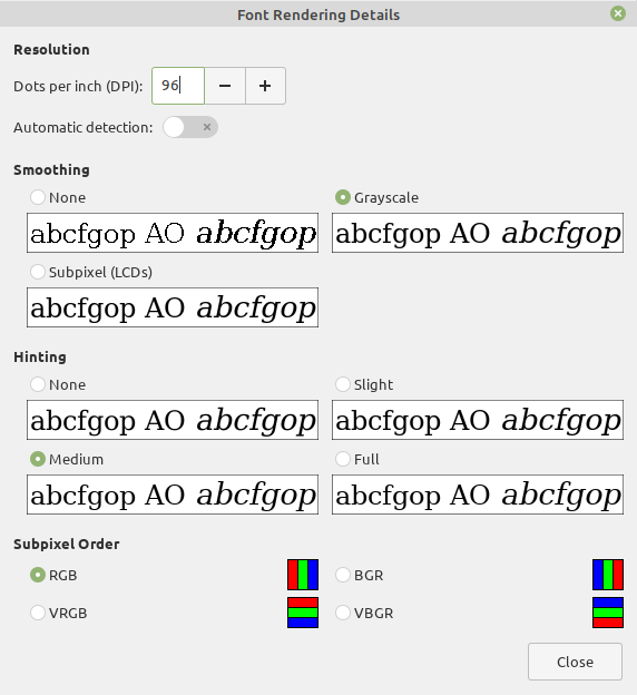
…this corresponds in the main screen to the shortcut Best shapes, meaning that the sizes and spacing will be altered to the minimum (I used to know some typefaces that were displayed visibly higher with Full hinting enabled!):
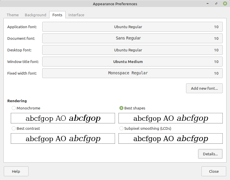
The setting that’s default nowadays in most if not all the Linux distros and regardless of the Desktop Environment, namely RGB, Slight… is for masochists. The contrast isn’t the best one, there are some color fringes, and the result is so mediocre that one feels the need to change one’s glasses.
Testing the untestable
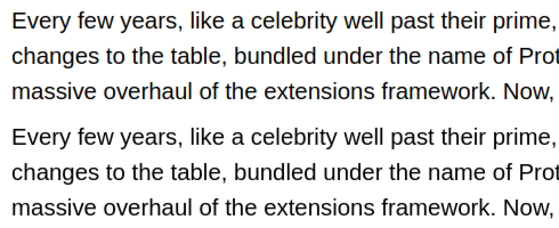
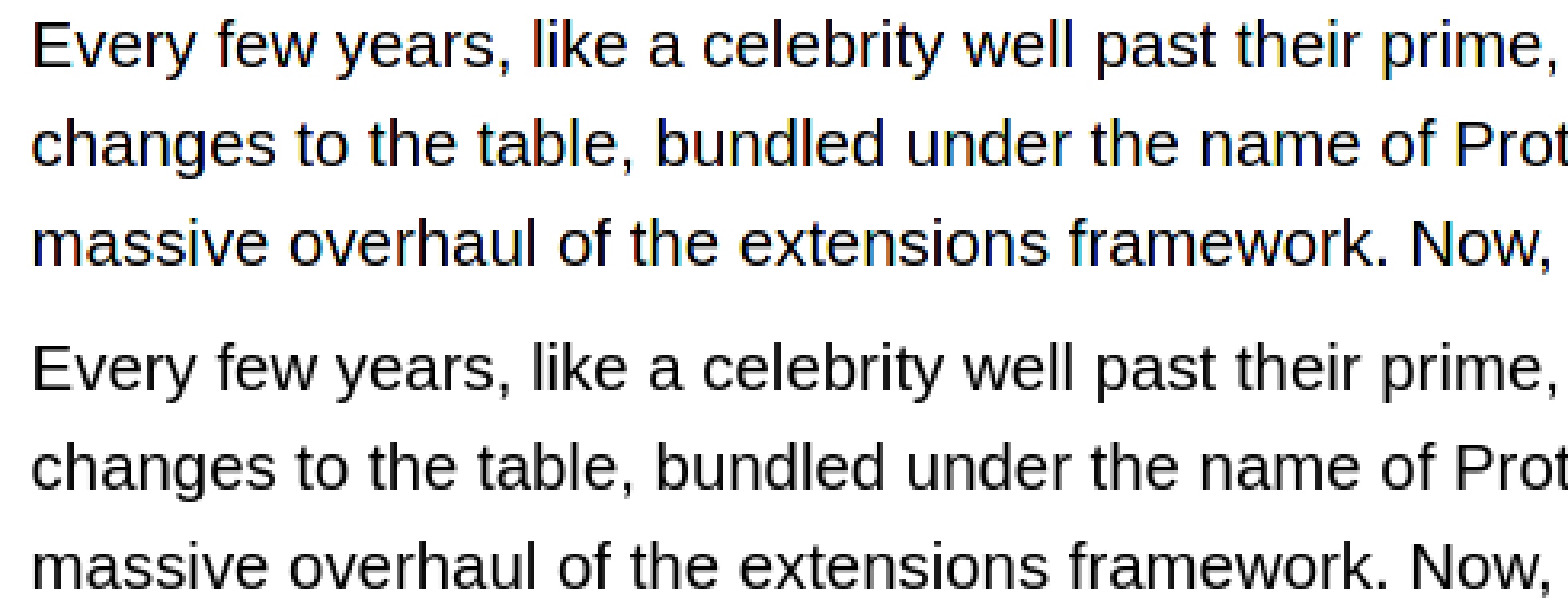
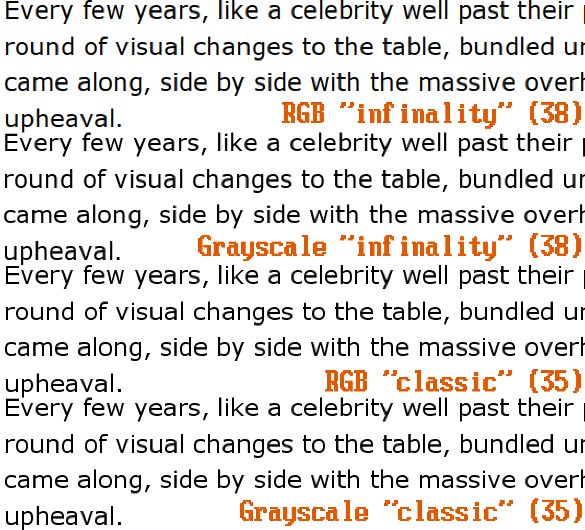
Incited by Dedoimedo, I said to myself: what the heck, let’s try and see the differences between those magical values of 35 (classic, grayscale-only), 38 (“Infinality”), and 40 (the new default, apparently suboptimal).
Well, guess what? I tried:
- Several distros: SalientOS (Arch), Manjaro, Fedora, Gecko Linux, PCLinuxOS, Linux Mint.
- Several desktop environments: XFCE, KDE, MATE.
- Several text editors: Mousepad, Xed, Kate, LeafPad, Geany.
Well, all the text editors ignored both the subpixel rendering settings and the TT_INTERPRETER_VERSION, practically displaying in all cases the text smoothed with Grayscale (to which degree, I couldn’t tell), and using the same “interpreter” (the version should be irrelevant if colored subpixel fringes aren’t desired!):
Ignoring the RGB settings?! Then why is everyone so keen to see RGB fringes anyway? Did someone decide that the text in a text editor (which can be used as a code editor) should be free of spurious colors? This might very well be the case.
I only got THREE situations in which the antialiasing was fully observed.
One, in the settings screens themselves:
👉 XFCE in Fedora 34, default interpreter, horrible color fringes in full RGB mode:
👉 XFCE in Mint 20.2 Beta:
👉 KDE in Salient OS, “infinality” (38), supposedly the best interpreter:
👉 KDE in Salient OS, “classic” (35), supposedly not supporting RGB:

Wow, I suppose they simply don’t use other interpreters in Arch, no matter what you tell them to do!
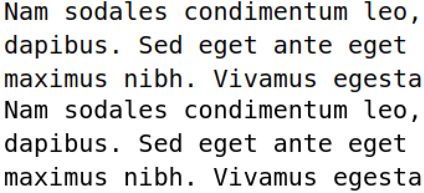
Two, in Visual Studio Code, here in Fedora 34, Full RGB vs Full Grayscale:
Three, in Firefox!
ℹ️ IMPORTANT NOTE: Firefox only observes the system-wide settings if and only if it’s not configured to override them:
👉 In Fedora 34, Full RGB vs Full Grayscale, default interpreter:
👉 Idem in the latest Gecko Linux:
👉 In Manjaro:
👉 Mysteriously, in Salient OS (Arch), we have a better contrast in Firefox than in KDE’s own settings windows, and miraculously, Firefox really honors the “classic” mode by rendering grayscale under it even if RGB was selected:
How about the classic way of fixing-or-screwing the fonts in Linux?
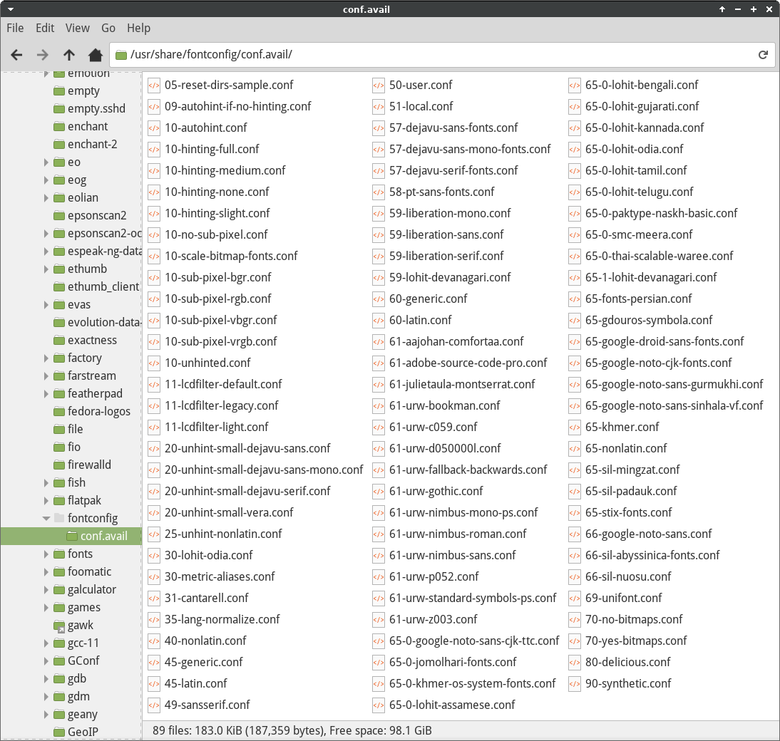
I almost forgot there was another thing that differentiated the distros with regard to how they render certain fonts out of the box! It’s the so-called Presets:
There are presets installed in the directory
/etc/fonts/conf.avail. They can be enabled by creating symbolic links to them, both per-user and globally, as described in/etc/fonts/conf.d/README. These presets will override matching settings in their respective configuration files.For example, to enable sub-pixel RGB rendering globally:
# cd /etc/fonts/conf.d# ln -s ../conf.avail/10-sub-pixel-rgb.confTo do the same but instead for a per-user configuration:
$ mkdir $XDG_CONFIG_HOME/fontconfig/conf.d$ ln -s /etc/fonts/conf.avail/10-sub-pixel-rgb.conf $XDG_CONFIG_HOME/fontconfig/conf.d
Some such presets:
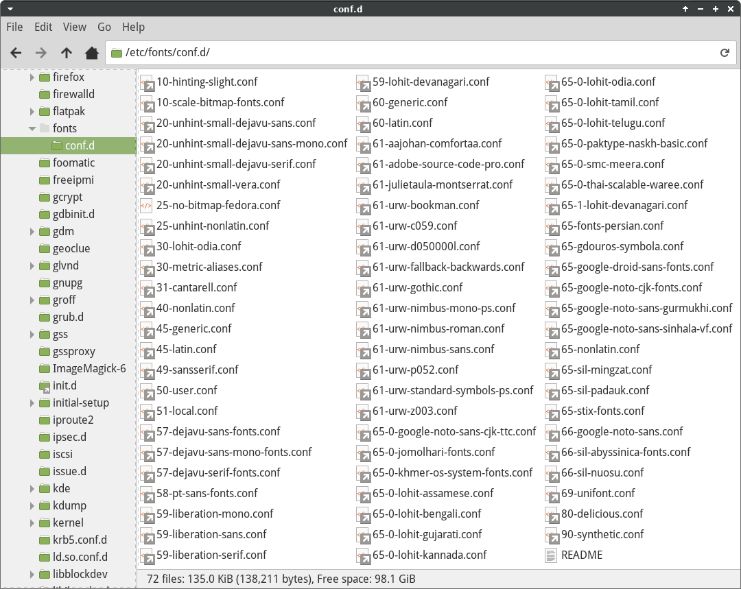
The actual configuration files are many more, and typically under /usr/share/fontconfig/conf.avail/:
The numbers are not randomly chosen:
00 through 09  Font directories
10 through 19  system rendering defaults (AA, etc)
20 through 29  font rendering options
30 through 39  family substitution
40 through 49  generic identification, map family->generic
50 through 59  alternate config file loading
60 through 69  generic aliases, map generic->family
70 through 79  select font (adjust which fonts are available)
80 through 89  match target="scan" (modify scanned patterns)
90 through 99  font synthesis
This mechanism is very powerful, but also so passé! I feel I’m too old for this shit, and too blasé to fiddle with such things. Are we in 2021, or in 1996?
Closing lines
After wasting so much time with exactly nothing, what’s the lesson I learned? Briefly:
- Dedoimedo complains too much for too little. He should be sometimes ignored when font rendering is discussed.
- There isn’t much difference in all those algorithms or interpreters, unless you’re very picky.
- People should just try their preferred setting (Full Grayscale, Full RGB, Medium Grayscale, etc.) and, if the result is satisfactory, stop worrying about the matter or, if they don’t like what they see, look for another distro! Either a distro made the right choices, or it didn’t. Life is too short to “fix” a distro by oneself.
- The most mediocre people are supposed to like the defaults (Slight RGB in most distros nowadays) and to live with them. (Well, maybe their girlfriends or wives are even uglier. What? Is Linux used by women too?)
- The most pathetic people would choose Full RGB, and then they would make all the efforts to further tweak the system until everything looks incredibly dumb.
Basically, in my case I go Full Grayscale and, it nothing bothers me, I just forget about it. That’s the first thing I do in Linux after configuring the keyboard layout and the Wi-Fi!
Fall 2024 change of mind
To follow the spirit of “I’m too old for this shit” (ironically, Danny Glover was only 40-41 years old when he played Roger Murtaugh in Lethal Weapon, but the character was supposed to be 50), I decided not to care anymore and go with the flow. I don’t care anymore if FREETYPE_PROPERTIES is 35 or 40, or whether other values can be used to obtain a different antialiasing.
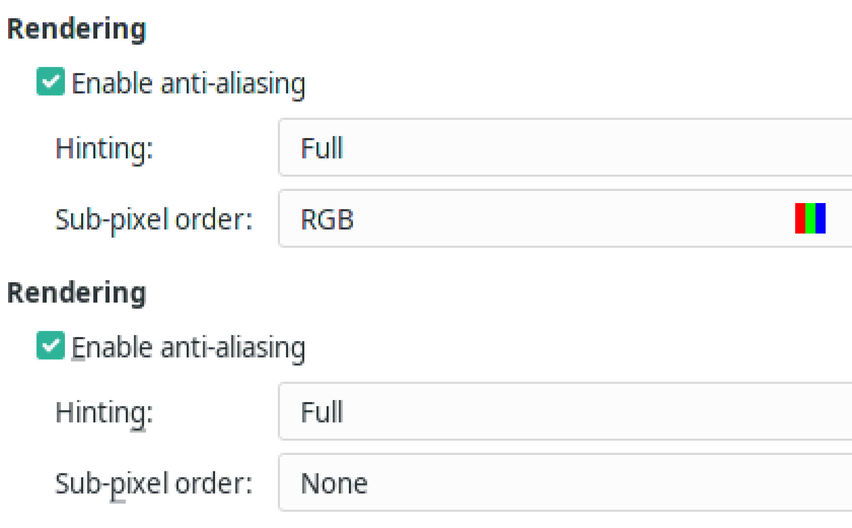
In most distros, in most desktop environments, hinting is set to Slight, RGB. I will not set it back to Full, Grayscale, at least not on laptops.
You should still check whether your display doesn’t happen to use a BGR, VRGB, or VBGR subpixel layout, but it’s highly unlikely on laptops. And on 4K displays, it doesn’t really matter.
Why this change of mind? Well, it might be that my eyesight isn’t quite as good as it once was, and I’m less bothered by the subpixels. I don’t see the colored fringes as clearly as I used to see them, unless I use a magnifier. So I’m OK with them, and when watching the screen from a certain distance, I might even agree that, at least on some displays, subpixel antialiasing is marginally better than the grayscale one!
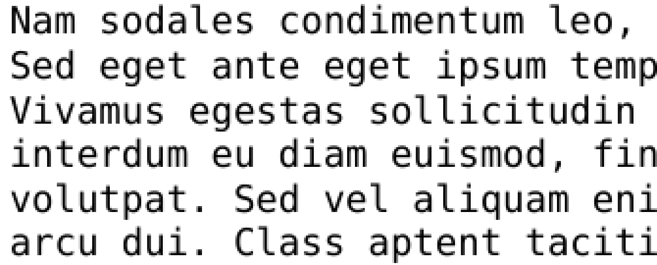
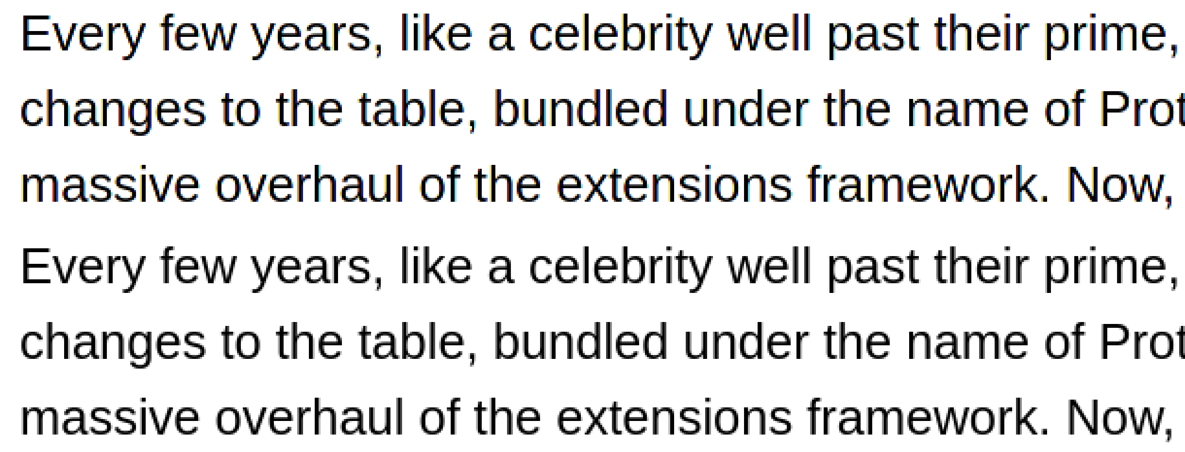
I still blame the proponents of subpixel antialiasing for the “fake advertising” they have always used. Take a look at this image from Lagom.nl (the scaling makes it worse, but I can’t help):
Grayscale smoothing isn’t that bad in real life. Or, let’s rephrase it this way: it doesn’t have to be this bad. If they disabled some algorithms (apparently, not all the relevant patents have expired), then this is the reason for it to be mediocre. Either way, now that I have my eyesight as mediocre as most of the population, I can accept the brainwashing and embrace the subpixel fringes!
Finally, some fonts are better suited for screens than others. I hope the font in which this text is rendered is looking pretty well even on Linux, although I know for sure that it looks even better on Windows.
In Ubuntu 18.04 I get decent results with
FREETYPE_PROPERTIES=”truetype:interpreter-version=35 cff:no-stem-darkening=1 autofitter:warping=1″
added to /etc/environment
At least it makes full hinting work again and i get crisp clear fonts
The same does nothing in PopOS 22.04
What a mess it all is.
With popularization of QD-OLED displays, there’s a growing trend of concern with subpixel rendering. Do you have any advice on how to improve subpixel rendering on QD-OLED displays?
No, but precisely because subpixel rendering is heavily dependent on the exact pixel structure, I don’t support subpixel (RGB) antialiasing. Now with the new color fringe artifacts created by Samsung’s QD-OLED… uh… have you searched on reddit?