
Future Euro banknotes: a flop?
Christine Lagarde, president of the ECB: “After 20 years, it’s time to review the look of our banknotes to make them more relatable to Europeans of all ages and backgrounds.” So the ECB plans to issue new, redesigned euro banknotes, and the hoi polloi are invited to express their opinions in a survey.
You can read on the ECB website about the future banknotes, and you can examine the ten finalist design proposals.
At lower quality, you can also take a look at them below, where I also add my comments on each of them.
Anchors: A ● B ● C ● D ● E ● F ● G ● H ● I ● J
Note that the designs had to choose between two possible motifs:
European culture
| Front | Reverse | |
|---|---|---|
| €5 Performing arts | Maria Callas | Street performers (music/dance/theatre) entertaining passersby |
| €10 Music | Ludwig van Beethoven | A song festival with a choir of children and young adults singing |
| €20 Universities and schools | Marie Curie (born Skłodowska) | A school or university with a female teacher with young students. There are notebooks and books on the tables |
| €50 Libraries | Miguel de Cervantes Saavedra | A library with some adults reading paper and digital books. A little boy and girl in front of a bookcase trying to get a book |
| €100 Museums and exhibitions | Leonardo da Vinci | Adults and children admiring some examples of street art, contemporary art, etc. |
| €200 Public squares | Bertha von Suttner | A tree-covered square allowing people to come together, with adults and children talking, walking, playing, etc. |
Rivers and birds
| Front | Reverse | |
|---|---|---|
| €5 | Mountain spring Wallcreeper next to a mountain landscape | European Parliament |
| €10 | Waterfall Kingfisher in a waterfall or run pool | European Commission |
| €20 | Confined river valley Bee-eater colony in a sand wall on the side of a large, confined river valley along a riverbank | European Central Bank |
| €50 | Meandering river White stork flying over a meandering river in an unconfined river valley | Court of Justice of the European Union |
| €100 | River mouth Avocet sweeping over the surface of a mud flat | European Council and Council of the European Union |
| €200 | Seascape Northern gannet flying over big ocean waves | European Court of Auditors |
It’s pointless to comment now on the choice of birds and people, or on the reverse of the notes. It’s what the Eurocrats have decided. Sure thing, “The decision benefited from the suggestions provided by two multidisciplinary advisory groups from across the euro area and is consistent with the preferences on the themes expressed by more than 365,000 Europeans in public surveys held in summer 2023 and in focus groups conducted between December 2021 and March 2022.” Et la marmotte, elle met le chocolat dans le papier d’alu.
Design A — Studio Joost Grootens
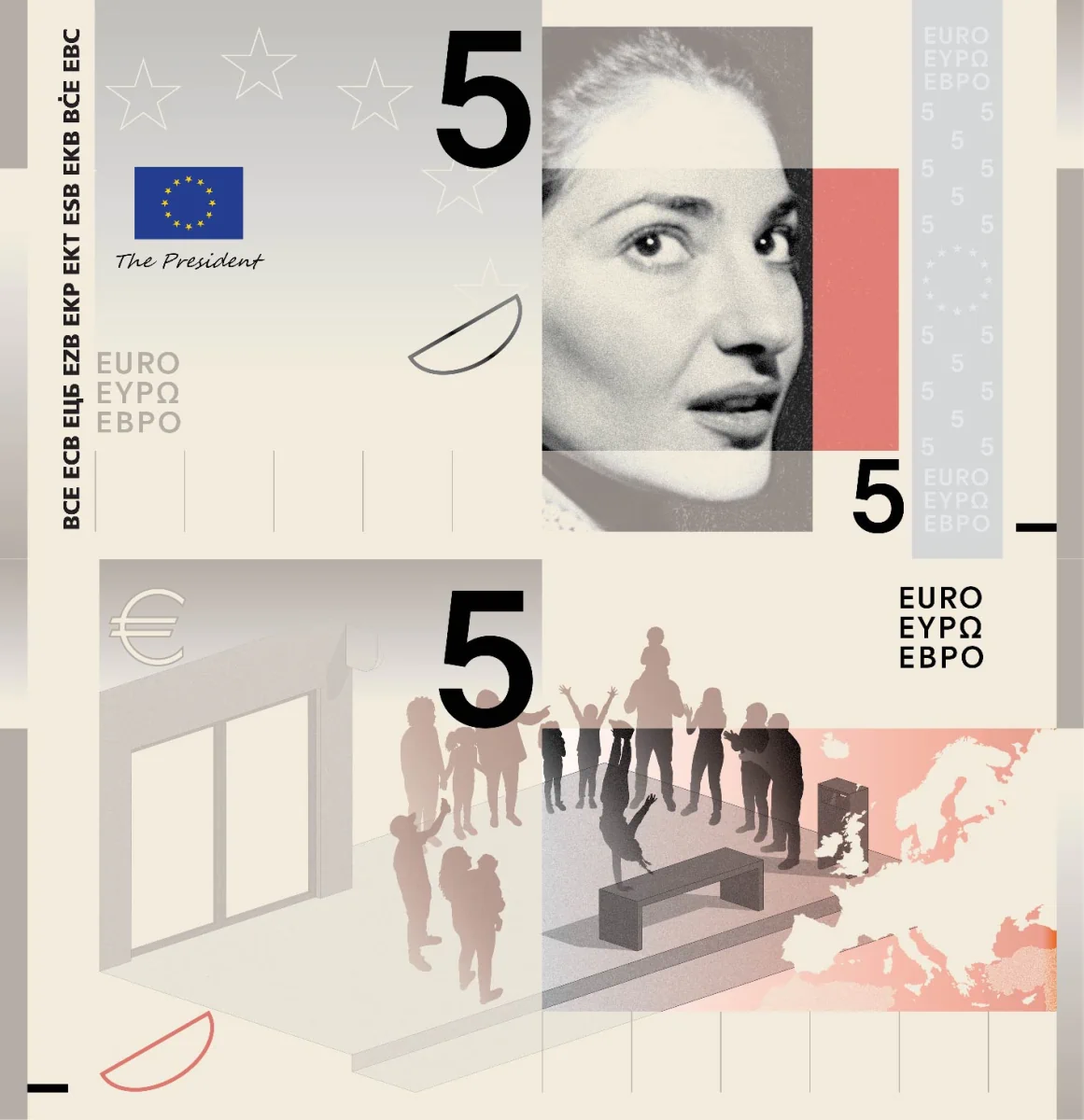
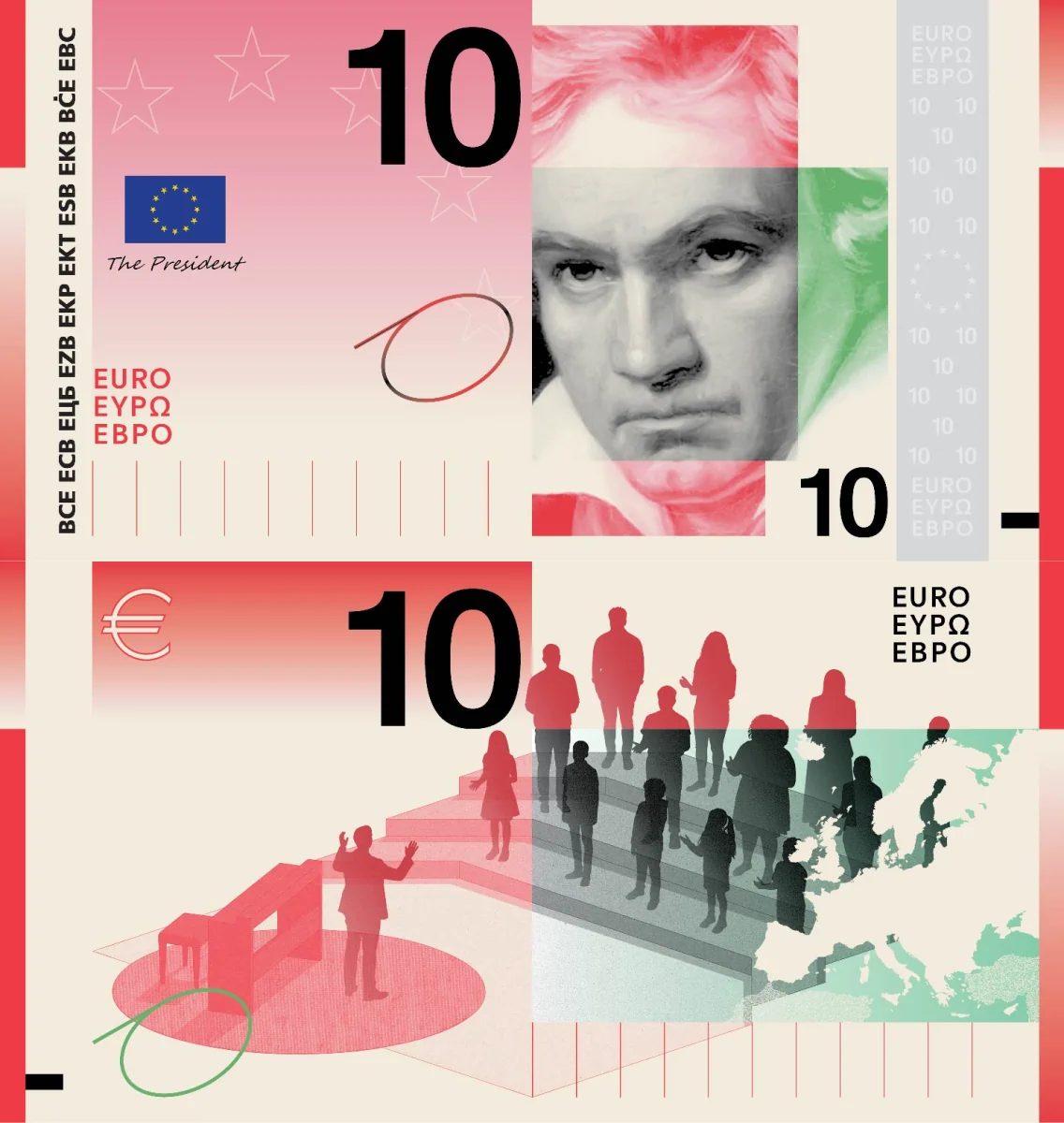
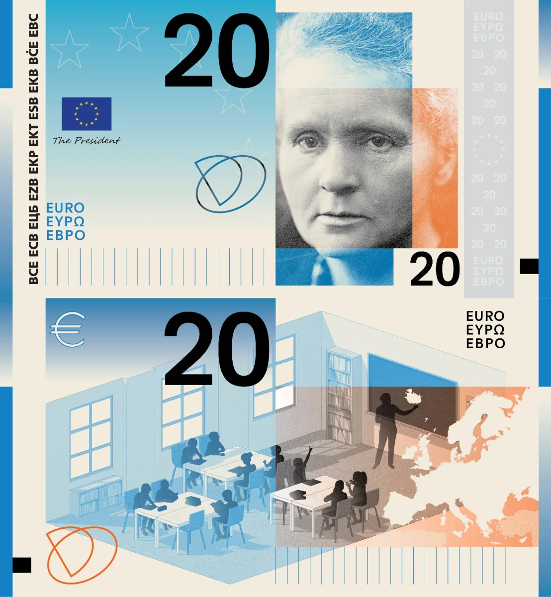
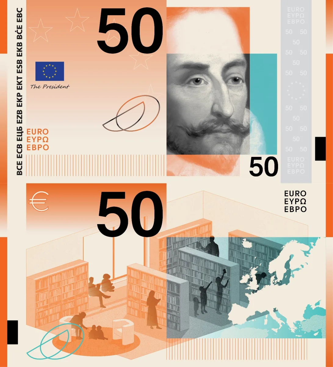
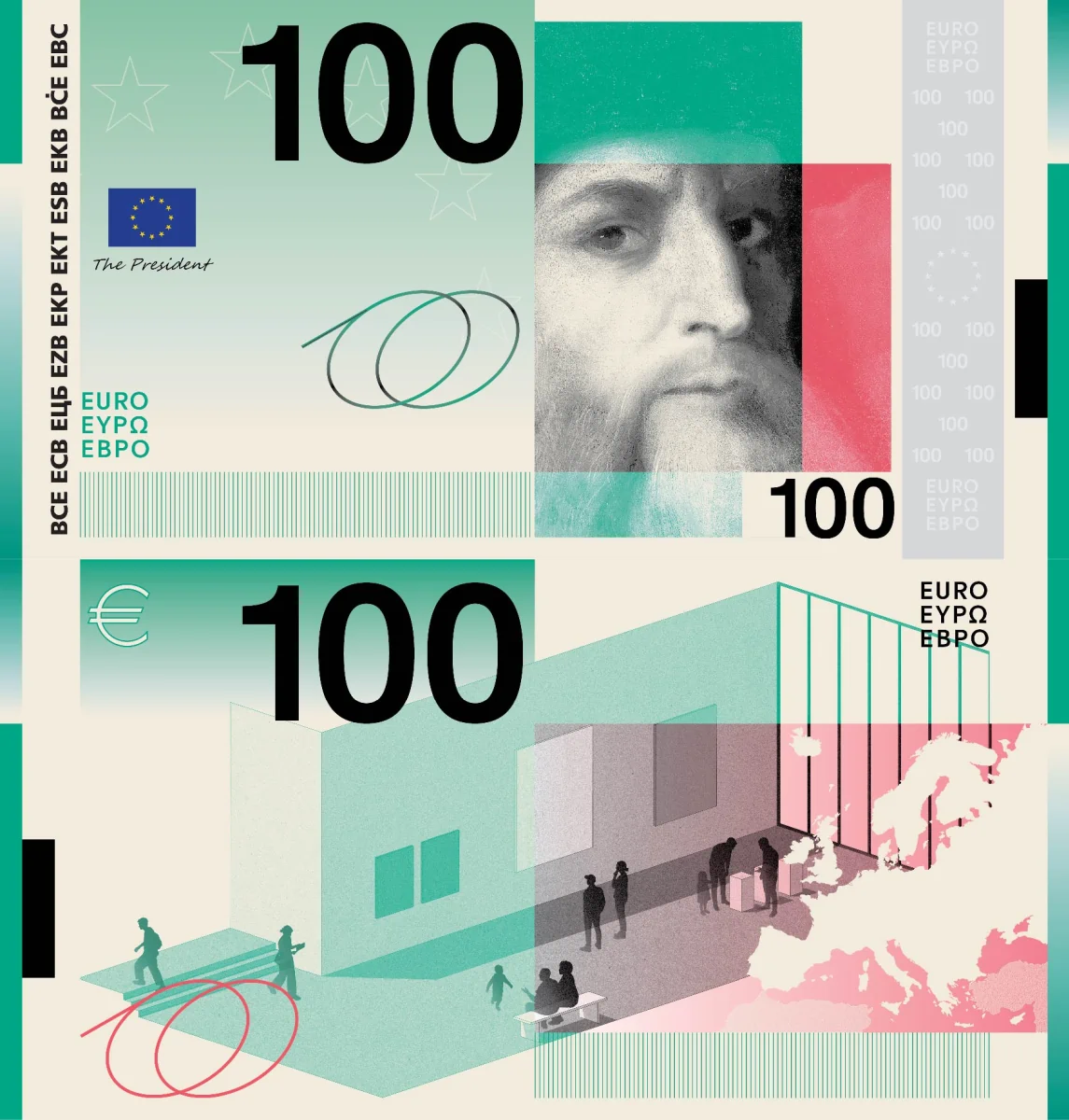
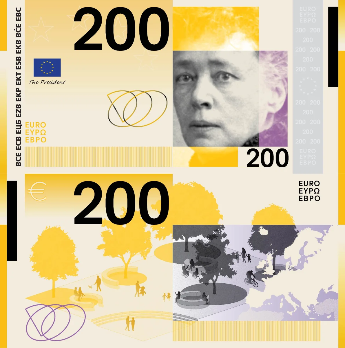
🟠 Too simplistic. I don’t like the combination of rectangles. Some portraits, especially those of Beethoven and Bertha von Suttner, are too blurry. The names of the characters are not shown anywhere, nor are the buildings named. The visible security elements seem minimal. Barely passable: 5/10.
Design B — PunktFormStrich
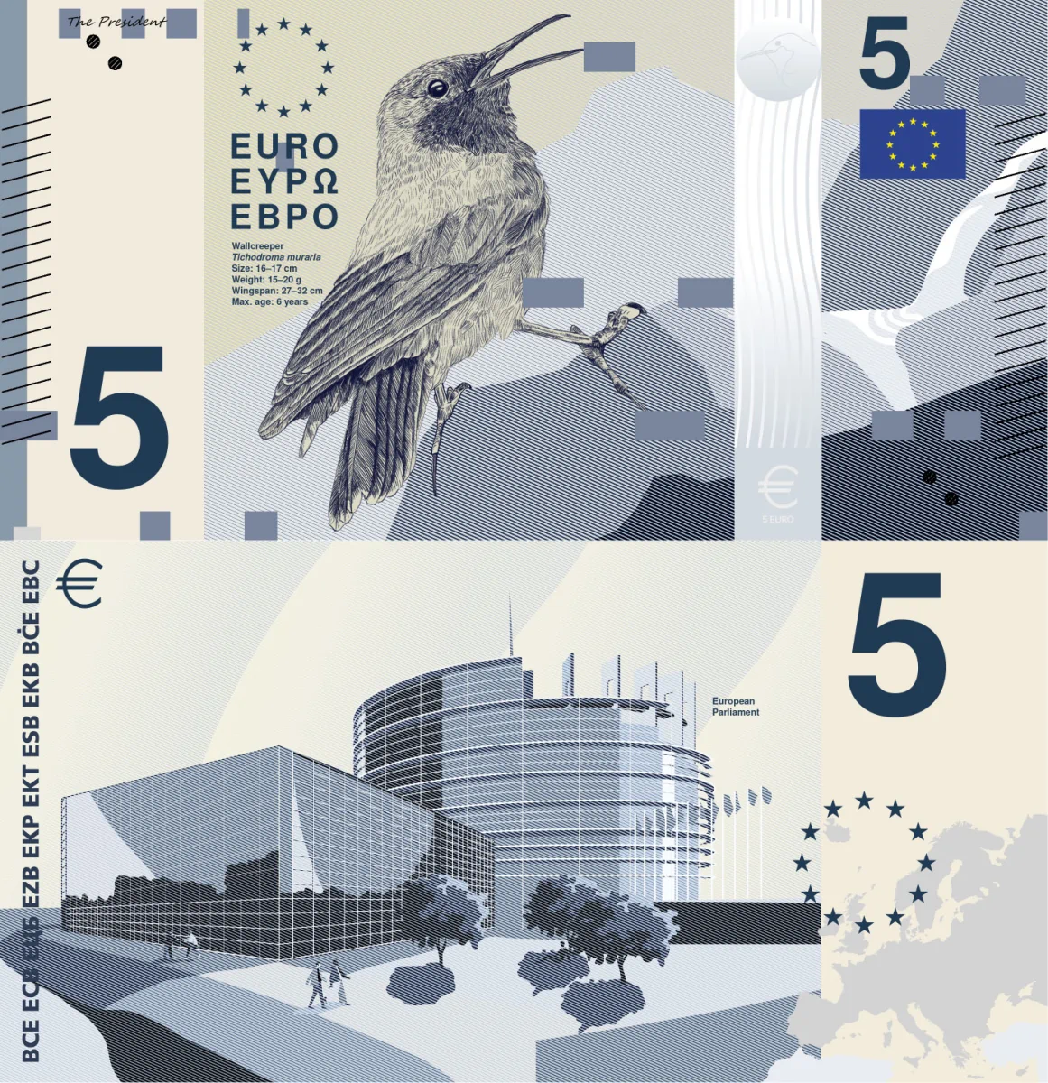
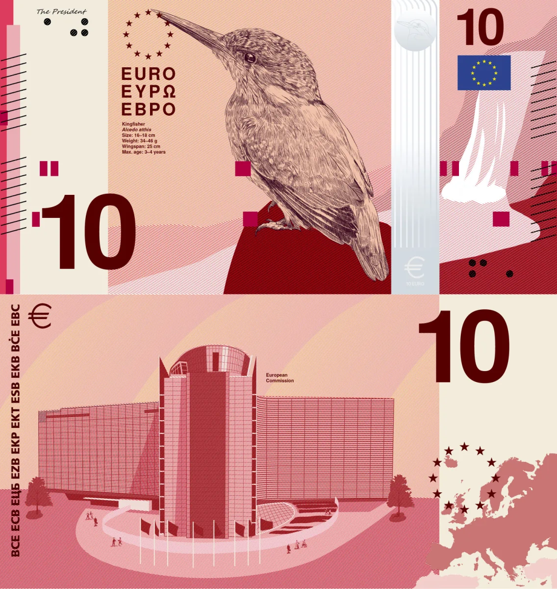
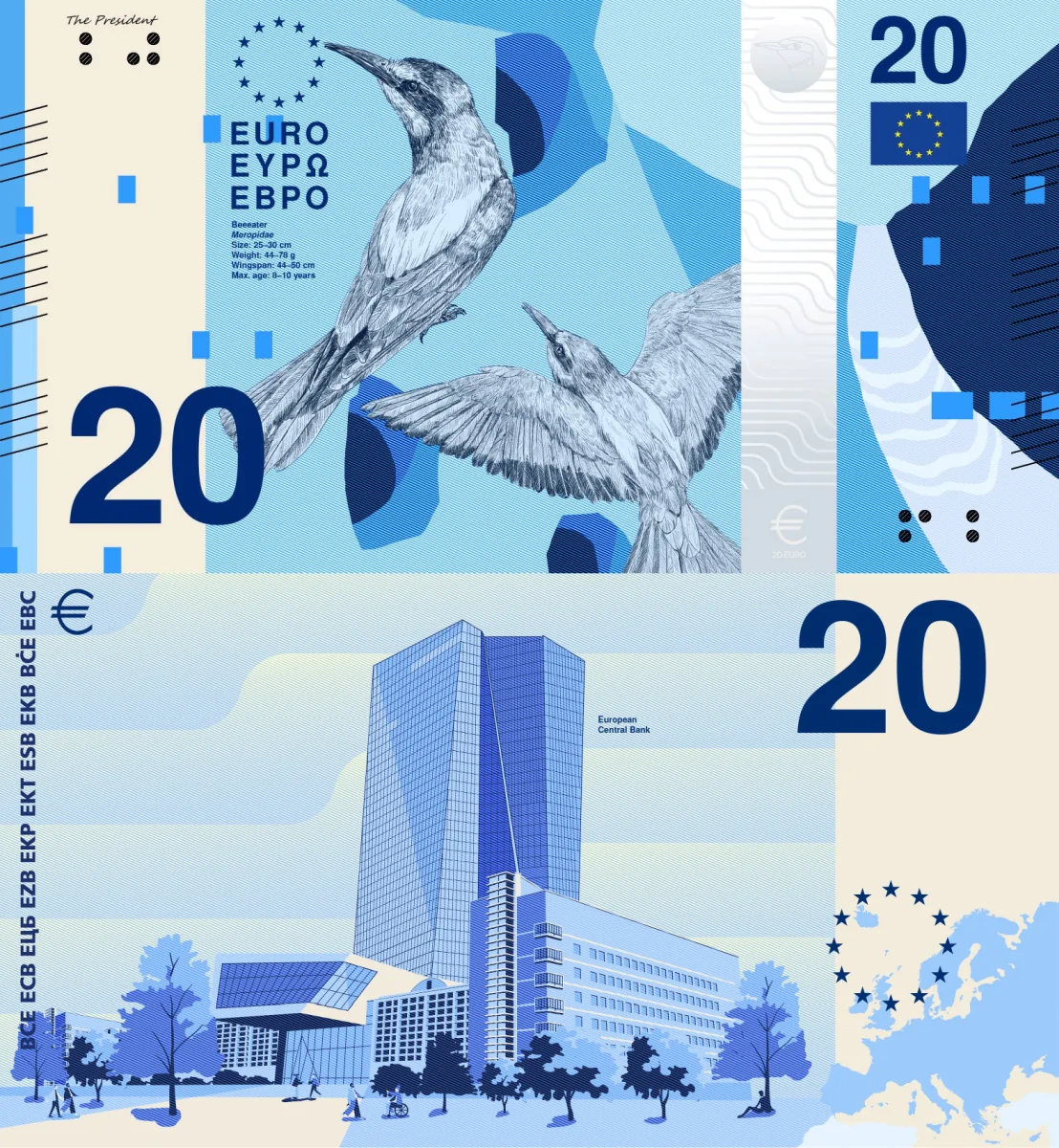
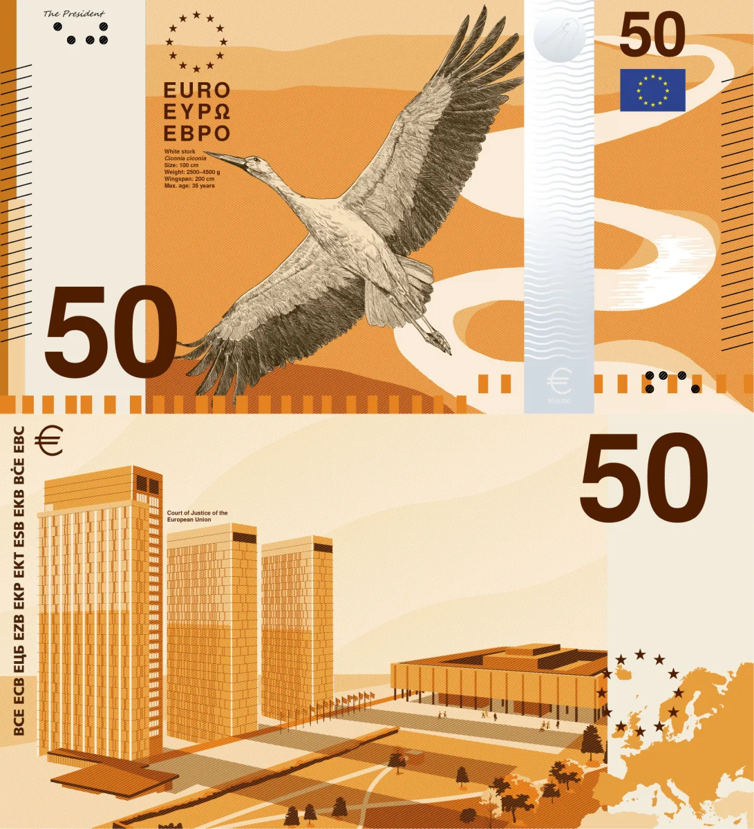
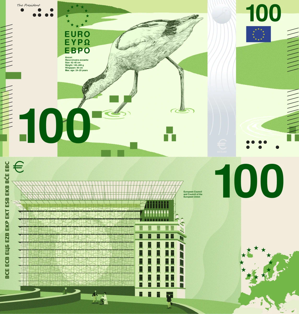

🟢 The best bird design! The names and characteristics of each bird are printed. The names of the EU buildings are also printed. The design is still conservative enough, and very clean. The visible security elements are decent. Very decent: 8/10.
Design C — Neue Gestaltung GmbH
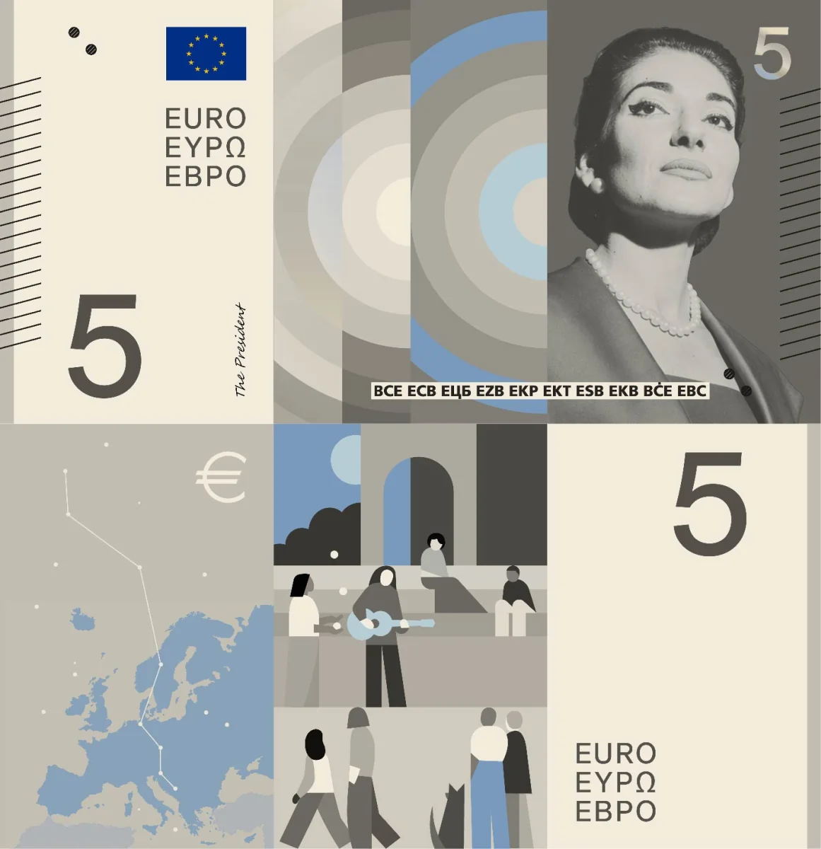
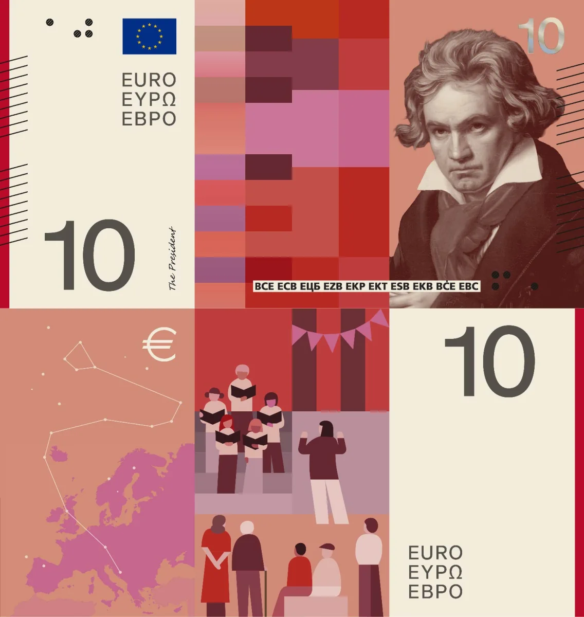
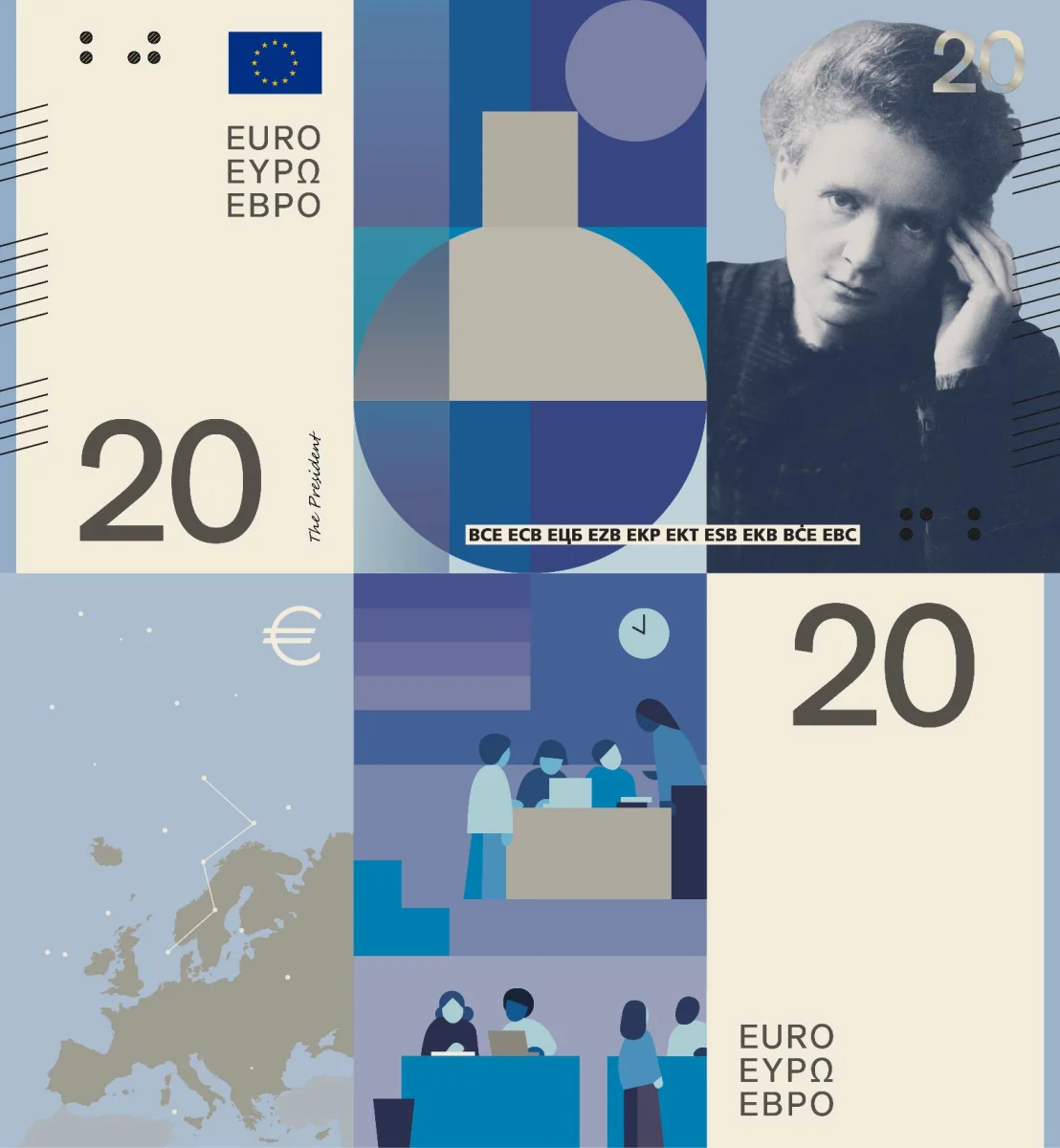
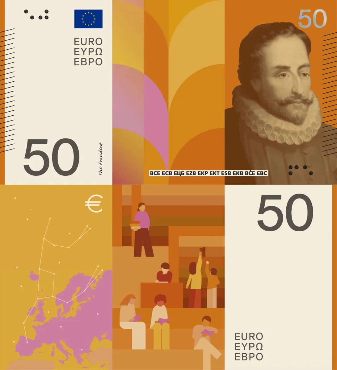
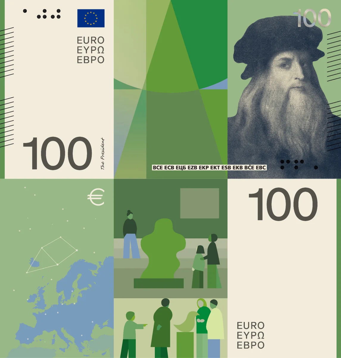

🔴 Horrendously stupid geometric design. The elements in the center of the front side are pathetic. The backside motifs are also in the center and unsatisfactory. The names of the characters are not shown anywhere, nor are the buildings named. No visible security elements. Catastrophic: 3/10.
Design D — Rudy Guedj and François Girard-Meunier
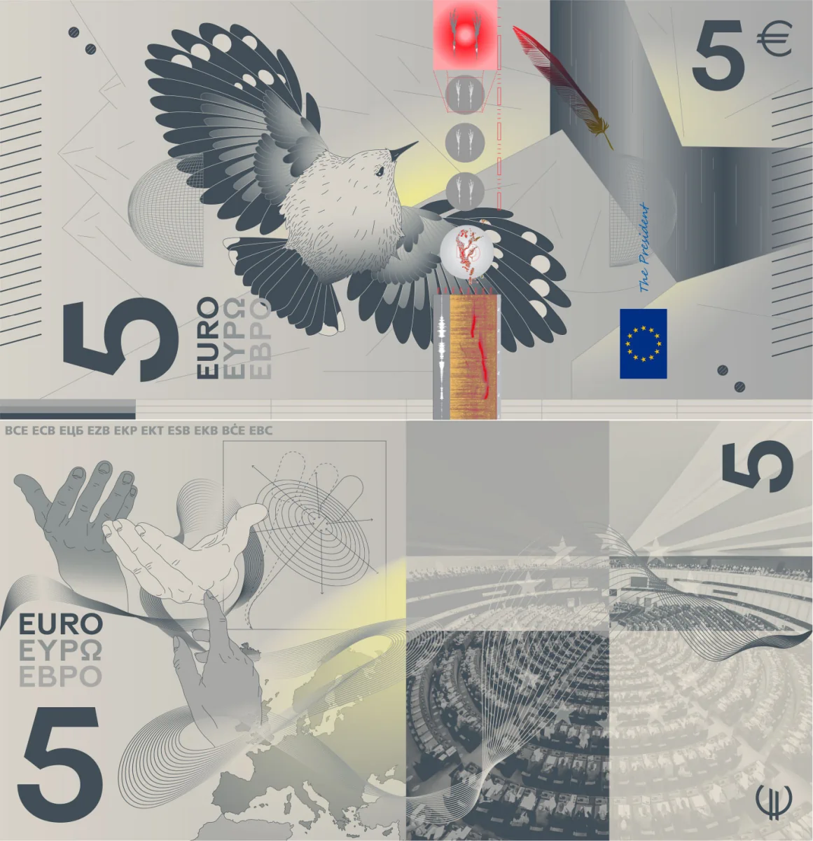
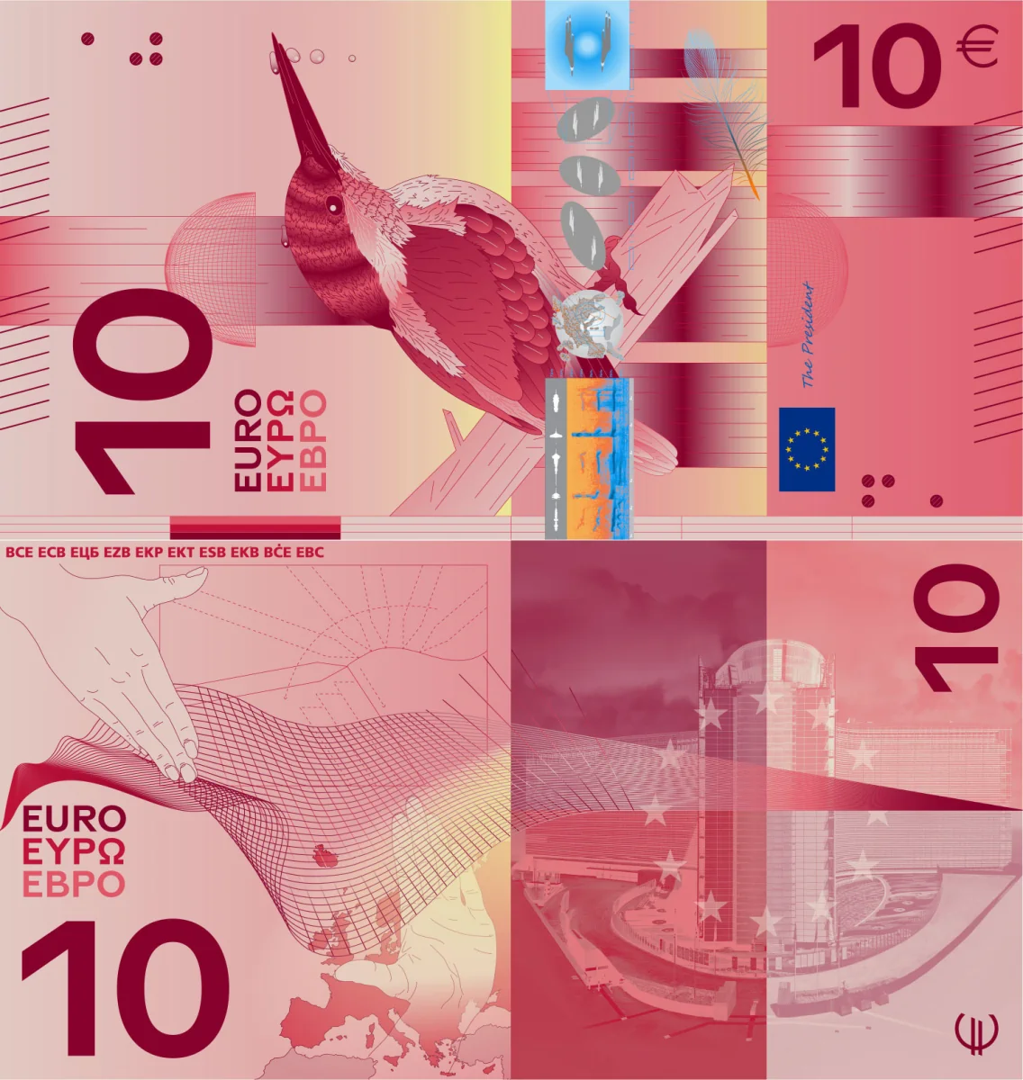

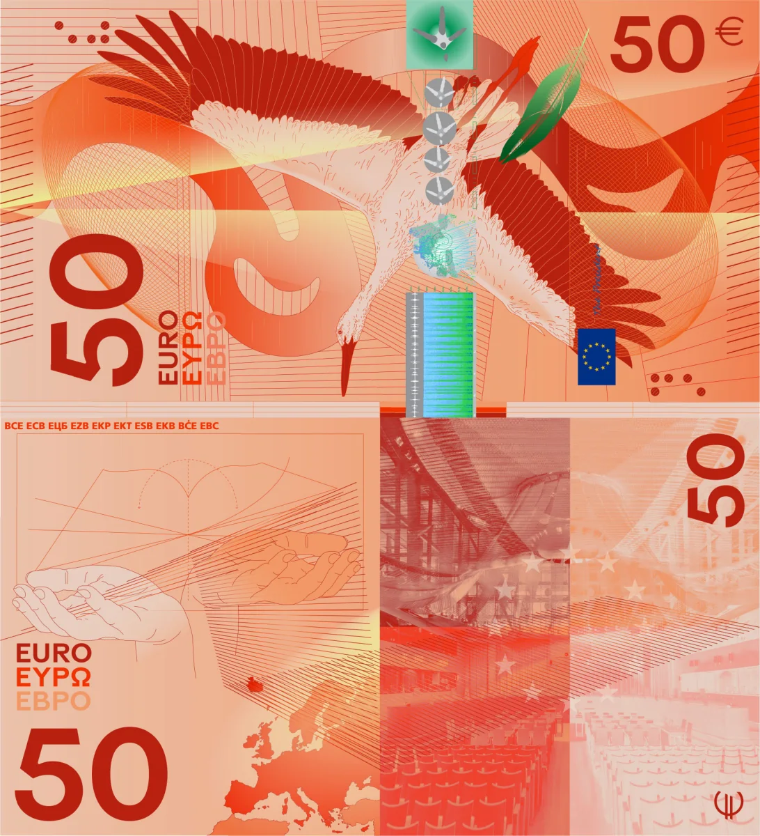
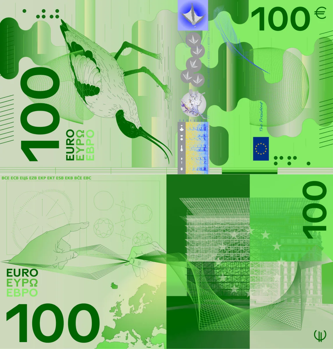
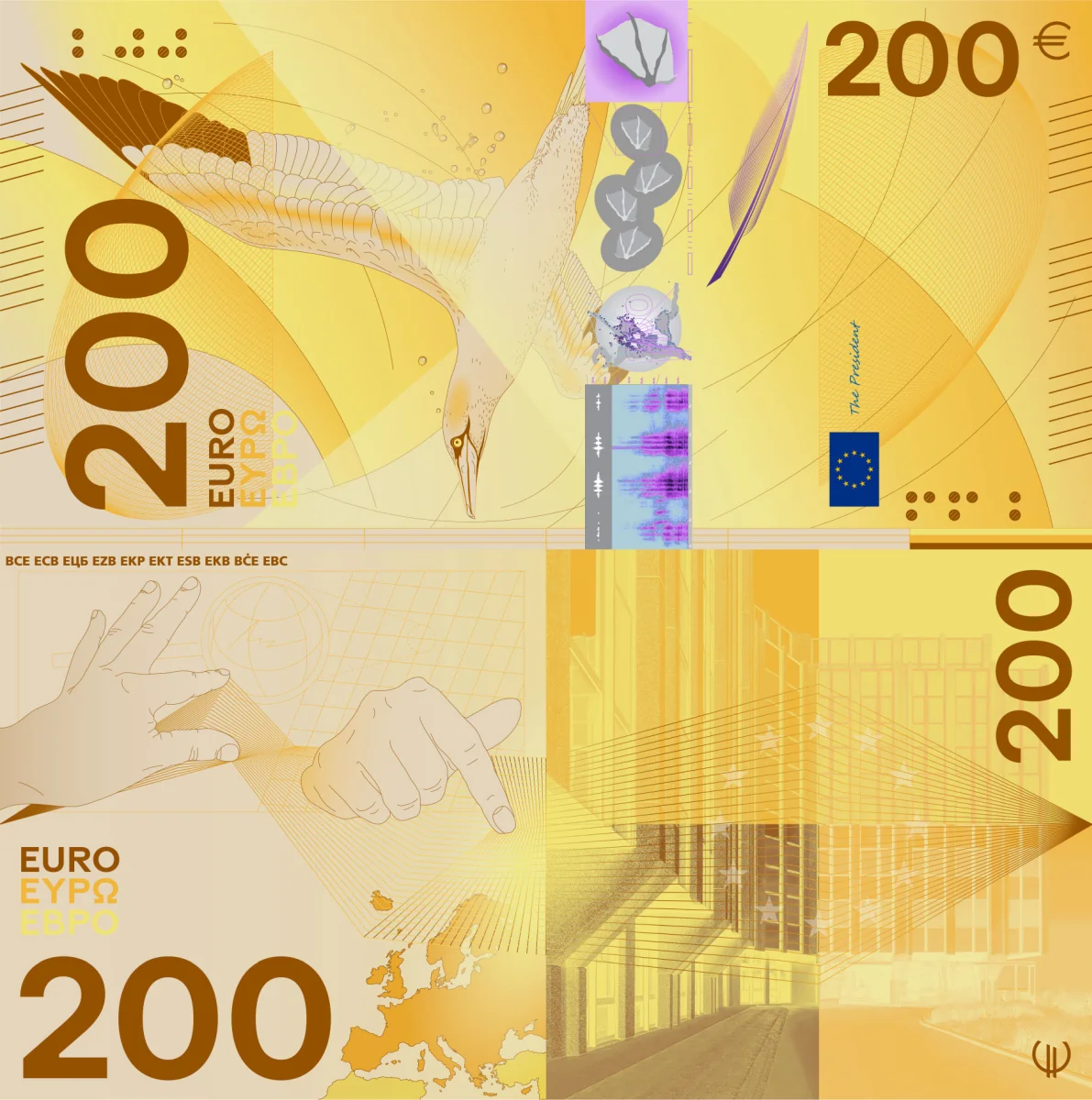
🔴 Bad mix of vertical and horizontal layouts. The front side is vertical, and the back side is horizontal. There is an excess of curves, lines, surfaces, and shades. The backside of all denominations includes hands and graphs: why? The names of the characters are not shown anywhere, nor are the buildings named. Heavily visible security elements. Extremely confusing: 4/10.
Design E — Myrsini Vardopoulou
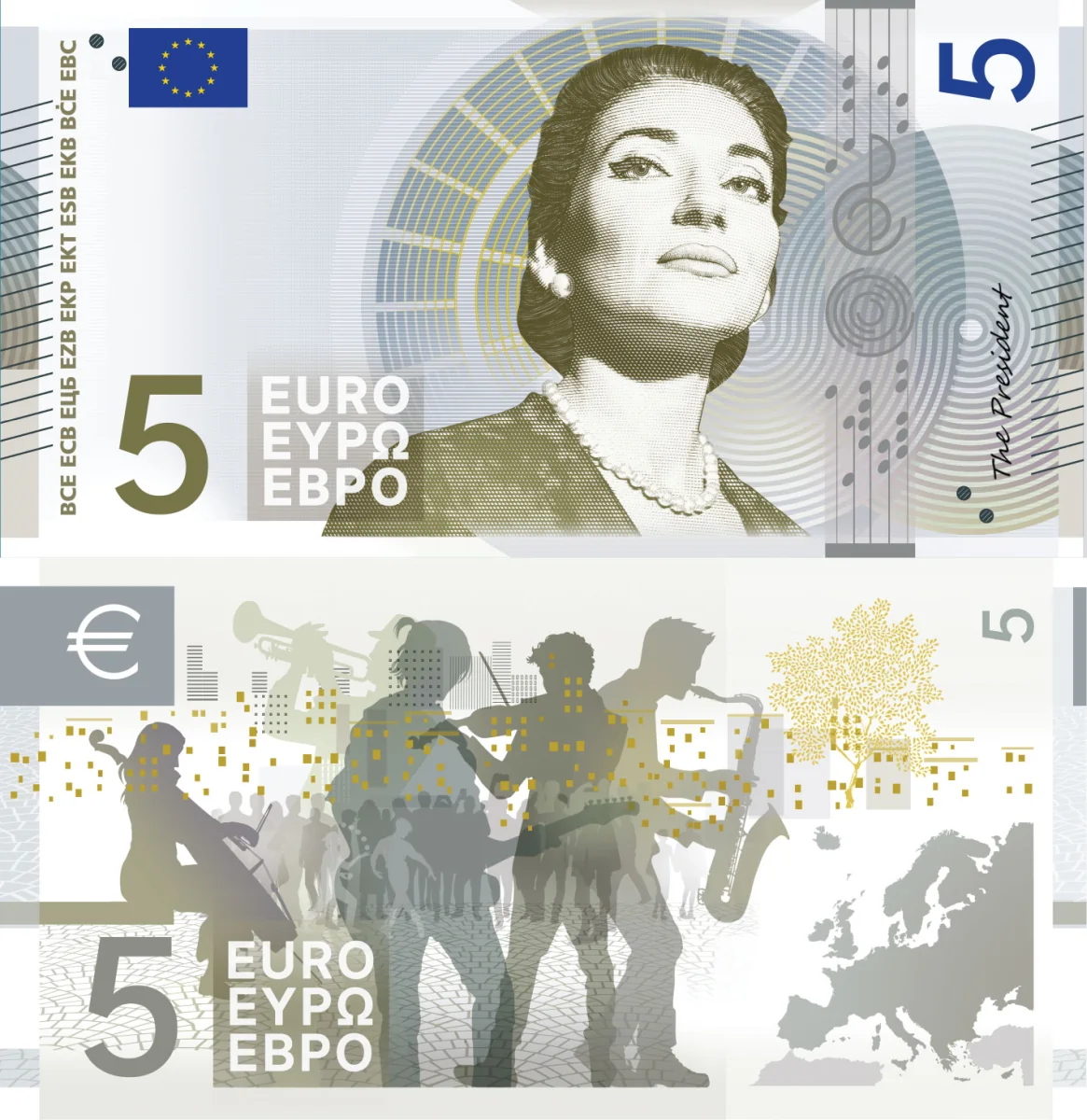
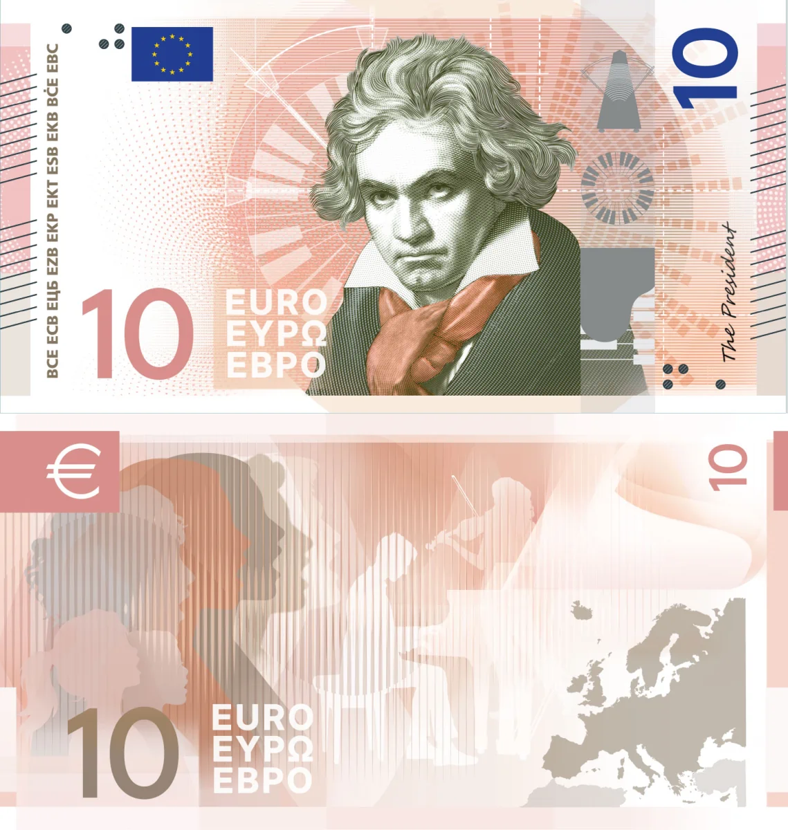
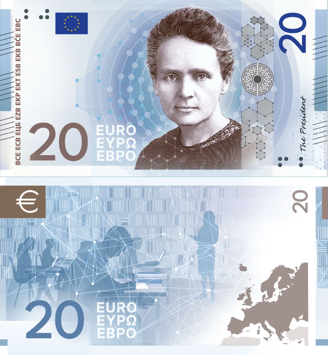
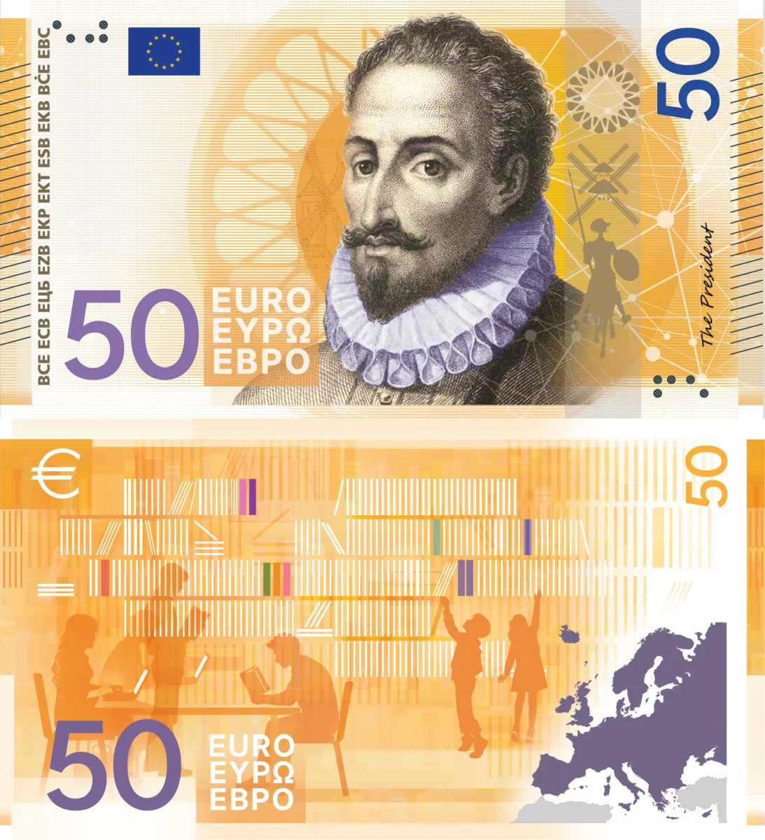
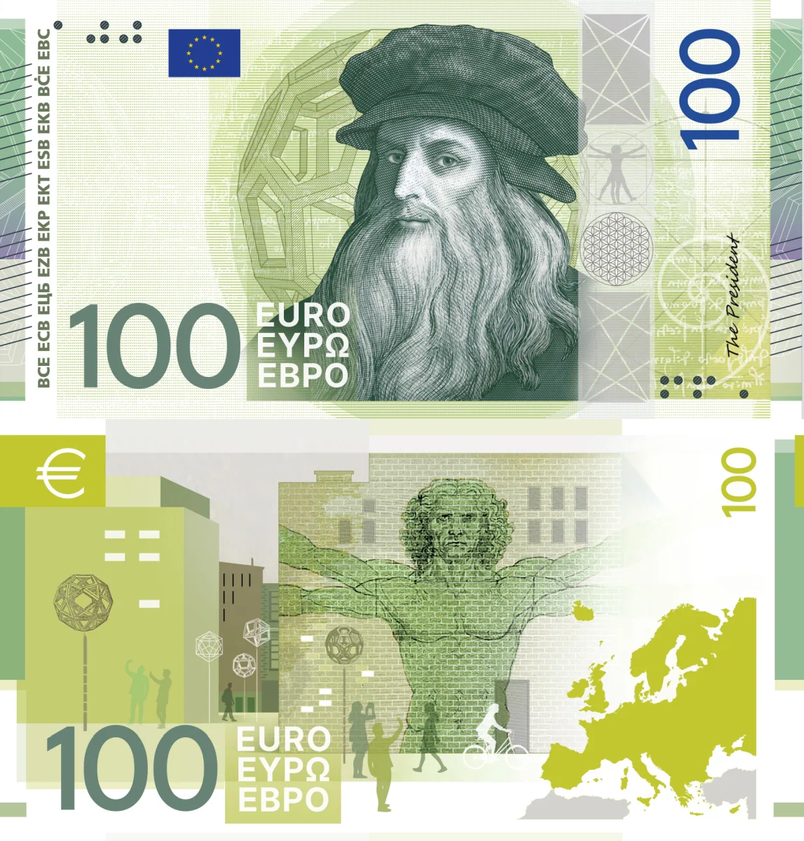

🟡 These are not colors; this is how cats see colors! Otherwise, an acceptable design. The visible security elements seem to be personalized for each denomination. Not that bad: 7/10.
Design F — Jan Robert Dünnweller
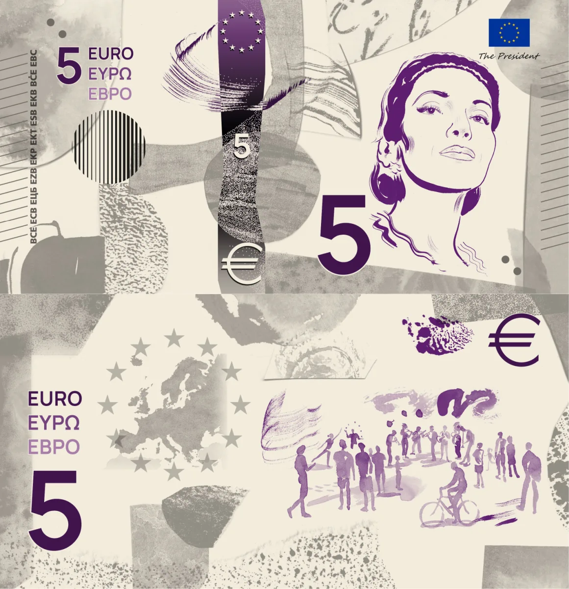
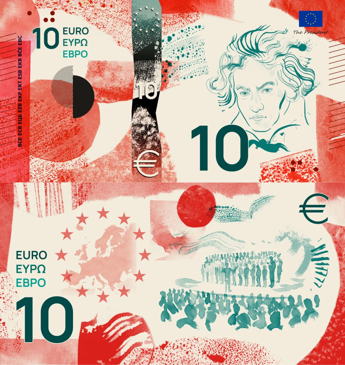
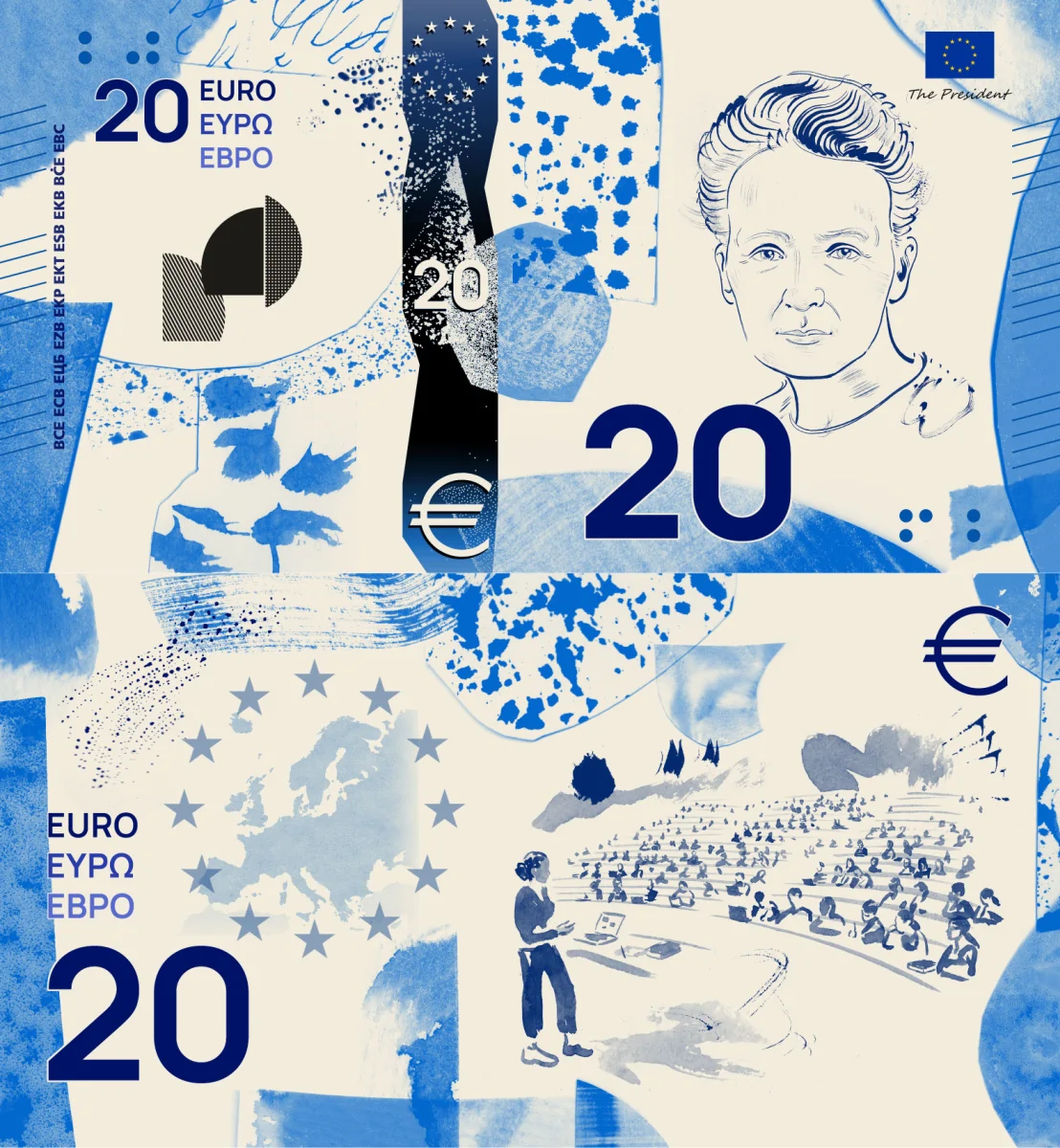
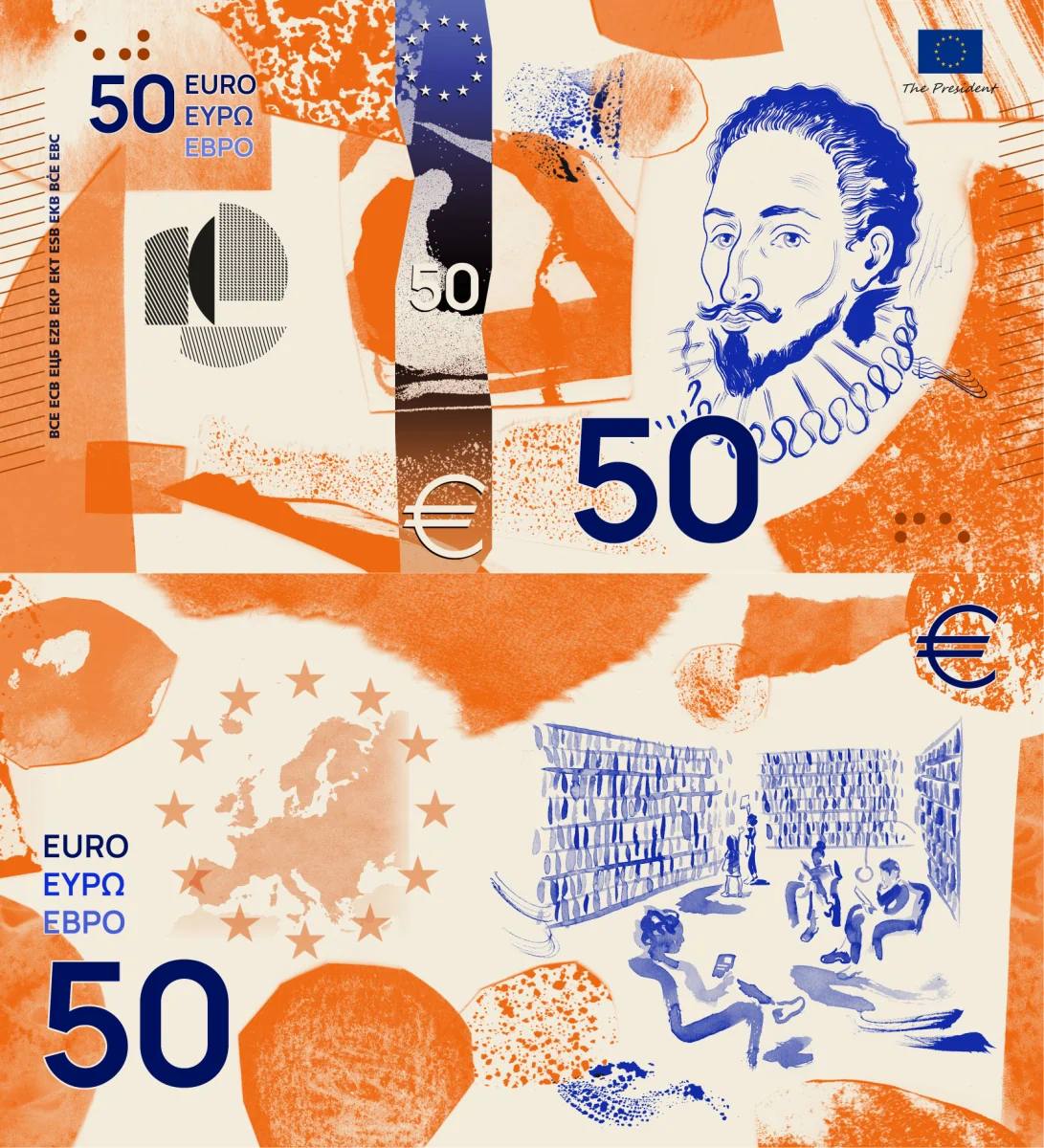
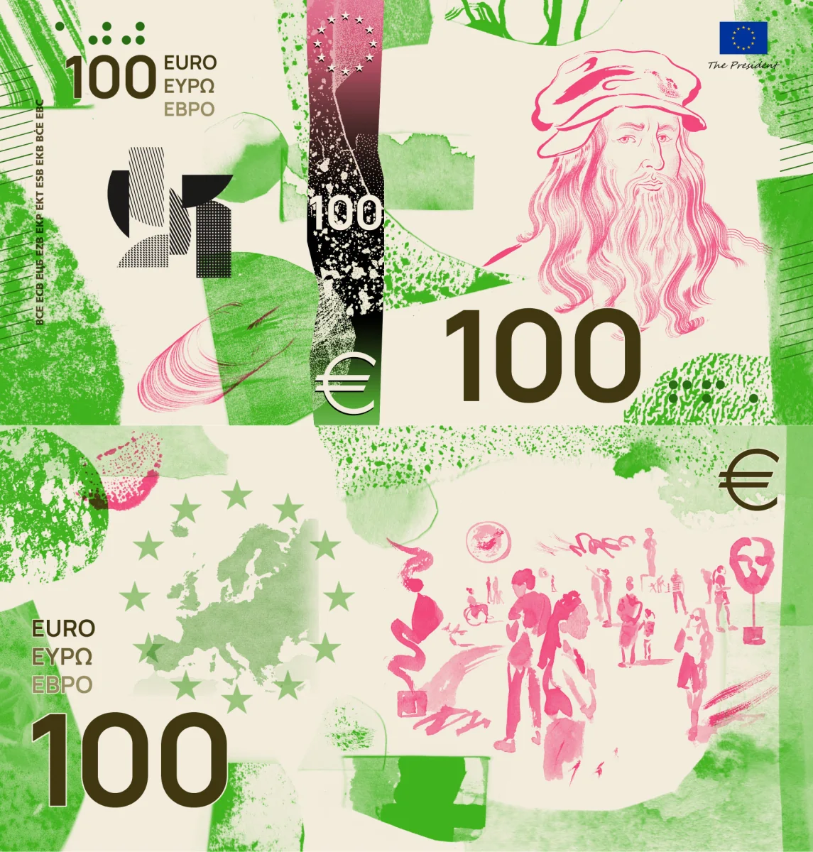
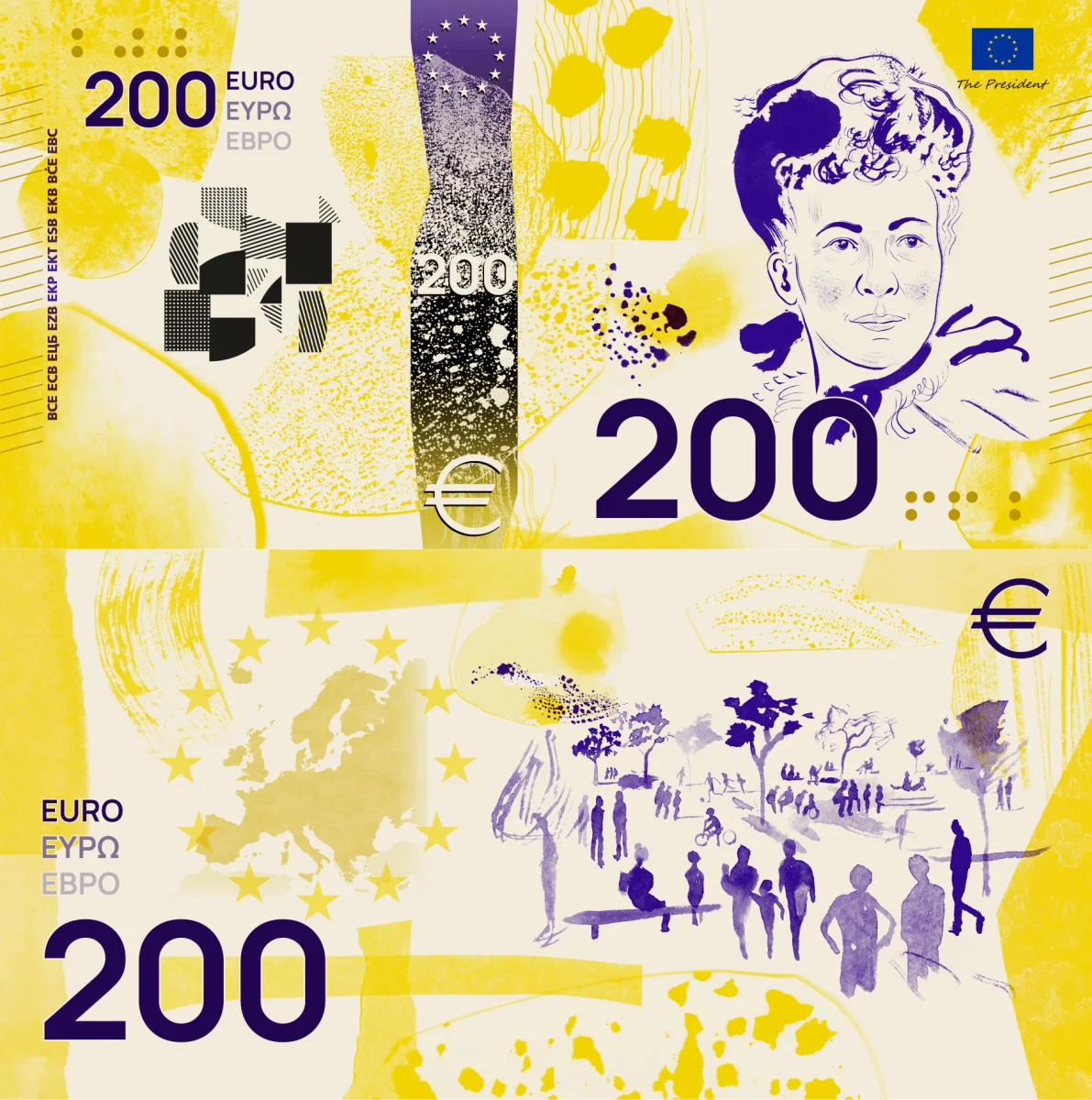
🔵 Interesting, but not for banknotes. Watercolors are nice, but not suitable for the purpose. The design is rather creative, playful, and bold. No names are given, which is consistent with the design. The visible security elements seem to be personalized for each denomination. Eccentric: 6/10.
Design G — Rubio & del Amo and Cruz más Cruz
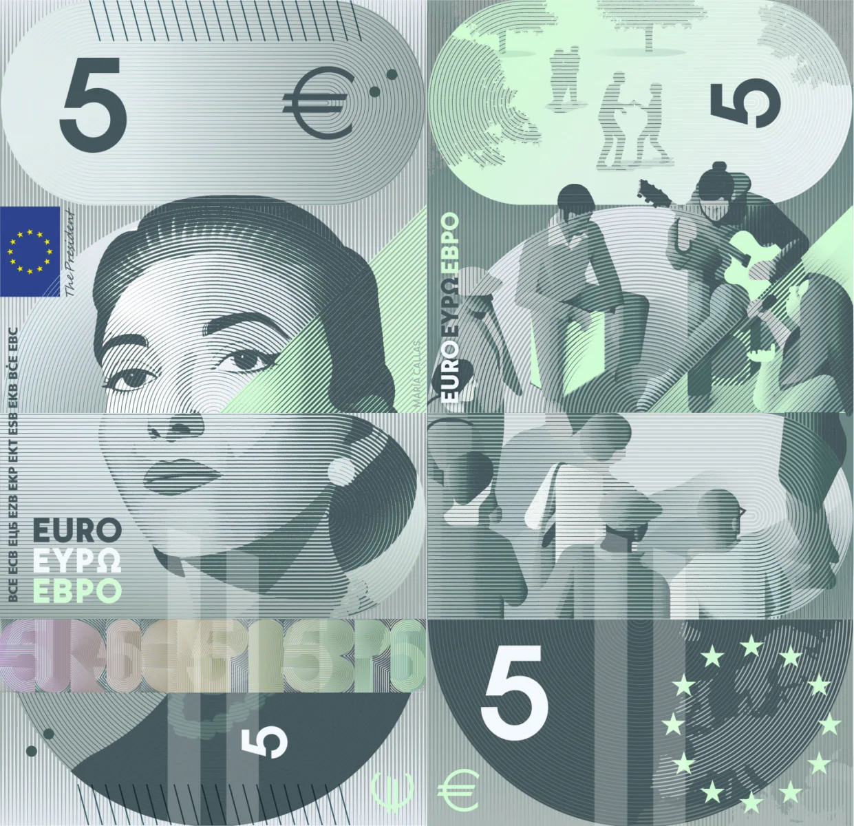
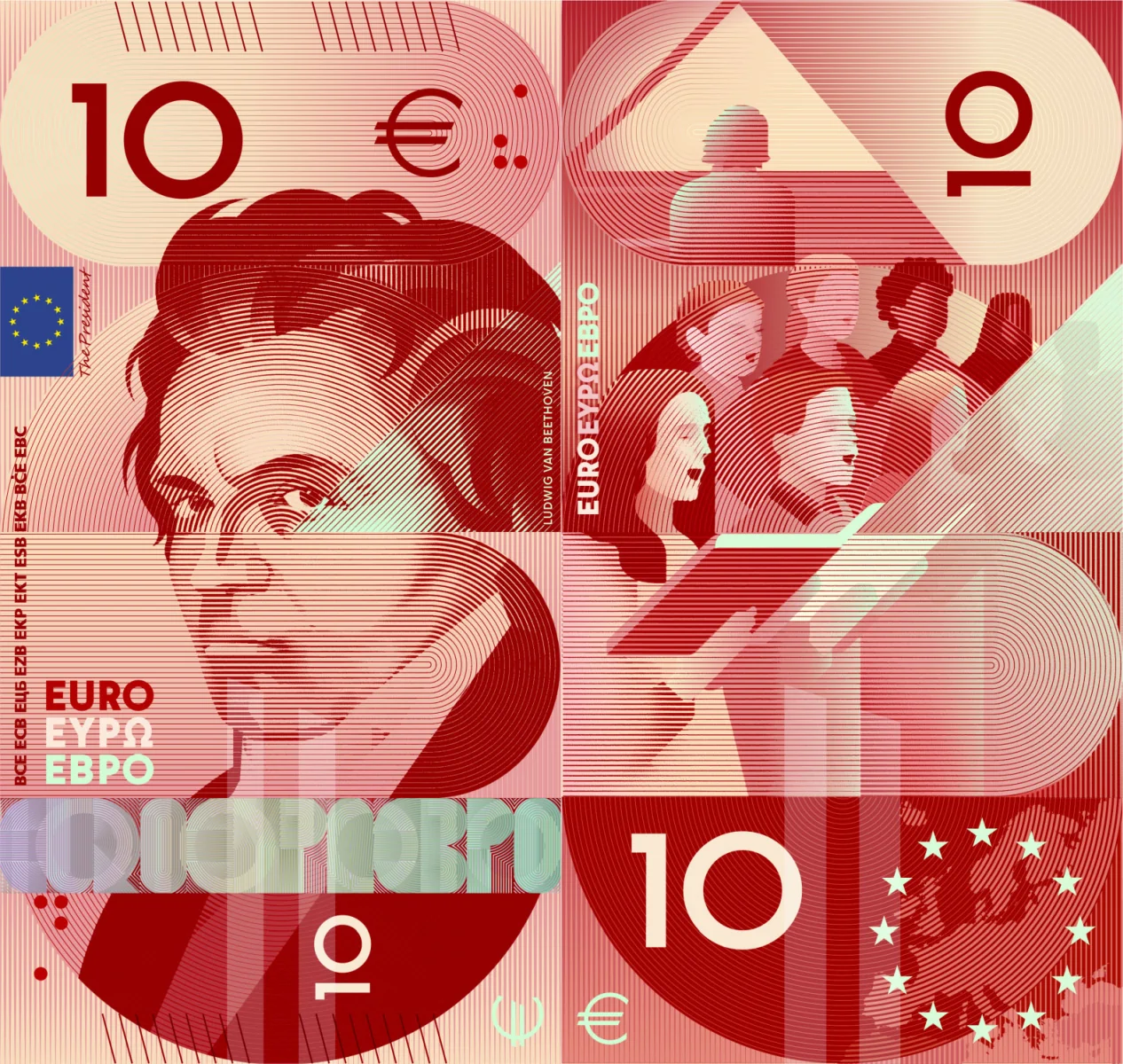
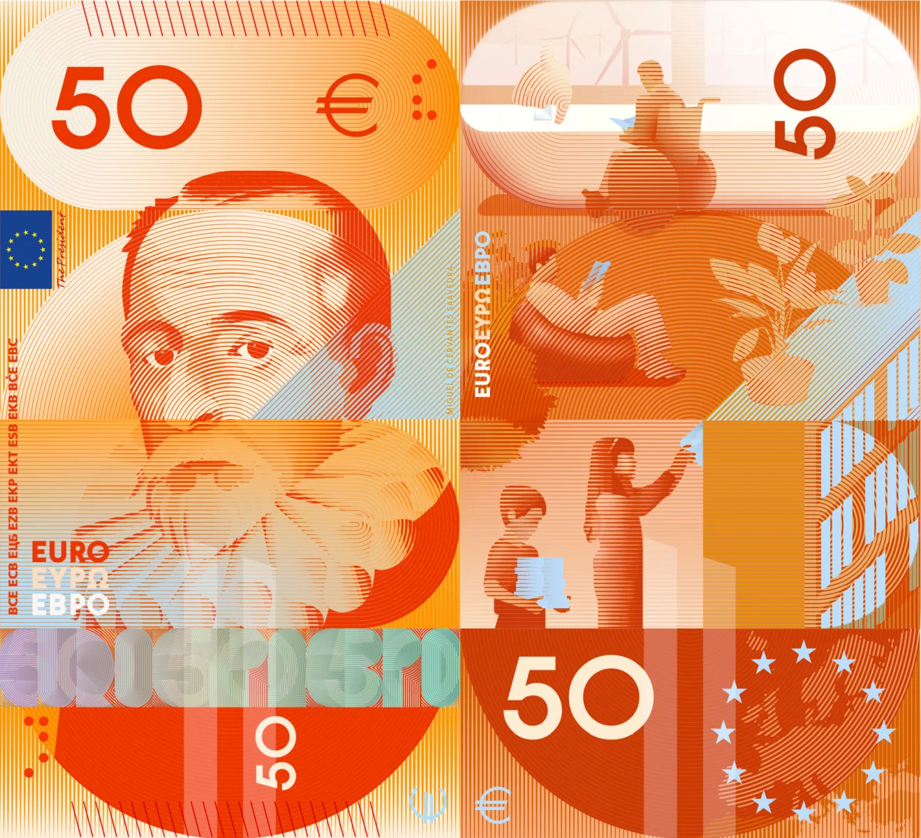
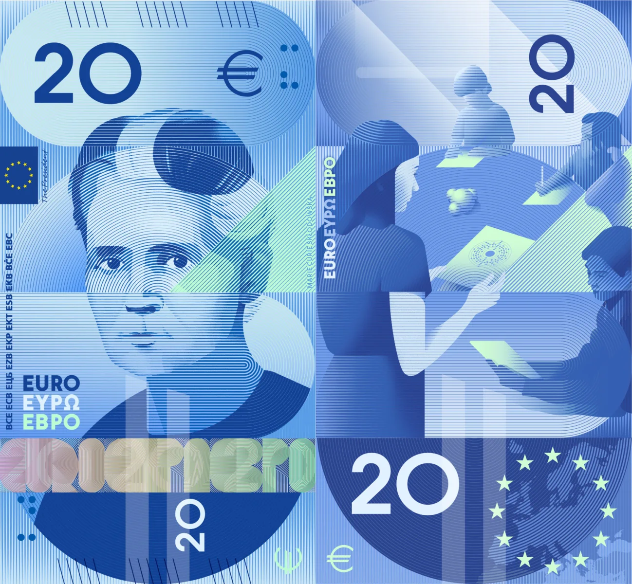
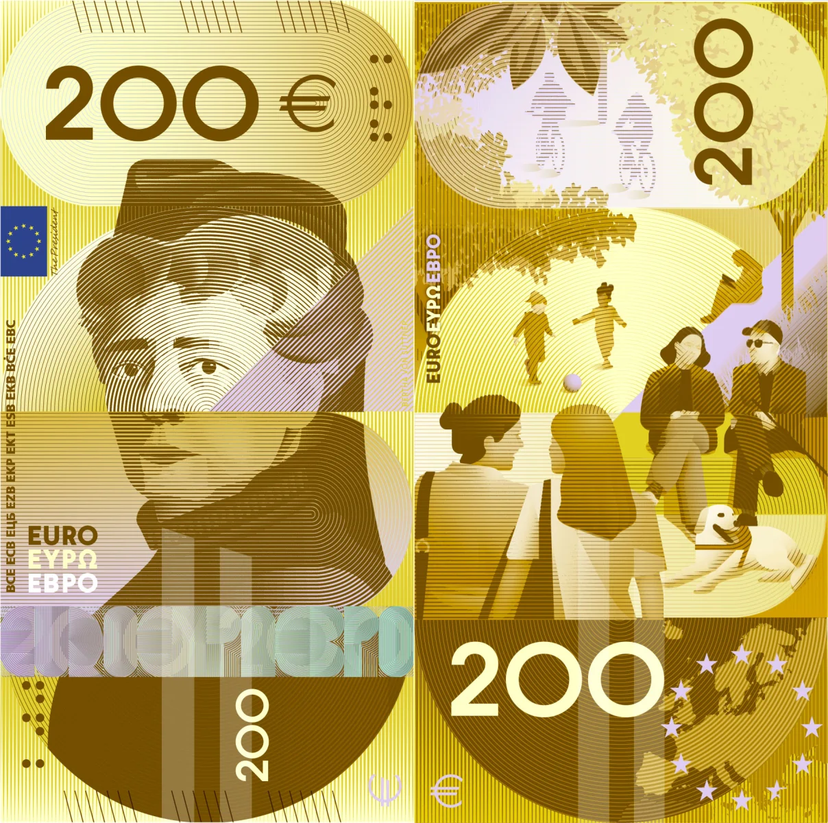
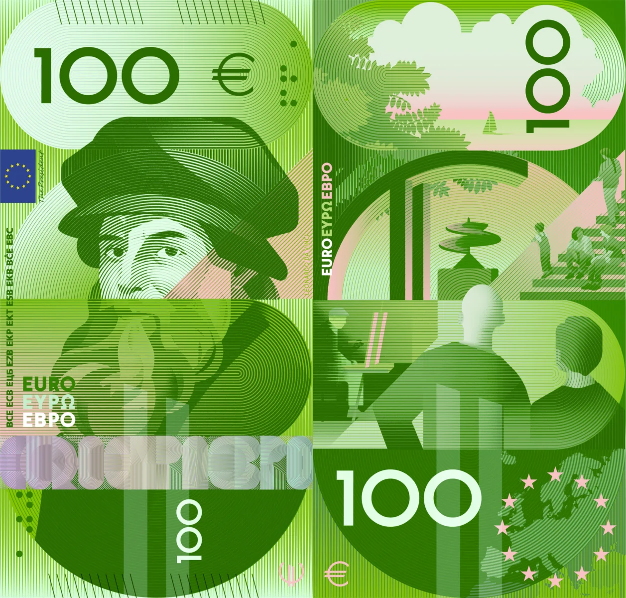
🔴 Fully vertical design. Both sides are vertical, something that I don’t like. (Yes, China issued vertical 20-yuan notes in 2024 and 2025, but they are commemorative polymer notes, not regular circulation banknotes. And they have a more classic design.) No names are given. The visible security elements are also influenced by the design. Crazy shit: 3/10.
Design H — Atelier Goppel-Toperngpong
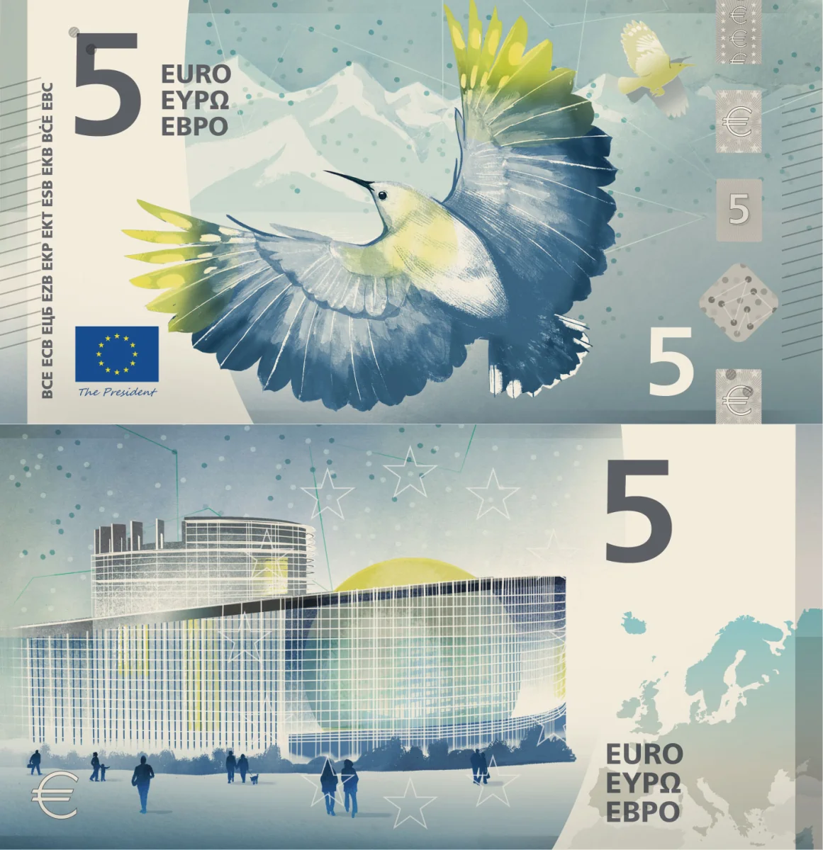
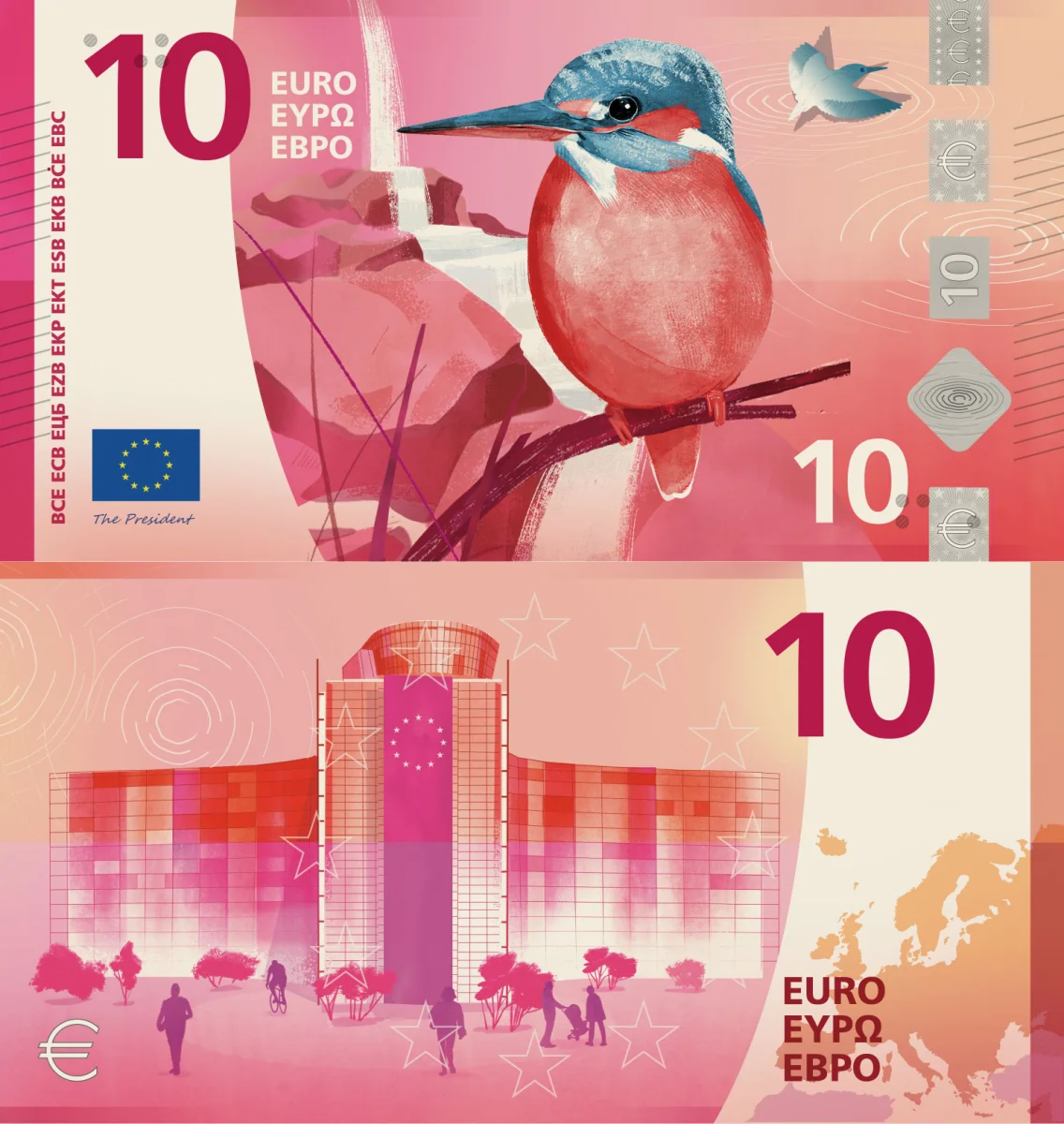
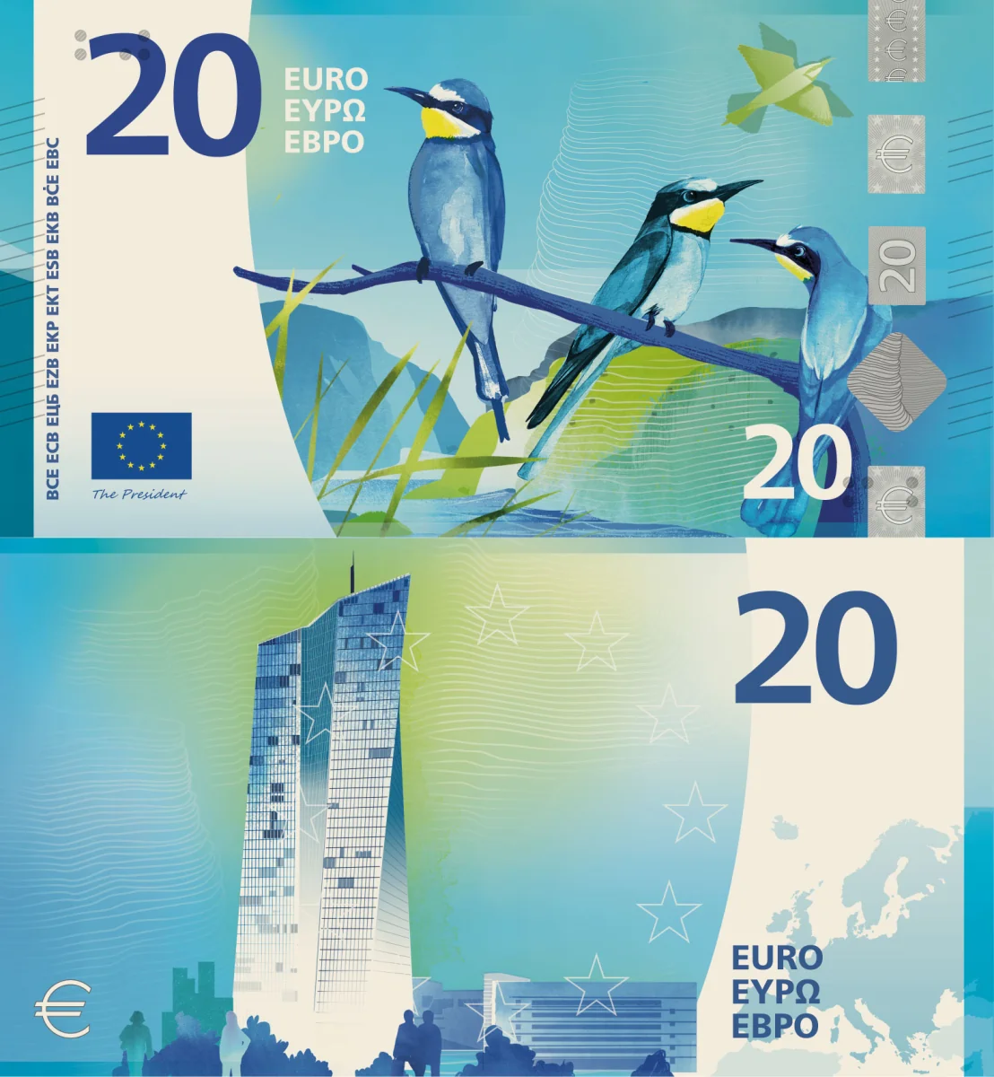
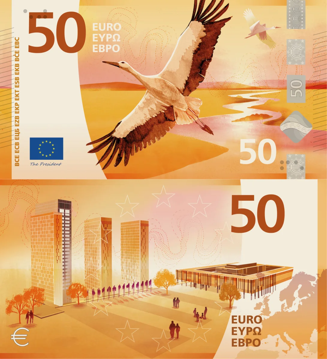
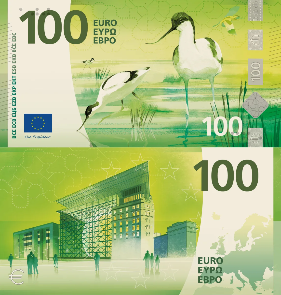
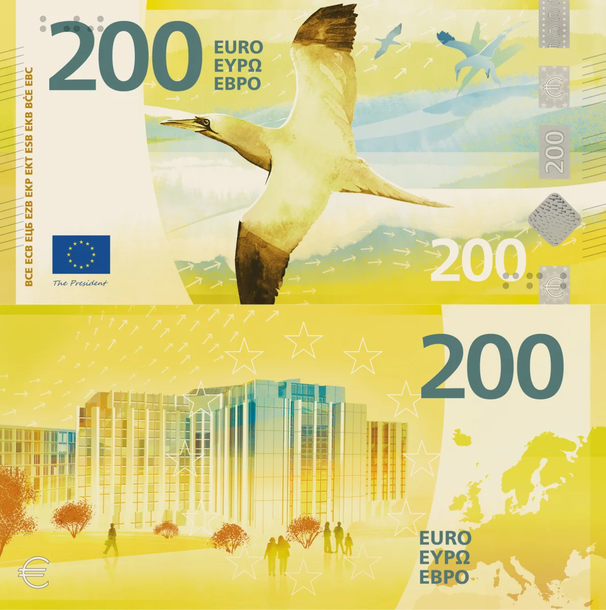
🟡 The second-best bird design. The design is rather conservative, with tonal backsides heavy in soft gradients. Unfortunately, the names of the characters are not shown anywhere, nor are the buildings named. Heavily visible security elements. Quite decent: 7/10.
Design I — Isabelle Daëron
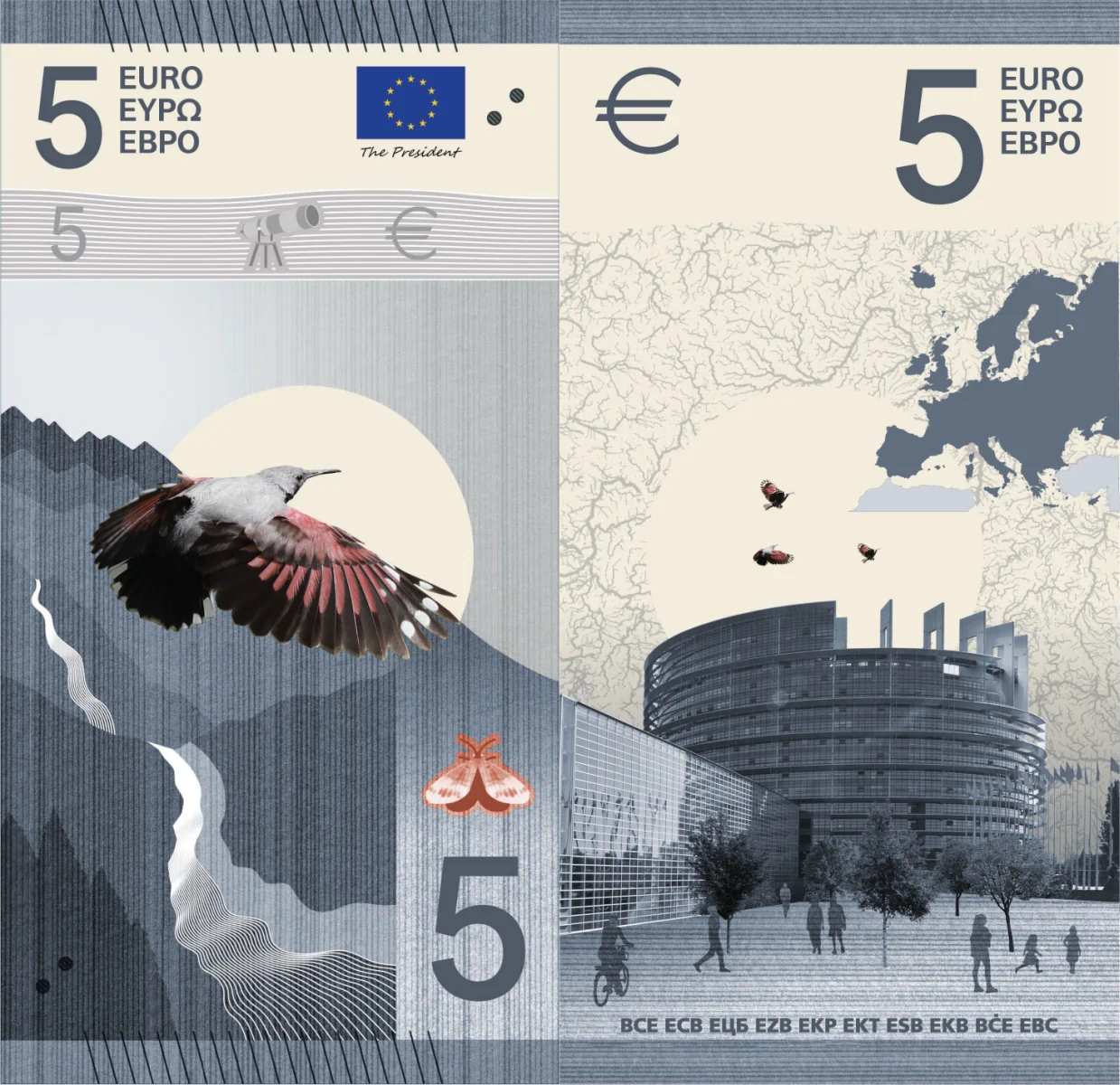
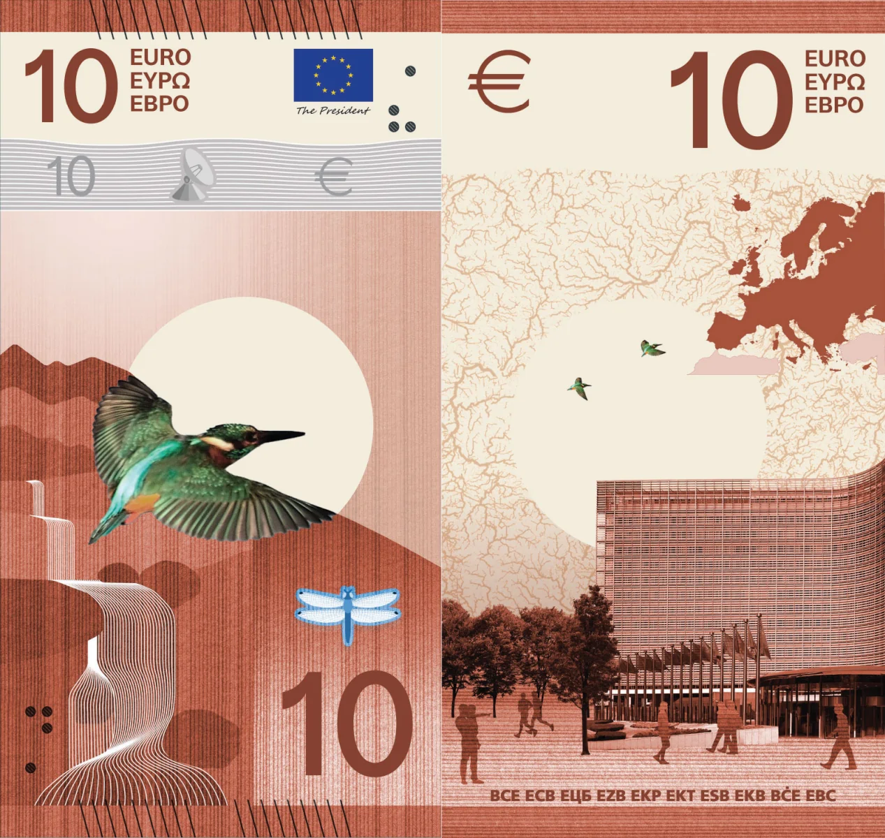
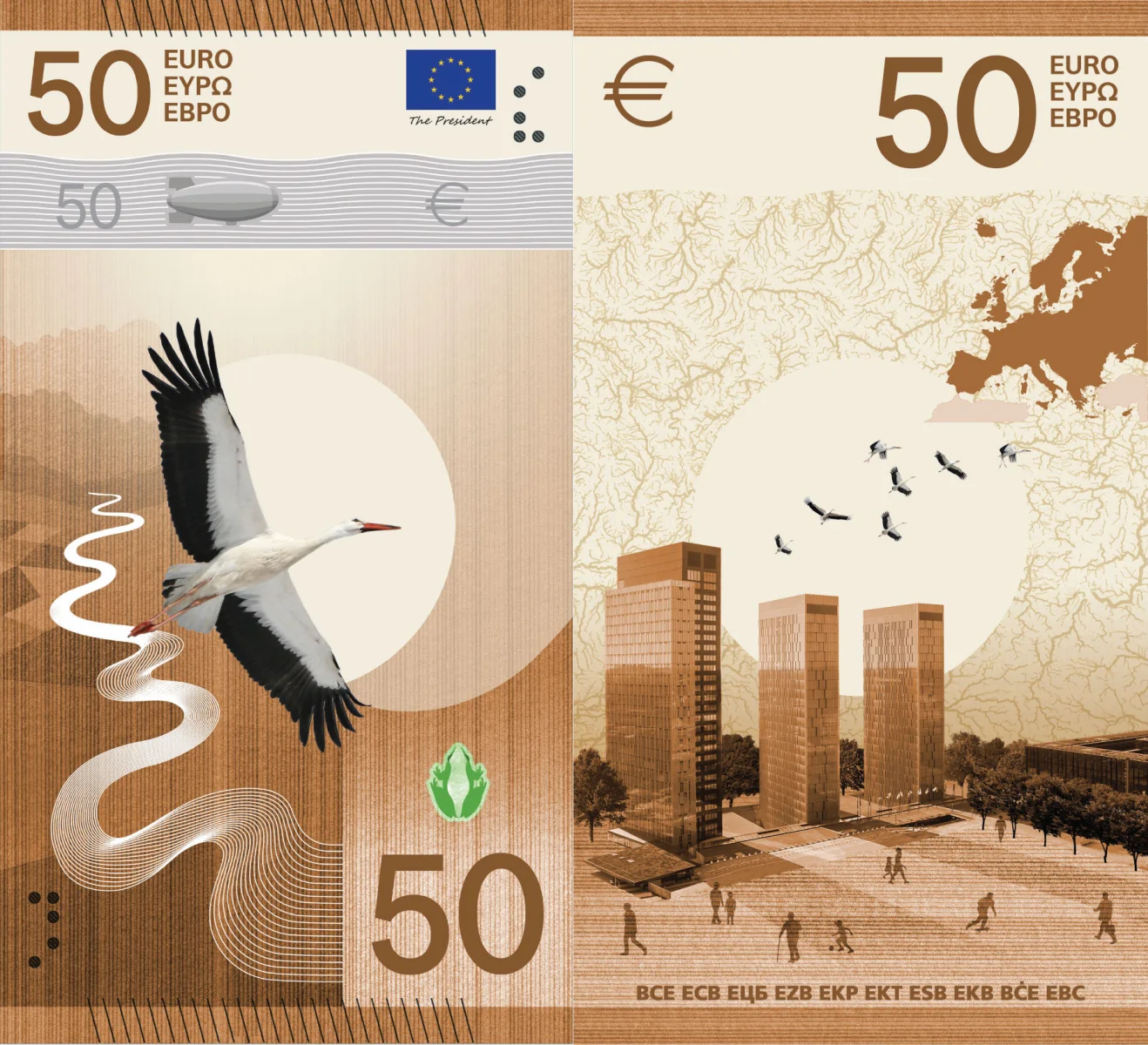
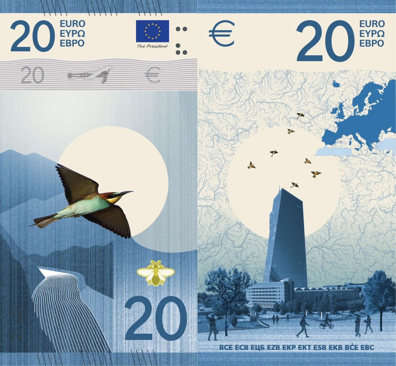
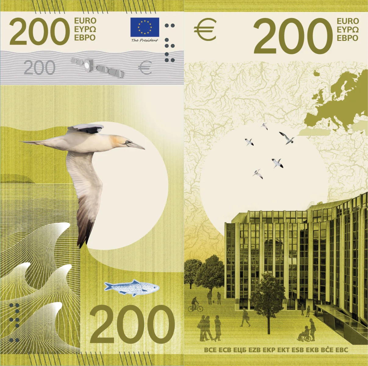
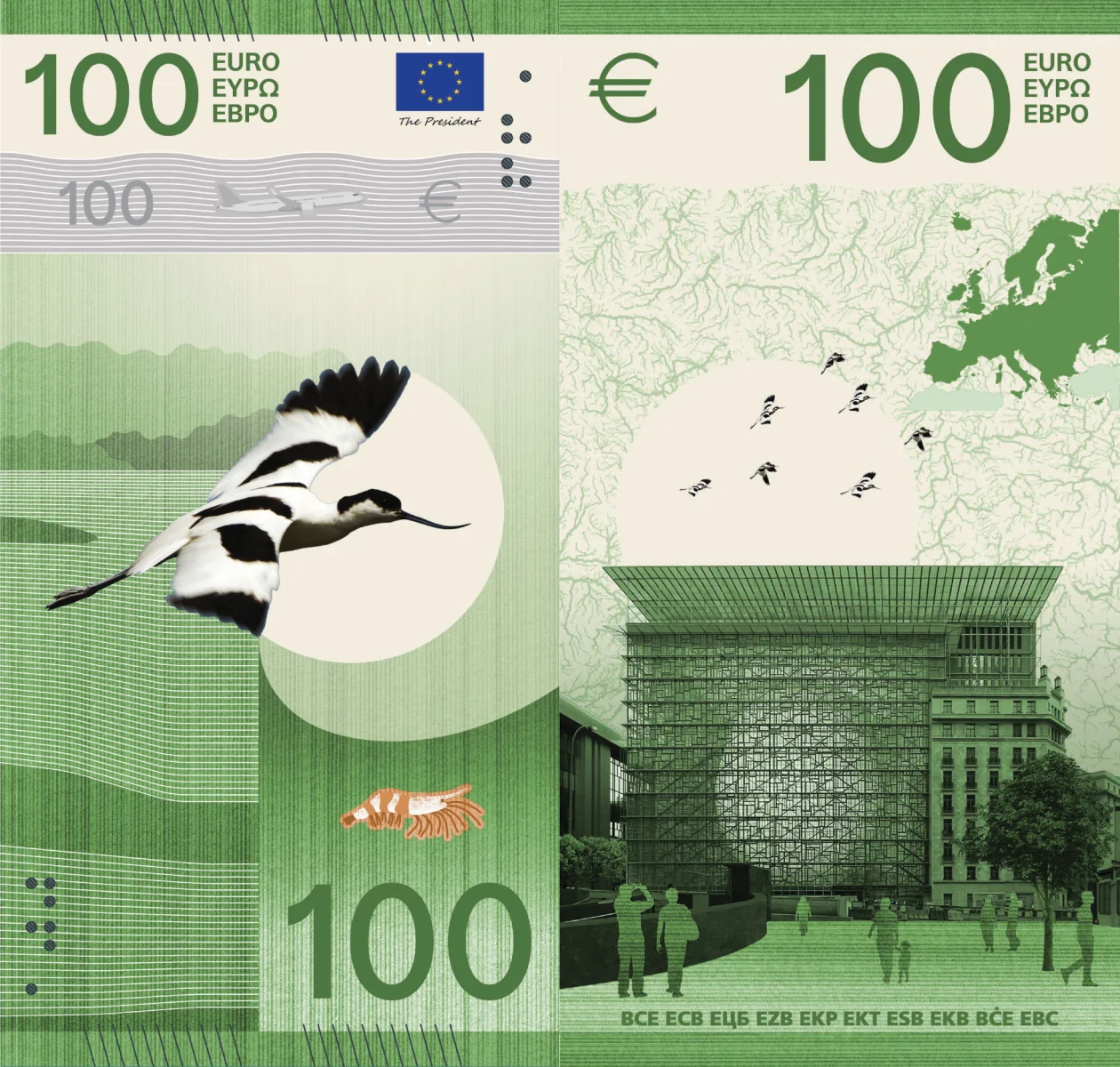
🔴 Another fully vertical design! This time, there’s absolutely nothing that could be read in a horizontal, landscape position! The very fine lines would not age well even on polymer. Still, the design would have looked better in normal, landscape format. The names of the characters are not shown anywhere, nor are the buildings named. Customized visible security elements (aeronautics and aerospace) that don’t observe the imposed motif. The added insects, a frog, a lobster, and a fish, are also unnamed. Too big a mess: 4/10.
Design J — Ville Tietäväinen
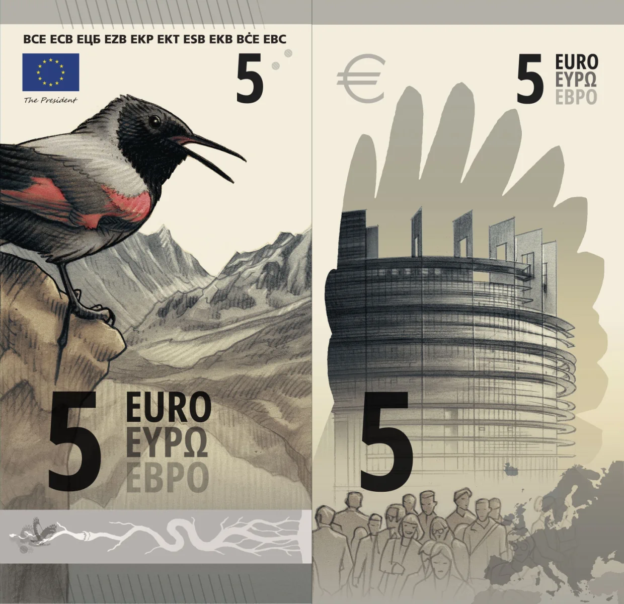
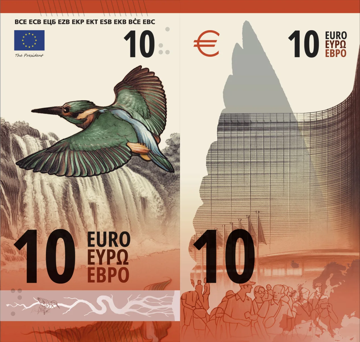
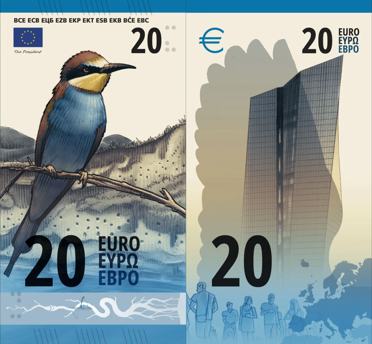
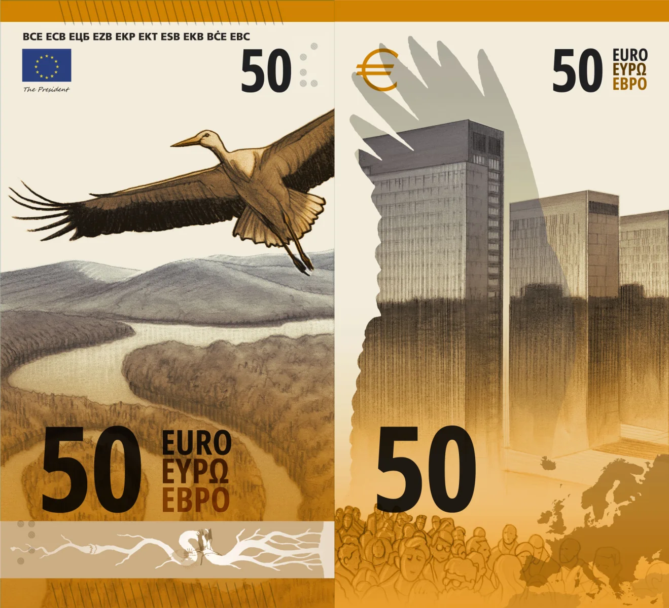
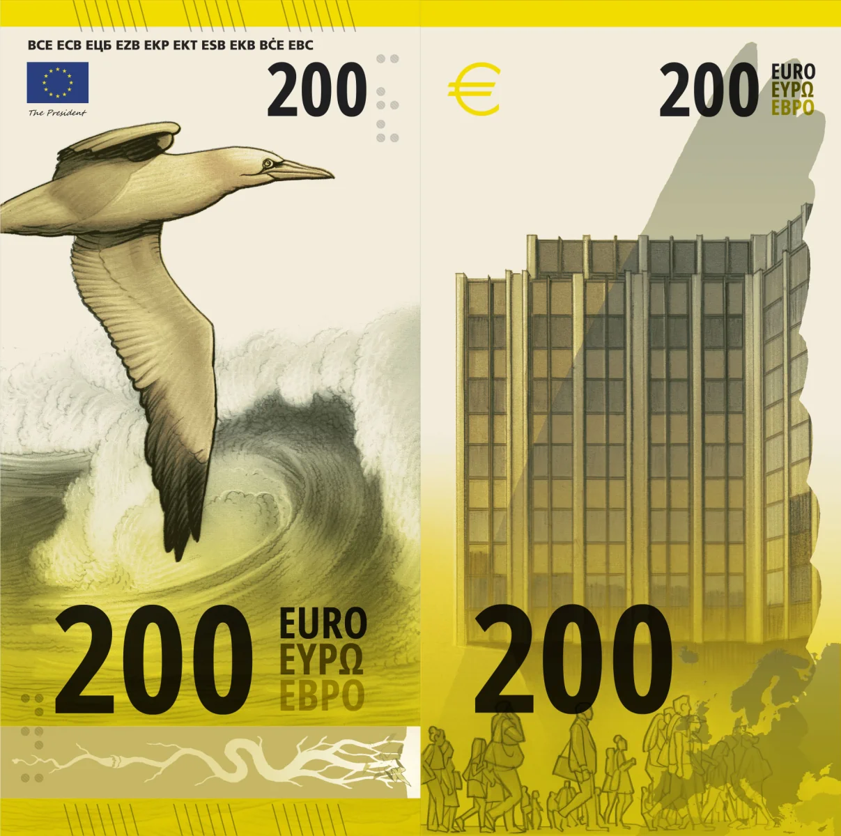
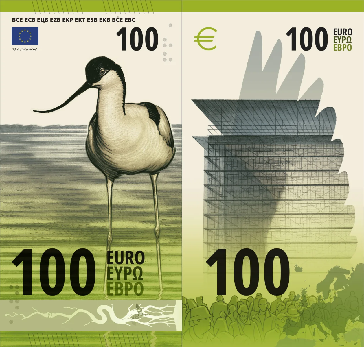
🔴 Yet another fully vertical madness! One more time, absolutely nothing that could be read in a horizontal, landscape position. I’m not sure what drawing technique is supposed to be represented by the birds themselves. Backsides have sketched people and a map of Europe, both elements being clumsily placed. The visible security elements are partially customized across denominations. One more mess: 4/10.
Bottom line
If they choose a catastrophic design, we’re fucked. And this has a high probability, given the quality of the Eurocracy.
Recap of my takes:
- A: 5/10
- B: 8/10
- C: 3/10
- D: 4/10
- E: 7/10
- F: 6/10
- G: 3/10
- H: 7/10
- I: 4/10
- J: 4/10
The current design is a failure, but it can get even worse!
I would probably choose B, E, H. However, I could see them choosing A or D.
I don’t know why, but one might think they’ll lean more toward the characters.